Download

1 / 5
50 likes | 61 Views
You may know a lot of things that you should include in a website design. But what are things that you should avoid? Our blog will outline these. Check out @ https://tananet.net/10-things-you-should-never-do-on-your-website/

E N D
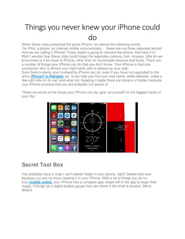
10 Things You Should Never Do On Your Website As you look for building a website, you’ll come across lots of resources on the features you should integrate into your website, best UX design practices, style and layout tips, and so on. At the same time, it’s important to know what you should avoid while crafting a website. Today, we will outline top 10 things that the experts at any leading website design company recommend avoiding at any cost! Check these out. 10 Things to Avoid on Your Website Poor Content Readability A website is a repository of content and people get to know about your business through the content. Therefore, your site content should be easily readable – both on large and small screen. Here are a few aspects to take care of:
Make sure to use moderate to large font Maintain adequate white space Too many colours can affect one’s vision, for instance, yellow font on purple background – a resounding No! Use bullet points and multiple short paragraphs Auto Play with Sound Any sort of auto-play feature with sound, be that audio or video, is a disturbing element. Many often, people browse websites in public places. They may not always use a headphone. A sudden video or audio with sound may irritate people in their surroundings and embarrass the users. This will only lead the users to bounce and they may be apprehensive of opening your site anytime soon! Also, if your video starts as people scroll down the page, allow them to find the close button or pause button intuitively. That way, they can scroll past the video if they don’t intend to check it. Hidden Information Make sure that all the information is readily available to the users and they don’t need to spend a long time finding an information. With so many competitors available on the web, the users are spoilt with choices. Don’t let them find an excuse for disliking your website or considering it suspicious and bounce. Two of the most crucial information that site owners often fail to acknowledge are the contact information and privacy policy. Allow your users to easily find these information to get in touch with you and rest assured that their privacy is not jeopardized. Also, it’s important to introduce your team and business through an about us page so that the visitors can rely on you. Unappealing 404 Page 404 page can be a silent traffic killer if it doesn’t seek to resolve the users’ problem. Have you come across those “404 Not Found” pages? Aren’t those frustrating? They only lead the users to hit the Back button and abandon the page.
It’s time to create an appealing 404 page for your website. Here are a few things you can do: Add a search function or suggest some of your product/service pages Direct them to homepage Ask them to inform the problem through a chatbox. It can work as a lead generation opportunity and you may use the contact information for marketing purpose. Too Many Pop-Ups You have attractive offers running on your e-store, you want people to subscribe to your newsletter, you want them to check out your new blog, you think people should know about your new services or new office opening… the list is never- ending! And you consider pop-ups to be the best way to grab people’s attention. Sure they are, but too many large and intrusive pop-ups can affect the users’ view and ruin their experience. It will irritate them and encourage them to bounce. Here are 3 things to bear in mind: Limit the numbers of pop-ups – use one or two Give people some time to get seasoned to your site before you show a pop-up Make sure that the users can easily opt-out from the pop-up by closing it or clicking/touching outside of the pop-up Poor Navigation Your site should guide people to easily find what they need and gradually lead them towards conversion. A clumsy navigation will reverse this aim. Here are a few things that ensure an easy and intuitive navigability: The website logo leads to the homepage. All the links featured on your site should be clearly distinguishable – with a different colour and underline. Breadcrumb navigation enables people to easily find out a way around your website.
Mistakes in Using Image Cheesy stock photos on your website deeply hurt the brand image! Therefore, instead of using generic images, use at least a few real pictures of your office, shop, or team. It will increase credibility. You should also size the image for the dimension where you want to place it. That way, the image will not look stretched at any point. The experts of website design services further recommend using CSS media queries to ensure that images, graphics and media files are fully responsive. Extra Long Pages Infinite scrolling is a trendy web design practice these days. While social media sites, news portals, arcade game collection sites, etc. can leverage this type of design, traditional business-centric websites should steer clear of these. That’s because, people may get irritated from scrolling a long web page and finding out information. Therefore, it’s better to include multiple web pages addressing various aspects of your business and enlisting your services and products. No Autocomplete Search Suggestions If you have a website with lots of pages for products, services, blogs, etc., including a search functionality is of paramount importance. To take user experience to the next level, consider using autocomplete suggestions as people search. All Pictures, No Text You must be familiar with the idea of including pictures and videos in a website to enhance user engagement. People can consume more information from visuals than from texts – you may know that as well. And all these insights lead you to believe that filling your website with lots of visuals will be the best way to engage people. Well, that’s not true! There’s no substitute for deep content and people do read the text content before interacting with a business. Therefore, make sure to keep a balance between text and visuals (unless of course, yours is a website of stock images)!
As you can see, avoiding these little things can make a major difference in your website design. Pay attention to these and you are good to go! Resource: https://tananet.net/10-things-you-should-never-do-on-your-website/ ……………………………………………………………………………………………………… WebGuru Infosystems Y8, Block-EP, Sector V, Salt Lake Kolkata-700091, India Website: https://www.webguru-india.com/ Email: enquiry@webguru-india.com Phone: +91-8420197208 Follow us on: