Download
1 / 5
50 likes | 66 Views
An e-store design should aim at three things - attract people, inspire trust, and ensure a glitch-free shopping experience. Today, letu2019s take a closer look at how to satisfy all the criteria. https://timebusinessnews.com/10-effective-tips-for-an-ecommerce-website-design/

E N D
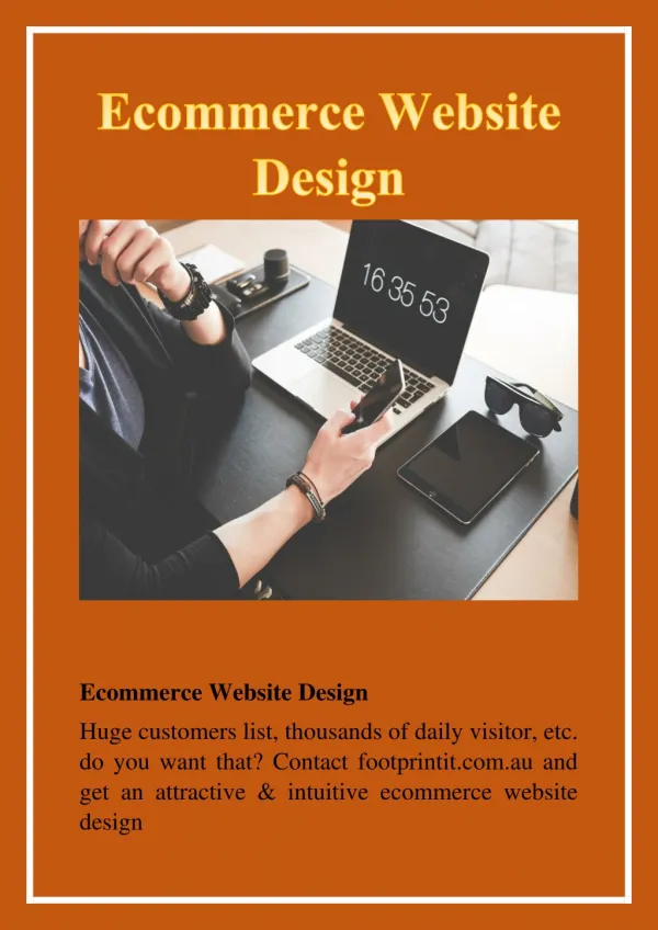
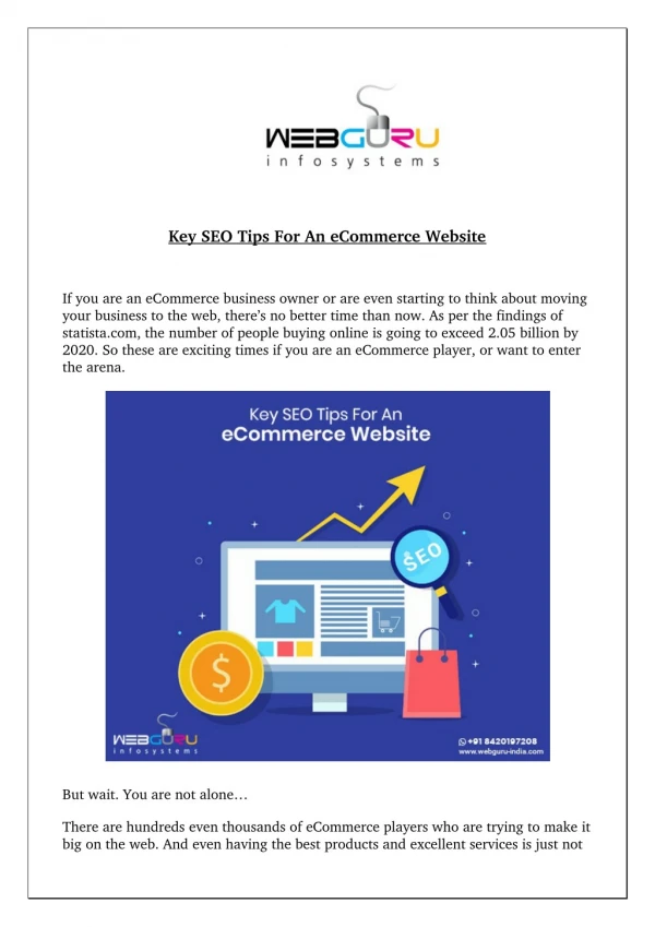
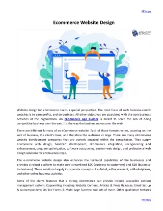
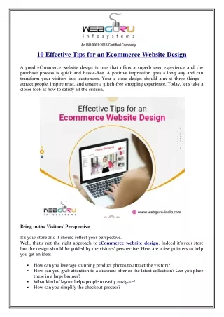
10 Effective Tips for an Ecommerce Website Design A good eCommerce website design is one that offers a superb user experience and the purchase process is quick and hassle-free. A positive impression goes a long way and can transform your visitors into customers. Your e-store design should aim at three things – attract people, inspire trust, and ensure a glitch-free shopping experience. Today, let’s take a closer look at how to satisfy all the criteria. Bring in the Visitors’ Perspective It’syour store and it should reflect your perspective. Well, that’s not the right approach to eCommerce website design. Indeed it’syour store but the design should be guided by the visitors’ perspective. Here are a few pointers to help you get an idea: How can you leverage stunning product photos to attract the visitors? How can you grab attention to a discount offer or the latest collection? Can you place these in a large banner? What kind of layout helps people to easily navigate? How can you simplify the checkout process?
When you think like a customer, you can design a site that perfectly syncs with their thoughts. You can check out various other eCommerce websites to see which elements are grabbing your attention and how they are designed. You can also opt for an A/B testing in your site to find out which design is driving more interaction from the visitors. Site Architecture with Categorization An online store can have ten to ten thousand products. Proper product categorization is crucial so that the users don’t feel overwhelmed and can find out the product they want to purchase. Use appropriate filters and product categories in the menu so as to organize the store neatly. If you have limited products, you may consider integrating a few drop-down menus for each product category. While filters and product categories significantly increase site navigability, here are a few other elements that further enhance navigability: Breadcrumbs allow the users to easily return to various hierarchical positions Search bar enables people to easily find out an element The brand logo should direct one to the homepage and it should be visible on every page Grid Layout in Product Pages Grid layout is the most popular style for eCommerce websites. Products organized in rows and columns help the visitors to easily browse the items. Make sure not to cram too many products in one row. The professionals company mention that having three or four products in a row makes the product catalogue pages appealing. Ensure to keep plenty of white spaces around each item so as to help people differentiate the products. Use the Colour that Suits Your Business Colour is a powerful element and you should leverage it the most in your e-store designing. Different colours trigger different emotions and actions from people. The first step is to maintain consistency and resonate with your brand. Black can be your favourite colour but it doesn’t suit an e-store that sells plants and flowers. If you have a brand logo, you can take an idea from that. Again, the elements you want to highlight should have a different colour to stand out from the rest. For instance, using green or red for the “Buy” or “Add to Cart” button is a good idea. These colours inspire excitement and create an urge to take action. at a leading website development
Quick fact: Dmix found a 34% increase in conversion rate after using a red button. Feature Easily Scannable Content You can craft long descriptions with flowery texts but no one is going to read these. Studies find that most web traffic reads about 20% of the text featured on a web page. Therefore, make sure that your content is easily scannable and people can find out the key information without spending a long time. Using short paragraphs with small sentences, bullets and lists is the best way to help people consume your product description. The easiest way to attract people is to feature high-end product images. Colourful and attractive pictures evoke a desire in people’s mind to purchase the item. You may include product videos, 360-degree product view, zoom-in feature, etc. to further enhance user experience. Make Your Store Visually Attractive Since the visitors cannot manually check the product, the images/videos give them a chance to closely inspect the product before purchasing. Poor quality images don’t attract them to shop the item. Quick fact: VWO found 40% increase in conversion rate by featuring excellent images. Look Super Professional You may not have a retail store. You may just have a little home-based bakery. You may resell products from home. No matter what your business model is, your online store should always look super professional. How to ensure that? Well, little things that can make a big difference here. For instance, check for any typos or misspelling in your site content. Find out if all the buttons are properly working. Make sure that the colour palette, font, and footer design is consistent in each page. A professional-looking store evokes confidence and people won’t hesitate to share sensitive information like card details. Create a Clean Checkout Page Having a cluttered checkout page is the worst mistake in an e-store. Here’s an interesting study by Baymard Institute. During their large-scale checkout testing at the Institute, the researchers documented that an average large-sized online store can gain a 35.26% increase in conversion rate simply through a better checkout page design. This amounts to $260 billion worth of abandoned orders only in the US and EU that is recoverable through checkout optimization (source: Baymard.com).
Make sure that the checkout page design is simple, easy to navigate and clean. Give the customers an option to check out as a guest. Keep the checkout form as short as possible and ask only the essential information from the customers. Once the purchase is complete, direct them to the confirmation page so that they can rest assured that the process is done. Focus on Responsiveness Over half of the eCommerce web traffic comes from the mobile. Having a responsive website design positively impacts conversion rate. Here are a few statistics that may interest you. 54% of visitors come from mobile devices 33% of them make a purchase from mobile devices 40% of the users will visit the competitors’ store after having a lousy mobile experience at an e-store. Don’t Forget to Feature Reviews 61% of online shoppers read customer reviews before deciding whether or not to purchase a product. The statistics sure convinces you to include reviews on your e-store? You may allow your customers to upload a product photo along with the review. Also, don’t hide the negative feedbacks or poor ratings. Featuring only positive reviews and 5-star ratings may evoke suspicion among the potential buyers. Closing Thoughts Designing an e-store can be tricky but following the above-mentioned tips will make your work easier. Implement these tips and see how users interact with your site. You should also create a site heatmap to find out where most people are bouncing and fix the issues. Found the article insightful? Feel free to share your thoughts. Resource: https://timebusinessnews.com/10-effective-tips-for-an-ecommerce-website-design/ ……………………………………………………………………………………………………… WebGuru Infosystems
Y8, Block-EP, Sector V, Salt Lake Kolkata-700091, India Website: https://www.webguru-india.com/ Email: enquiry@webguru-india.com Phone: +91-8420197208 Follow us on: