Why Responsive Design Matters in Graphic Projects
0 likes | 2 Views
At Web Era Solutions, a leading graphic design and web development company in Delhi NCR, we understand how crucial it is for businesses to embrace responsive graphic design. In this blog, weu2019ll explain what responsive design means for your visual assets, why it matters, and how it can significantly improve user experience, brand consistency, and engagement.

Why Responsive Design Matters in Graphic Projects
E N D
Presentation Transcript
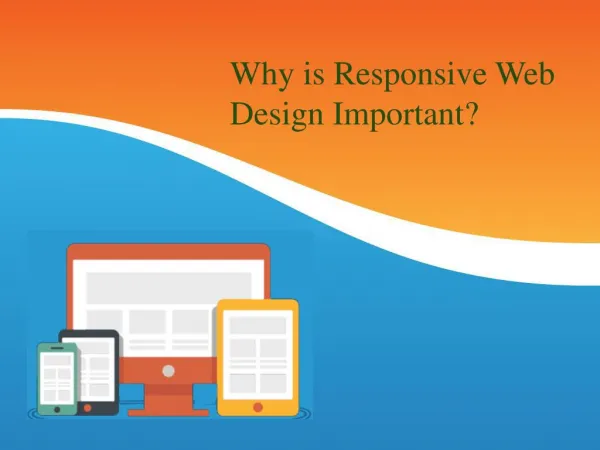
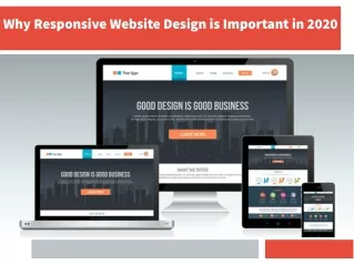
Why Responsive Design Matters in Graphic Projects In today’s digital-first world, your audience is everywhere — on phones, tablets, desktops, and even smart TVs. Whether it’s a website banner, social media post, or digital ad, your graphics need to look great and function perfectly across all devices. That’s where responsive design in graphic projects becomes not just important — but essential. At Web Era Solutions, a leading graphic design and web development company in Delhi NCR, we understand how crucial it is for businesses to embrace responsive graphic design. In this blog, we’ll explain what responsive design means for your visual assets, why it matters, and how it can significantly improve user experience, brand consistency, and engagement. What is Responsive Graphic Design? Responsive design refers to the ability of digital content — including graphics — to adapt seamlessly across various screen sizes and devices. In graphic design projects, it means creating visuals that: ● Scale proportionally ● Maintain clarity and composition
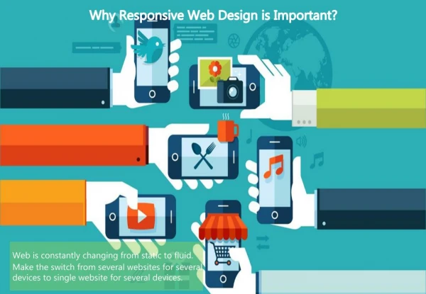
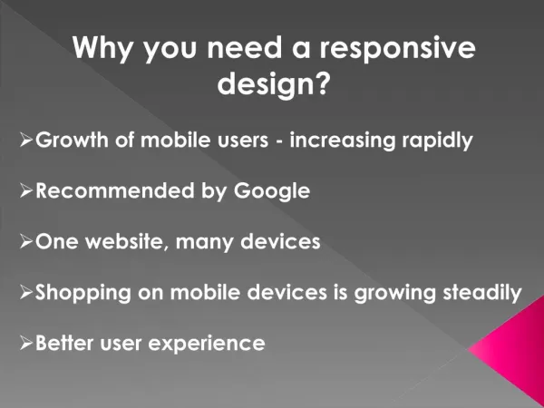
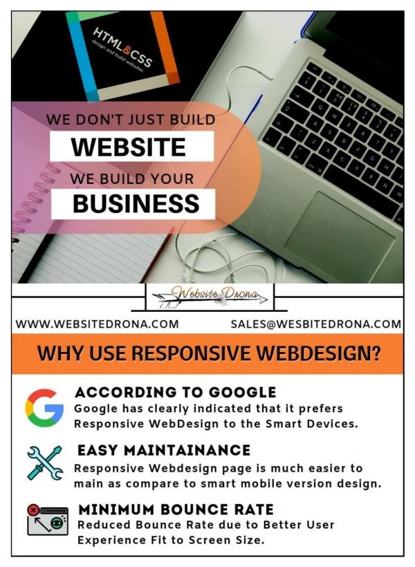
● Adjust content layout for readability ● Remain visually appealing regardless of device Whether it's a responsive website banner, social media ad, or email graphic, responsive design ensures your message looks polished and professional everywhere. Why Responsive Design Matters in Graphic Projects 1. Multi-Device Usage is the New Normal Users no longer rely on a single device to browse the web. According to recent data, more than 60% of internet traffic comes from mobile devices. That means your graphics must be mobile-ready by default. If your visual content isn’t responsive, it may: ● Appear cropped or distorted ● Load slowly on certain devices ● Lose its impact or message ● Lead to a poor user experience At Web Era Solutions, we create mobile-optimized graphics that retain their quality and effectiveness on every screen. 2. Better User Experience = Better Engagement When graphics load correctly and look stunning across devices, users stay longer and engage more. On the other hand, hard-to-read text, stretched images, or misaligned layouts can frustrate users and cause them to bounce. Responsive design improves user experience by: ● Ensuring readability ● Maintaining visual hierarchy ● Delivering faster load times
● Keeping brand aesthetics consistent These factors not only help with audience engagement but also influence SEO rankings and conversion rates. 3. Boosts Your Brand’s Professionalism Your brand is only as strong as how consistently it’s presented. A responsive design ensures your logo, banners, headers, and product visuals appear uniform across devices and platforms. Without responsive design: ● Logos may appear pixelated on high-res screens ● Text in graphics might become illegible ● Important messaging may get cropped out ● Social media visuals might not fit platform specs Our graphic design services in Delhi NCR focus on scalable, high-resolution designs tailored for each platform and device. 4. Essential for Social Media Marketing Social platforms like Instagram, Facebook, LinkedIn, and X (Twitter) all have different image size requirements. A single static design won’t cut it. Responsive graphic design means creating platform-specific versions of your visuals, such as: ● Square designs for Instagram posts ● Vertical layouts for Stories and Reels ● Horizontal formats for Facebook ads ● LinkedIn banners for business pages This approach maximizes reach, improves click-through rates, and ensures your brand stands out wherever your audience is scrolling.
5. Enhances Email Campaign Performance Email marketing relies heavily on visuals — headers, banners, product images, CTAs. If these aren’t optimized for responsive email clients, your emails may look broken or unreadable on mobile devices. Responsive email graphics help: ● Improve open and click rates ● Ensure proper rendering on mobile and desktop ● Increase conversions through clear CTAs ● Reduce unsubscribe rates Our design team at Web Era Solutions crafts responsive email visuals that boost campaign results and align with your overall branding. 6. Future-Proofing Your Graphic Assets Technology and devices are constantly evolving. Responsive design ensures your graphic assets are scalable, adaptive, and ready for whatever screen sizes or platforms emerge next. This means: ● Less need for frequent redesigns ● Easier updates for new campaigns ● Long-term consistency in brand identity ● Reduced development costs over time We design with the future in mind — from vector-based logos to scalable UI elements — so your brand always looks its best. Why Choose Web Era Solutions? As a full-service graphic design agency in Delhi NCR, we specialize in responsive design for digital and print projects. Whether you’re building a brand, launching a campaign, or redesigning your website, our team ensures your visuals are:
Device-optimized High-resolution and scalable Aligned with your brand guidelines Platform-ready for web, social, and email SEO- and performance-friendly We blend creativity, strategy, and technology to create designs that look good and perform even better. Ready to make your designs look great on every screen? Contact Web Era Solutions today for responsive graphic design solutions that boost your brand visibility and engagement. Let’s Create Visuals That Work Everywhere — Beautifully!