Download
1 / 6
70 likes | 242 Views
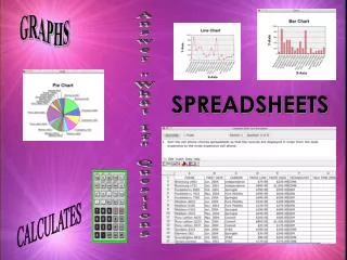
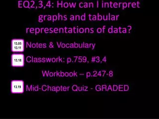
EQ2,3,4: How can I interpret graphs and tabular representations of data?. Notes & Vocabulary Classwork: p.759, #3,4 Workbook – p.247-8 Mid-Chapter Quiz - GRADED. 13.05 13.11. 13.18. 13.19. Measures of Central Tendency.

E N D
EQ2,3,4: How can I interpret graphs and tabular representations of data? Notes & Vocabulary Classwork: p.759, #3,4 Workbook – p.247-8 Mid-Chapter Quiz - GRADED 13.05 13.11 13.18 13.19
Measures of Central Tendency • Measures of central tendency describe the center of a set of data and include mean, median and mode. • Mean – sum of data divided by number of items in the data set • Median – middle number of the data ordered from least to greatest • Mode – number or numbers that occur the most
Stem-and-Leaf Plots • Stem-and-Leaf Plots list numerical data in ascending or descending order. The greatest place value of the data is used for the stems. The next greatest place value forms the leaves. • List them from least to greatest in the Stem column. Write the leaf in the corresponding Leaf column. • Order leaves from least to greatest and write a key that explains how to read the stems and leaves.
Measures of Variation • Measures of variation describe the distribution of data. • The range is the difference between the greatest and the least value of the set. • The quartiles divide the data into four equal parts. • The median separates the data set in half. • The interquartile range is the difference between the upper quartile and the lower quartile. • Outliers are values that are more than 1.5 times the value of the interquartile range beyond the quartiles.
Box-and-Whisker Plots • A Box-and-Whisker plot uses a number line to show the distribution of a data set. • It divides a data set into four parts using the median and the quartiles. • A box is drawn around the quartile values and whiskers extend from each quartile to the extreme data points that are not outliers.
Histograms • A histogram displays numerical data that has been organized into equal intervals with bars that have the same width and no space between them. • While a histogram does not show exacgt data points, its shape shows the distribution of the data. • Histograms can be used to compare data although the mean, median, mode and range cannot be determined.