Download
1 / 11
110 likes | 125 Views
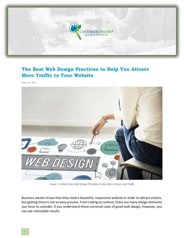
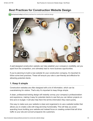
What does this mean for your business? It means that your website is the face of your business. Itu2019s how potential customers will decide whether they trust you enough to do business with you in the future.<br><br>Therefore, letu2019s go through some of the best web design practices that you should be using to help your online business.

E N D
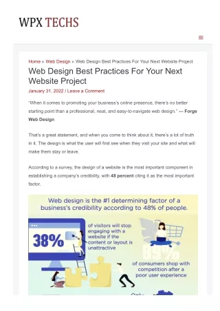
Home » Web Design » Web Design Best Practices For Your Next Website Project Web Design Best Practices For Your Next Website Project January 31, 2022 / Leave a Comment “When it comes to promoting your business’s online presence, there’s no better starting point than a professional, neat, and easytonavigate web design.” ― Forge Web Design That’s a great statement, and when you come to think about it, there’s a lot of truth in it. The design is what the user will first see when they visit your site and what will make them stay or leave. According to a survey, the design of a website is the most important component in establishing a company’s credibility, with 48 percent citing it as the most important factor.
So what does this mean for your business? It means that your website is the face ofSo what does this mean for your business? It means that your website is the face of your business. It’s how potential customers will decide whether they trust you enough to do business with you in the future. Therefore, let’s go through some of the best web design practices that you should be using to help your online business. Table of Contents 1. EasyToRead & SkimFriendly Typography is Best 2. Choose a Color Scheme that Reflects Your Brand 3. White Space is Important for User Experience 4. Use HighQuality Graphics to Engage Users 5. Simple Navigation Helps Visitors Find What They Want 6. Mobile Optimized Web Design is Essential 7. Create Strong CTAs to Drive Action 8. Arrange Elements in an Even Fashion Across the Page 9. Texture Can Make or Break the Design 10. Test, Test, Test! Conclusion
1. EasyToRead & SkimFriendly Typography is Best Typography is by far one of the essential parts of web design. Typography can make or break how users interact with your website. You can have a beautiful layout and nice pictures, but if your typography is not done right, you will be losing out on a lot of potential business. So what makes good typography? How do you get good typography? There are many different ways to approach typography, and some are better than others. The goal here is to understand what makes an excellent typographical design and then create it in whatever way works best for you. 2. Choose a Color Scheme that Reflects Your Brand Image Source Color is a crucial design tool, but it’s also one of the most difficult to get right. Simply throwing color onto your site or app isn’t enough—good designers choose colors that reflect their brand and lead to cohesive projects. According to statistics, consumers (39%) value color more than any other aspect of a website’s design. (Top Design Firms) So, when choosing a color scheme, ask yourself:
So, when choosing a color scheme, ask yourself: Will it accurately reflect your company’s identity? Is it memorable? Does it put users in an appropriate mindset? Only after you’ve answered these questions should you consider how well each color works on its own and with others. This step might feel daunting, but several simple tools are available to make your life easier. Adobe Color CC is an excellent place to start. 3. White Space is Important for User Experience White space, or negative space, is often overlooked in web design. White space can help to keep a design from feeling cluttered and overwhelming and add visual appeal. Although it’s tempting to jam all your content into one page, remember that less is more in web design. Most users will navigate away from a site that seems too crammed with text and graphics. According to a study, effective use of white space between lines of paragraphs, as well as the left and right margins, can boost understanding by up to 20%. Micro White Spaces are small spaces between lines, paragraphs, or menu items. Image Source Get creative with white space by using margins and lines to separate different
content areas on your page or perhaps letting photos speak for themselves rathercontent areas on your page or perhaps letting photos speak for themselves rather than adding lots of text next to them. With some careful planning, you can improve the user experience while maintaining professional aesthetic standards by incorporating white space into your designs with some careful planning. 4. Use HighQuality Graphics to Engage Users What if we told you that consumers would abandon a website with poor graphic design? Yes, as per stats, 94% of the consumers do so. While you may not think of visual design as an integral part of your web project, it’s critical. A good site will engage users with highquality graphics and copy from initial impressions to callstoaction and beyond from initial impressions to callstoaction and beyond. One of our top strategies for engagement is using images. Not only do graphics help break up walls of text, but they also allow you to drive users through your sales funnel (and maybe even convert them into customers!). According to the stats, visuals are highly significant to 49 percent of digital marketers in their marketing efforts.
Image Source So how can you get started? Here are some tips on how to incorporate more visually appealing images in your next web project: Interactive Design Users are intrigued by interactive features. One example of this is scroll boxes, which appear as readers move down a page. They are intrigued enough to continue scrolling for more content by using these elements. Add HighQuality Images While images do not necessarily need to be related to your site’s topic, they can be. However, highquality images which are relevant to your site’s content will keep your visitors interested and intrigue them as well. Use Professional Photos Do not use unprofessional photos that distract or deter users from engaging with your site. Avoid blurry or poorly taken pictures as they might look unappealing and can be a turnoff for potential customers and clients. Find a professional graphic designer. 5. Simple Navigation Helps Visitors Find What They Want
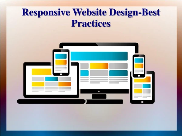
Want People visit your website to accomplish specific tasks, and they don’t have time to learn an overly complicated navigation system. Use simple menus and clear link text with active verbs that describe what visitors can expect when they click a link. The fewer menu levels you have and more links on each page, the easier it is for visitors to get around your site without getting lost or distracted. Highlight important links with different colors (your logo color is always safe) or boldface, so important links stand out from all others. Keep menu items short; no more than four words per item is best. 6. Mobile Optimized Web Design is Essential When creating a new website, it’s crucial to ensure that your pages are mobile optimized. Yes, as per the survey, it is found 50% of website traffic comes from mobile devices. Image Source
Image Source By focusing on site speed and ease of use, you can create a more functional and userfriendly experience for your target audience—one that won’t deter them from returning to your website or driving business to your company. Fortunately, there are several best practices to help: Keep page load times short. Be sure that all links and buttons work correctly. Avoid popups (they don’t convert well). Make text large enough to read on small screens. 7. Create Strong CTAs to Drive Action You cannot ignore the fact that a high conversion rate is essential for the success of your website. According to Statistic Brain, a 1% increase in a conversion rate can lead to an 11% increase in revenue. According to HubSpot, you’ll need smart CTAs. Conversion rates for default and multivariate CTAs were a little over 1%, whereas smart CTA conversion rates were around 3.5 percent.
Image Source: HubSpot The best way to ensure that visitors take action is by using clear, compelling calls toaction (CTAs). Keep these elements top of mind when designing your next website project: make sure: Each button contains one and only one command Use color appropriately Don’t overload them with information or clutter Place them strategically at eye level or above and avoid using legal jargon or legalese You may also want to think about testing different versions of CTAs on your site to figure out which performs best. 8. Arrange Elements in an Even Fashion Across the Page One of the simplest & easiest ways to improve a web page’s visual appeal is to pay attention to where and how often elements are placed. Besides, this can have an impact on everything from readability to usability and accessibility. A good rule of thumb is to arrange content in a way that allows it to breathe across as much of a page as possible without drawing attention away from that content. You don’t want too many elements competing for space or focusing so much on the location that they become distracting instead of informative. 9. Texture Can Make or Break the Design Much like fashion, a website’s texture can make or break its success. Moreover, when it comes to web design best practices, many UX experts and web designers agree that texture is one of those things you have to get right. If your website’s text is too crisp and clear, there is a chance that people will be
distracted when they are trying to read more indepth content. If they aren’t reading,distracted when they are trying to read more indepth content. If they aren’t reading, then you might as well not even have it on your site! For example, think about how newspapers print articles on rough paper so that you can feel them before reading anything—it draws attention toward what you need to read next. 10. Test, Test, Test! Testing your website design before it goes live is possible in many ways. Tools like BrowserShots and UserTesting allow you to see how people interact with your site as they go through common web experiences (like checking out a product). You can also create an early version of your site on your computer and share it with friends or colleagues, so you get feedback sooner rather than later. When you do launch, make sure you put in place some essential monitoring tools (i.e., Google Analytics) to start learning about how people use your site. That’ll be crucial data as you refine both usability and design over time. Conclusion Creating a successful web design starts with following best practices, regardless of the type of project you’re working on. When building out your next website, keep these ten tips in mind to ensure that your website is easytouse and pleasing to your users. Author Bio: I’m Varun Bhagat, a Sr, technical consultant and blogger working for PixelCrayons which is a leading web designing company in India. I like to share my technical knowledge with likeminded people. ← Previous Post
Leave a Comment Your email address will not be published. Required fields are marked * Type here.. Name* Email* Website Save my name, email, and website in this browser for the next time I comment. Post Comment » Copyright © 2022 WPX TECHS | Powered by Astra WordPress Theme