Download
1 / 50
680 likes | 946 Views
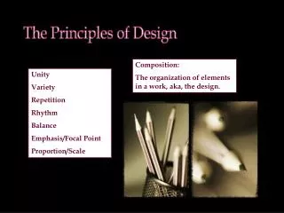
The Principles of Design. These concepts determine how the Elements of Design are used in a composition. Balance in Fine Art. Winslow Homer - "Dressing for the Carnival", 1877

E N D
The Principles of Design These concepts determine how the Elements of Design are used in a composition.
Balance in Fine Art Winslow Homer - "Dressing for the Carnival", 1877 • In Homer's painting, the artist tells a story of a performer putting on his costume while fascinated children watch. He uses very strong valuecontrast to emphasize intense sunlight and shadows. He balanced values, shapes, and colors to create a unified visual statement with the central carnival figure as the focal point. • Source: Elements and Principles of Design: Student Guide with Activities, published by Crystal Productions
Balance in Graphic Design • How to Be a Wicked Witch Book Cover Dennis ClouseCyclone Design and Illustration At first glance, an observer may wonder how this cover could possibly represent a good example of balance. Think of this design not in terms of balancing two mirrored sides (symmetrical balance), but of two different elements—type and shape—offsetting each other. The illustration on the left side is basically built of shapes, while the right side of the design is primarily type. The two are placed in the format in such a way as to create a sense of near-perfect balance. The dark vignette border and the tail of the cat coming up to the right edge of the cover do wonders to stabilize the design. • Source: Design Basics for Creative Results by Bryan L.
Further Definition • Balance is the attainment of optical and psychological equilibrium in a design. • What is it? • The visual weight of an image. Balance can relate to symmetry, asymmetry or radial balance. • Symmetrical Balance is an even placement of visual weight in the design. • Asymmetrical Balance creates uneven spaces, a sense of imbalance making tension and a dynamic suggestion of visual movement. Asymmetrical balance refers to a psychological or "felt" balance. Space and shape don't need to be evenly dispersed on the page • Radial Symmetry relates to images emitting from a point like spokes on a wheel or ripples from a pebble tossed into a pond.
Why is Balance Important? • People like balance; we are creatures of symmetry and appreciate it in everything. A design is like a real world building: it needs to be balanced or it doesn’t work.
How To Achieve Balance • Color: Colors have weight (Red = Heavy, Baby Blue = Light) • Shape: Squares can be heavier than circles • Lines: Thin vs. thick • Size: larger=heavier • Use elements to create stability or a sense of dynamic space. Notes: • Balance is vital. A design can be ruined by poor balance • Balance should not be 50/50 in a boring mathematical sense. Different elements should add up to balance.
Rhythm • Rhythm is the repetition of visual movement - colors, shapes or lines. • Variety is essential to keep rhythms exciting and active, and to avoid monotony. • Movement and rhythm work together to create the visual equivalent of a musical beat.
Rhythm in Fine Art • Marcel Duchamp - "Nude Descending a Staircase (No2)", 1912 • Duchamp painted this painting to show the rhythmic movement of a figure coming down the stairs. The effect is like stop-action or strobe-light photography, because the repeated shapes and angles of the abstracted figure move diagonally across the canvas. Try to feel the rhythm the next time you walk down some stairs. • Source: Elements and Principles of Design: Student Guide with Activities, published by Crystal Productions
Pattern • Pattern uses the art elements in planned or random repetitions to enhance surfaces of paintings or sculptures. • Patterns often occur in nature, and artists use similar repeated motifs to create pattern in their work. • Pattern increases visual excitement by enriching surface interest.
Pattern in Fine Art • Jasper Johns - "Numbers in Color", 1958-1959 • The pattern in Johns' painting is regular, consisting of 121 rectangles stacked in eleven rows, each with eleven rectangles. The numbers (0-9) seem irregular because of the irregular use and application of color. There is no focal area in many patterned paintings.
Movement • Visual movement is used by artists to direct viewers through their work, often to a focal area. • Such movements can be directed along lines, edges, shapes, and colors within the works, but moves the eye most easily on paths of equal value.
Movement in Modern Art • Diego Rivera - "Liberation of the Peon", 1931 • Rivera's painting is charged with emotion and filled with history. The naked slave (peon) is being cut free from political tyranny as well as physical enslavement by the liberating soldiers. All movement leads to the focus, where a knife is cutting the binding ropes. Notice how emphasis is placed on the act of liberation rather than on the liberating heroes. Movement is also created when we observe the direction in which the human eyes are looking—directly at the peon. This causes our eyes to follow theirs, creating visual movement toward the focus. The horses look directly at us, which draws us into the grouping of figures and horses. • Source: Elements and Principles of Design: Student Guide with Activities, published by Crystal Productions
In graphic design, movement is also known as flow. • Flow is the combination of elements to guide the viewer around the design in the correct direction. Flow begins and ends with the dominant element to help keep the eye moving constantly around the design. You never want the eye to stop. Why is important? • You want the viewer to see everything in the correct order and you want the viewer to look at your design for as long as possible. Flow can achieve this. How to achieve it: • Lines: The eye will naturally follow lines from start to end • Abstracted arrows • Text: headlines; people read from left to right
Contrast • Contrast refers to differences in values, colors, textures, shapes, and other elements. • Contrasts create visual excitement, and add interest to the work. • If all the art elements - value, for example - are the same, the result is monotonous and unexciting.
Contrast in Fine Art • Paul Cezanne - "Still Life with Apples and Peaches", 1905 • When Cezanne painted this painting, he used all the design elements and all the design principles to build a unified composition. Try to find where he used the seven elements and seven principles of design. If you study his use of contrast alone, you can find at least eight kinds of contrast, which naturally develops an overall sense of variety. • Pattern contrast: intricate pattern vs. no pattern • Edge contrast: hard edge vs. soft edges
Contrast in Fine Art Continued • Value contrast: dark, middle and light values • Intensity contrast: pure colors vs. muted colors • Temperature contrast: cool colors vs. warm colors • Texture contrast: textured vs. smooth • Shape contrast: organic shapes vs. geometric shapes • Size contrast: large shapes vs. small shapes • Source: Elements and Principles of Design: Student Guide with Activities, published by Crystal Productions
Contrast in Graphic Design • Tableaux Restaurant PromotionPetrulaVrontikisVrontikis Design Office • This elegant solution to promoting Tableaux Restaurant uses contrast and variety to create a sophisticated yet lively look. The mailer, especially, is the epitome of this approach, with its use of different yet complementary images and elements, including a leopard-skin pattern, stylized sun images, metallic bronze with olive green, Chinese type and English with calligraphic flourishes.
Contrast in Graphic Design Continued • The address side of the mailer has a high-key value, while the opposite side is low-key. this piece is given special appeal by the use of an unusual shape and die-cut black flaps that lift up to reveal more information printed on a light screen of olive green. • The mailer, along with the rest of the identity system, uses three common colors—black, olive green and a metallic bronze—to unify the elements and give a common identity to the campaign. • Source: Design Basics for Creative Results by Bryan L. Peterson
Emphasis • Emphasis is used by artists to create dominance and focus in their work. • Artists can emphasize color, value, shapes, or other art elements to achieve dominance. • Various kinds of contrast can be used to emphasize a center of interest.
Emphasis in Fine Art • Henri de Toulouse Lautrec - "At the Moulin Rouge", 1892/1895 • The emphasis in de Toulouse-Lautrec's painting is on the atmosphere and the strange lighting and color in a Paris cabaret. Actually, we are drawn into the five-member group of people seated at the table, where emphasis is on conversation among friends. This center of interest is otherwise known as a focal area. • Focal areas emphasize the most important aspect of a work of art. Visual emphasis on a focal area can be achieved by using the strongest light and dark valuecontrasts. It can also be developed by using other strong contrasts of art elements, such as shape. • Source: Elements and Principles of Design: Student Guide with Activities, published by Crystal Productions
Emphasis in Graphic Design • Emphasis is also known as dominance in graphic design. What is it? • The first thing the eye sees on a design. • Traditionally this was the central part of the design, from which all other parts radiated.
Why is it important? • Design is to manipulate the viewer; dominance is where the viewer is to start looking • There is an order in a design. You want the viewer to follow the correct direction, getting information in the correct order. To do this you need to force them to a specific start point on the design. • It gets the viewer's attention.
How To Achieve it • Through the use of some elements: • Color (Red being the best.) • Image • Shocking • Weird • Controversial • Sexual • Text or Words • Shocking • Weird • Controversial • Contrast (Contrasting colors, e.g. black on white) • Size (Bigger image vs. smaller)
Variable Factors • A number of design components affect or modify what we see, but are not constant because they represent changeable relationships between the viewer and the scene. These relationships are called variable factors. Such factors as scale, proportion, distance, observer position, atmospheric conditions, light, seasons, and motion are important considerations which the designer should be aware of and which may be used effectively in proposed designs.
Variable Factors • scale • proportion • distance • observer position • atmospheric condition • light • seasons • motion
Final Notes on Emphasis • Be careful that your dominant element doesn’t overwhelm the whole image. Too much dominance and the viewer will see nothing else. • A view may contain more than one dominant feature: two objects of equal visual influence are said to be co dominant. Many dominant features in a view tend to be distracting; the eye is drawn from one to another without the opportunity to focus on one major element.
Unity • Visual unity is one of the most important aspects of well-developed art and is planned by the artist. • Unity provides the cohesive quality that makes an artwork feel complete and finished. • When all the elements in a work look as though they belong together, the artist has achieved unity.
Unity in Fine Art • Vincent van Gogh - "Starry Night", 1889 • Van Gogh was concerned with the unity of his paintings. In this one, the swirling brush strokes and dominance of cool colors tends to unify the surface and create the feeling that everything belongs together. • Source: Elements and Principles of Design: Student Guide with Activities, published by Crystal Productions
Unity in Graphic Design • Target Ad CampaignGaby BrinkTemplin Brink Design • Nowhere is unity more important than in an an campaign. Creating unity is a form of branding: you must establish a look and attitude that are recognizable even before the content of the ad is read. This particular campaign for Target works quite well in this way. The design is fresh and attention-getting.
Unity in Graphic Design Continued • As simple as the idea is—combining related objects with images of the products the ads feature—it is sure to get noticed because it is also playful. Too olften, the tendency is to take our assignments so seriously that we forget the value of whimsy and entertaining design in making customers feel good about the products we are endeavoring to sell. • Another nice feature of these ads is the treatment of the type. Not only are the headlines clever but the type is tastefully applied to the ad. It is interesting that the Target nameplate does not exist anywhere on the ads. The symbol is enough to identify the store. • Source: Design Basics for Creative Results by Bryan L. Peterson
Further Definition • Unity is a measure of how the elements of a page seem to fit together - to belong together. A unified work of art represents first a whole, then the sum of its parts.
What is it? • All of the design elements (images, fonts) are consistent with each other in shape, style and colour and consistent with the overall message of the image and from a commercial point of view, its target market.
Why is Unity Important? • Establishing and maintaining a consistency throughout your printed piece is essential to the success of your design. • If there is no unity than the main message of the design may be lost or miss the targeted audience. • Unity helps to hold the image together both image wise and message wise.
How To Achieve Unity • Similarity: Repeating colors, shapes, values, textures, or lines creates a visual relationship between elements, called correspondence
How many pitchforks can you find in American Gothic by Grant Wood?
How to Achieve Unity Continued • Color symbolism: Colors that work together with the message; e.g. an environmental action poster would do well with greens and other natural colors. The color supports the message. • Shapes & Lines: Are they curved and soft in an organic sense, or hard and sharp at right angles for something to do with computers? • Size: One element is not overwhelming another to the point it’s lost • Fonts: Work together with design elements (e.g. curvy lines with curvy fonts, rigid line with rigid fonts.) Fonts help convey/support the message.
Achieving Unity Continued • Style: Overall style creates a united message. • A wedding invitation has certain style elements that give it instant reorganization (e.g. wedding bells, doves, flowers, bride and groom images, a flowing script style font.) An ad for a certain brand of wedding invitations would use wedding elements in its design. • Style also talks to the targeted audience; the overall style of a hip hop CD design would be radically different from the design of a Gilbert and Sullivan CD. Each design would be tailored to the market and the products’ respective tastes and pre-existing established styles.
Achieving Unity Continued • Proximity: The simplest method of making objects appear to belong together is to group them closely together. This allows us to see a pattern. • Repetition/Pattern: Another method often used to promote unity is the use of repetition. Repetition of color, shape, texture or object can be used to tie a work together. • Continuation: A much more subtle method of unifying a work involves the continuation of line, edge or direction from one area to another. Continuation is often used in books and magazines to tie the elements of a page together with the use of rules, and by lining up edges of copy, headlines and graphics.
Final Notes on Unity • Is the layout seen and perceived as a single, unified whole? • Are there things that just don't feel right, like a sore thumb sticking out? • Unity also exists in variety. It is not necessary for all of the elements to be identical in form, providing they have a common quality of meaning or style. For example, fashions from a specific period share common features of silhouette, materials, and color that identify the style of the day, or the look of a particular designer.