Download
1 / 48
480 likes | 613 Views
"Don't Forget the Salt!" Aquarius Education and Public Outreach Annette deCharon University of Maine. This map shows a seven-day average, based on all known measurement locations sampled over the past 100 years for Sea Surface Salinity (SSS). http://www.youtube.com/watch?v=nb7KAf-HsE8.

E N D
"Don't Forget the Salt!" Aquarius Education and Public OutreachAnnette deCharonUniversity of Maine
This map shows a seven-day average, based on all known measurement locations sampled over the past 100 years for Sea Surface Salinity (SSS)
Not presently measured by satellite, this map shows the weekly SSS coverage that will be achieved by Aquarius after it is activated Aquarius / SAC-D is a joint U.S. (NASA) - Argentine (CONAE) venture
How do we engage today’s learners to utilize SSS data sets? By providing resources that demonstrate how improved understanding of salinity patterns – with ties to climate and the water cycle – can benefit society as a whole.
K-4: Explain that evaporation can separate the water from the salt in salt water
5-8: Explain how the processes of the water cycle relate to the ocean Salinity patterns are governed by geographic differences in the "water budget." Students learn about the processes that influence salinity patterns using sequential maps of monthly mean data from the North Atlantic Ocean. http://aquarius.nasa.gov/education-datatools.html
By clicking on the "play" button, users view pairs of monthly maps. • On a data analysis worksheet, students answer a series of "Key Questions": • What is the environmental significance of the "0" line on the E-P map?
By clicking on the "play" button, users view pairs of monthly maps. • On a data analysis worksheet, students answer a series of "Key Questions": • What is the environmental significance of the "0" line on the E-P map?
By clicking on the "play" button, users view pairs of monthly maps. • On a data analysis worksheet, students answer a series of "Key Questions": • What is the environmental significance of the "0" line on the E-P map?
By clicking on the "play" button, users view pairs of monthly maps. • On a data analysis worksheet, students answer a series of "Key Questions": • What is the environmental significance of the "0" line on the E-P map?
By clicking on the "play" button, users view pairs of monthly maps. • On a data analysis worksheet, students answer a series of "Key Questions": • What is the environmental significance of the "0" line on the E-P map?
By clicking on the "play" button, users view pairs of monthly maps. • On a data analysis worksheet, students answer a series of "Key Questions": • What is the environmental significance of the "0" line on the E-P map?
By clicking on the "play" button, users view pairs of monthly maps. • On a data analysis worksheet, students answer a series of "Key Questions": • What is the environmental significance of the "0" line on the E-P map?
By clicking on the "play" button, users view pairs of monthly maps. • On a data analysis worksheet, students answer a series of "Key Questions": • What is the environmental significance of the "0" line on the E-P map?
By clicking on the "play" button, users view pairs of monthly maps. • On a data analysis worksheet, students answer a series of "Key Questions": • What is the environmental significance of the "0" line on the E-P map?
By clicking on the "play" button, users view pairs of monthly maps. • On a data analysis worksheet, students answer a series of "Key Questions": • What is the environmental significance of the "0" line on the E-P map?
By clicking on the "play" button, users view pairs of monthly maps. • On a data analysis worksheet, students answer a series of "Key Questions": • What is the environmental significance of the "0" line on the E-P map?
By clicking on the "play" button, users view pairs of monthly maps. • On a data analysis worksheet, students answer a series of "Key Questions": • What is the environmental significance of the "0" line on the E-P map?
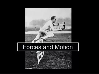
9-12: Explain the influence of ocean salinity on the thermohaline circulation (e.g., “global conveyer belt”) Hands on experiments Salinity difference (35 ppt) Temperature difference (30 deg C) Karp-Boss et al. (2009) http://tos.org/hands-on/teaching_phys.html
Visualizations Density Thermohaline circulation http://aquarius.gsfc.nasa.gov/gallery-animations.html NASA Scientific Visualization Studio
Advanced students can use interactive tools to explore historical salinity, temperature & density data from the World Ocean Atlas (2005). Guided by a "Q & A" format, users can create maps, in-water profiles & time-series graphs. Direct links to Interactive Tools & Tutorials http://aquarius.jpl.nasa.gov
Annual mean maps & In-water profiles: Salinity, temperature & density
Annual mean maps & In-water profiles: Salinity, temperature & density
Annual mean maps & In-water profiles: Salinity, temperature & density
Annual mean maps & In-water profiles: Salinity, temperature & density Can choose up to six locations at once
Annual mean maps & In-water profiles: Salinity, temperature & density
Annual mean maps & In-water profiles: Salinity, temperature & density
Annual mean maps & In-water profiles: Salinity, temperature & density
Advanced students can use interactive tools to explore historical salinity, temperature & density data from the World Ocean Atlas (2005). Guided by a "Q & A" format, users can create maps, in-water profiles & time-series graphs. Direct links to Interactive Tools & Tutorials http://aquarius.jpl.nasa.gov
Monthly mean maps & Time-series graphs Salinity, Temperature & Density from 1 - 6 depths
Monthly mean maps & Time-series graphs Salinity, Temperature & Density from 1 - 6 depths
Monthly mean maps & Time-series graphs Salinity, Temperature & Density from 1 - 6 depths
Monthly mean maps & Time-series graphs Salinity, Temperature & Density from 1 - 6 depths
Monthly mean maps & Time-series graphs Salinity, Temperature & Density from 1 - 6 depths
Monthly mean maps & Time-series graphs Salinity, Temperature & Density from 1 - 6 depths
Interactive tools include annual salinity, temperature, and density data (1800-2005) to answer these questions: Were the oceans as salty a hundred years ago? Can we answer that question? Why do we care? Quick link to climate data http://aquarius.jpl.nasa.gov/
“Student outcomes” resources database (examples) http://aquarius.nasa.gov/education-outcomes.html
Where can you find these tools & resources? • http://aquarius.nasa.gov/education.html • For more information, please contact: • Annette deCharon <annette.decharon@maine.edu> Thank you!