Download
1 / 12
120 likes | 228 Views
Data Display: Tables and Graphs. Communicating - Conveying oral or written information verbally as well as visually through models, tables, charts, and graphs. Predicting - Proposing possible results or outcomes of future events based on observations and inferences drawn from previous events.

E N D
Data Display:Tables and Graphs Communicating - Conveying oral or written information verbally as well as visually through models, tables, charts, and graphs. Predicting - Proposing possible results or outcomes of future events based on observations and inferences drawn from previous events. Applying process skills to interpret data from graphs, tables, and charts.
Tables • Tables display data in columns and rows to make it easier to read and understand.
Graphs Three types: - Line graph - Bar graph - Circle graph
Line Graph • Shows the relationship between two variables. • What is a “variable”? • Both variables in a line graph must be numbers. • One variable is shown on the horizontal axis, or x-axis, of the graph. • The other variable is placed along the vertical axis, or y-axis.
Bar Graph • A bar graph uses rectangular blocks, or bars, of varying sizes to show the relationships among variables. • One variable is divided into parts. • The second variable must be a number. • The bars show the size of the second variable.
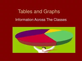
Circle Graph A circle graph (“pie graph”) shows the parts of a whole.
Some IMPORTANT Characteristics of Tables and/or Graphs: • A title • Labeled columns and rows, or axes • Evenly spaced scales • Some graphs have keys and/or color-coding. (See the circle graph.)
Check Your Understanding! • Suppose you have two variables, for example, how much salt you eat in a day and how much water you drink, and you want to visually depict their relationship across time. What visual tool might you use to show this relationship? • When you put numerical data into rows and columns, you are creating a _______.
Check Your Understanding! 3. Suppose you want to visually demonstrate how much of a given area is woodland, how much is grassy but has no trees, and how much has been developed. With different segments like this to consider, how might you choose to show the relationship of parts to the whole?