
GUI Control Properties and Layout Concepts
Learn about control properties like name, text, font, and layout concepts such as anchoring and docking in GUI design. Explore checkboxes, panels, radio buttons, and more.

GUI Control Properties and Layout Concepts
E N D
Presentation Transcript
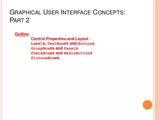
Graphical User Interface Concepts: Part 2 Outline Control Properties and LayoutLabels, TextBoxes and ButtonsGroupBoxes and PanelsCheckBoxes and RadioButtonsPictureBoxes
Common Control Properties • Derive from class Control • Name, Text, Font, BackColor properties • Enable property - Indicate a control’s accessibility • TabIndex property • Order in which controls are given focus • Automatically set by Visual Studio .NET • Visible property • method Hide sets Visible to false • Doesn’t have to be disable to be hidden • Focus method • Transfers the focus to a control and make it active
Control Layout Properties • Anchor property • Anchors control to a constant distance from specified parent container control • Docking allows control to spread itself along and entire side • Dock property • Allows a control to spread itself along an entire side of parent container • DockPadding property (for parent containers) • Size property for forms • Allow for specifying size range • MinimumSize and MaximumSize property
Control Properties and Layout Before resize After resize Constant distance to left and top sides Anchoring demonstration.
Control Properties and Layout Darkened bar indicates to which wall control is anchored Click down-arrow in Anchor property to display anchoring window Manipulating the Anchor property of a control.
Control Properties and Layout Control expands along top portion of the form Docking demonstration.
Labels, TextBoxes and Buttons • Labels • Derived from class Control • Font, Text and TextAlign Properties • Textbox • Text, ReadOnly, ScrollBars, Multiline properties • PasswordChar property - altering it makes textbox a Password textbox • TextChanged event (default) • Button • Derived from ButtonBase • Text property • Click Event (default)
55 /// Required method for Designer support - do not modify 56 /// the contents of this method with the code editor. 58 privatevoidInitializeComponent() 82 // inputPasswordTextBox 84 this.inputPasswordTextBox.Location = 85 newSystem.Drawing.Point( 16, 16 ); 86 this.inputPasswordTextBox.Name = 87 "inputPasswordTextBox"; 88 this.inputPasswordTextBox.PasswordChar = '*'; 89 this.inputPasswordTextBox.Size = 90 newSystem.Drawing.Size( 264, 20 ); 91 this.inputPasswordTextBox.TabIndex = 0; 92 this.inputPasswordTextBox.Text = ""; Set the Name, PasswordChar and Text properties for inputPasswordTextBox
GroupBoxes and Panels • Containers to arrange components on a GUI • All controls contained within move together when container is moved • GroupBoxes can display a caption • determined by Text property • Controls property (list of controls contained) • Panels can have scrollbar • used in running and designing form • AutoScroll property (Default is false) • BorderStyle property (Default is None) • Controls property (list of controls contained)
GroupBoxes and Panels Controls inside panel panel panel scrollbars Creating a Panel with scrollbars.
hiButton_Click leftButton_Click rightButton_Click DEMO
Checkboxes and RadioButtons • Two Types of State buttons • On/off (true/false state) • Derived from class ButtonBase • CheckBox • No restriction on usage • RadioButton • Grouped together • Only one can be true • Mutually exclusive options • Text property – text displayed to right of button (label) • Checked property – indicates whether button has been checked • CheckChanged event (default event)
15 private System.Windows.Forms.CheckBox boldCheckBox; 16 private System.Windows.Forms.CheckBox italicCheckBox; 18 private System.Windows.Forms.Label outputLabel; 31 // make text bold if not bold, if already bold make not bold 33 privatevoid boldCheckBox_CheckedChanged( 34 object sender, System.EventArgs e ) 35 { 36 outputLabel.Font = 37 new Font( outputLabel.Font.Name, 38 outputLabel.Font.Size, 39 outputLabel.Font.Style ^ FontStyle.Bold ); 40 } 41 42 // make text italic if not italic, 43 // if already italic make not italic 44 privatevoid italicCheckBox_CheckedChanged( object sender, System.EventArgs e ) 46 { 47 outputLabel.Font = new Font( outputLabel.Font.Name, outputLabel.Font.Size, 50 outputLabel.Font.Style ^ FontStyle.Italic ); 51 } Font constructor takes in the font name, size, and style When program start, both Checkbox are unchecked Style is a member of the FontStyle enumeration Style property itself is read-only Style can use bitwise operators
CheckBoxTest.csProgram Output Result when bold is selected Result when both styles are selected
1 // RadioButtonsTest.cs 2 // Using RadioButtons to set message window options. 3 4 //using statements go here; 10 11 // form contains several radio buttons--user chooses one // from each group to create a custom MessageBox 15 privateSystem.Windows.Forms.LabelpromptLabel; 16 privateSystem.Windows.Forms.LabeldisplayLabel; 17 privateSystem.Windows.Forms.ButtondisplayButton; 18 19 privateSystem.Windows.Forms.RadioButtonquestionButton; 20 privateSystem.Windows.Forms.RadioButtoninformationButton; 21 privateSystem.Windows.Forms.RadioButtonexclamationButton; 22 privateSystem.Windows.Forms.RadioButtonerrorButton; 23 privateSystem.Windows.Forms.RadioButtonretryCancelButton; 24 privateSystem.Windows.Forms.RadioButtonyesNoButton; 25 privateSystem.Windows.Forms.RadioButtonyesNoCancelButton; 26 privateSystem.Windows.Forms.RadioButtonokCancelButton; 27 privateSystem.Windows.Forms.RadioButtonokButton; 28 privateSystem.Windows.Forms.RadioButton 29 abortRetryIgnoreButton; 30 31 privateSystem.Windows.Forms.GroupBox groupBox2; 32 privateSystem.Windows.Forms.GroupBox groupBox1; 33 privateMessageBoxIconiconType = MessageBoxIcon.Error; privateMessageBoxButtonsbuttonType = MessageBoxButtons.OK; The enumeration name indicate which button to display Label is used to prompt user Label is used to display which button was pressed Display the text Display RadioButtons are created for the enumeration options One event handling exists for all the radio buttons in groupBox1 and groupBox2 To store user’s choice of options iconType is created. Object iconType is a MessageBoxIcon enumeration
// change button based on option chosen by sender privatevoidbuttonType_CheckedChanged( object sender, System.EventArgs e ) { if ( sender == okButton) // display OK button buttonType = MessageBoxButtons.OK; // display OK and Cancel buttons elseif ( sender == okCancelButton ) buttonType = MessageBoxButtons.OKCancel; // display Abort, Retry and Ignore buttons elseif ( sender == abortRetryIgnoreButton ) buttonType = MessageBoxButtons.AbortRetryIgnore; // display Yes, No and Cancel buttons elseif ( sender == yesNoCancelButton ) buttonType = MessageBoxButtons.YesNoCancel; // display Yes and No buttons elseif ( sender == yesNoButton ) buttonType = MessageBoxButtons.YesNo; // only one option left--display Retry and Cancel buttons else buttonType = MessageBoxButtons.RetryCancel; } // end method buttonType_CheckedChanged Handlers compare the sender object with every radio button to determine which button was selected Each radio button generates a CheckedChanged when clicked
// change icon based on option chosen by sender privatevoidiconType_CheckedChanged( object sender, System.EventArgs e ) if ( sender == errorButton ) // display error icon iconType = MessageBoxIcon.Error; elseif ( sender == exclamationButton ) iconType = MessageBoxIcon.Exclamation; // display information icon elseif ( sender == informationButton ) iconType = MessageBoxIcon.Information; else// only one option left--display question mark iconType = MessageBoxIcon.Question; } // end method iconType_CheckedChanged // display MessageBox and button user pressed protectedvoiddisplayButton_Click( object sender, System.EventArgs e ) { DialogResult result = MessageBox.Show( "This is Your Custom MessageBox.", "Custom MessageBox", buttonType, iconType, 0, 0 ); Handlers compare the sender object with every radio button to determine which button was selected Result of message box is a DialogResult enumeration Click handler for displayButton creates a MessageBox
// check for dialog result and display it in label switch ( result ) { caseDialogResult.OK: displayLabel.Text = "OK was pressed."; break; caseDialogResult.Cancel: displayLabel.Text = "Cancel was pressed."; break; caseDialogResult.Abort: displayLabel.Text = "Abort was pressed."; break; caseDialogResult.Retry: displayLabel.Text = "Retry was pressed."; break; caseDialogResult.Ignore: displayLabel.Text = "Ignore was pressed."; break; caseDialogResult.Yes: displayLabel.Text = "Yes was pressed."; break; caseDialogResult.No: displayLabel.Text = "No was pressed."; break; } // end switch } // end method displayButton_Click The result input will help determine which text to display among the cases
Radio button style allow user to select one per column Error icon type Exclamation icon type OKCancel button type OK button type
Question icon type Information icon type AbortRetryIgnore button type YesNoCancel button type YesNo button type RetryCancel button type
PictureBoxes • Class PictureBox • Displays an image • Common properties • The Image property sets the Image object to use • SizeMode property sets how the image is displayed • Default event is click
privateSystem.Windows.Forms.PictureBoximagePictureBox; privateSystem.Windows.Forms.LabelpromptLabel; // form to display different images when clicked publicclassPictureBoxTest : System.Windows.Forms.Form { privateintimageNum = -1; // change image whenever PictureBox clicked privatevoidimagePictureBox_Click( object sender, System.EventArgs e ) { imageNum = ( imageNum + 1 ) % 3; // imageNum from 0 to 2 // create Image object from file, display on PictureBox imagePictureBox.Image = Image.FromFile( Directory.GetCurrentDirectory() + "\\images\\image" + imageNum + ".bmp" ); } } // end class PictureBoxTest Method GetCurrentDirectory of Class Directory returns current directory of file as a string Set the Image property of imagePictureBox to an Image Use imageNum to append the correct number Method FromFile which takes a string and creates an Image object PictureBoximagePicture use to display one of three bitmap images Includes instructions Click On Picture Box to View Images Store the image we want to display To respond to the Click event Modulus calculation insures that number is between 0 and 2

