Download
1 / 4
40 likes | 55 Views
Unleash the storytelling power of data with our PDF guide on Power BI Dashboards. Dive into the world of interactive visualizations and discover how Power BI empowers businesses to turn raw data into captivating narratives. Visit https://www.totalebizsolutions.com/technology/power-bi-partner/ and unlock the potential of data-driven storytelling with Total eBiz Solutions - your Power BI partner.

E N D
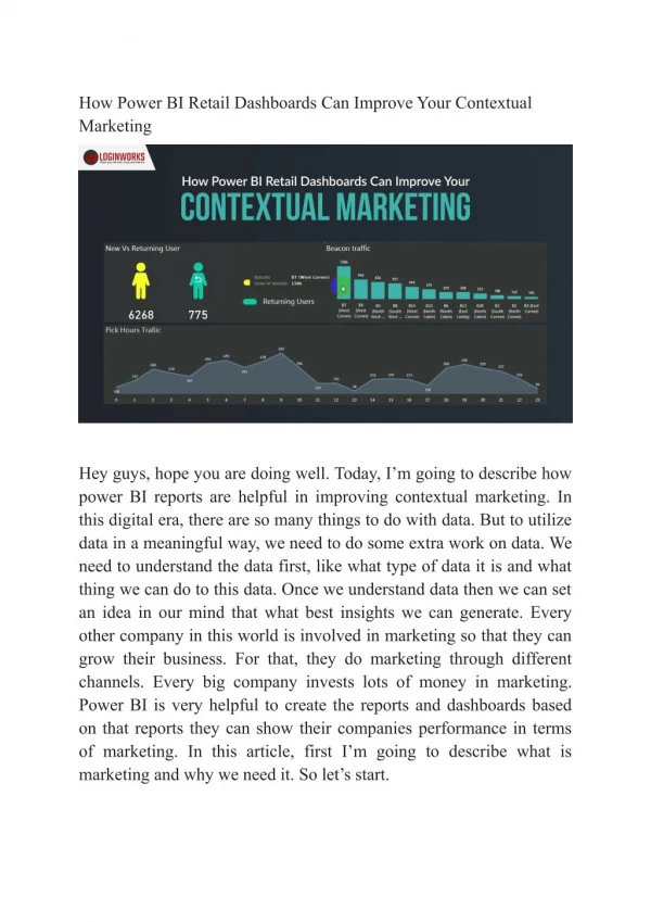
Power BI dashboards are visual canvases that tell a story through visualizations. You can create a dashboard using any report with edit permissions. A top-level executive might use a Power BI dashboard to analyze the profitability of the organization. Digital Marketers use it to understand the effectiveness of their marketing campaigns. Key Performance Indicators (KPIs) KPIs allow business leaders to track the progress toward a defined objective, whether it is sales revenue or lead conversion rates. They also help to dismantle potential data siloes by making metrics more actionable and measurable for various departments. A Power BI dashboard can display a variety of different types of visuals that make it easier to identify and analyze key performance indicators. Some examples of these include gauges, scorecards, and line charts. The most important element in creating a Power BI dashboard is selecting the right type of data to be displayed. The metric should be easy to understand and can help the user achieve organizational goals. There are three requirements for a KPI visual: a base context, a target concept, and a current value or status. The actual context is represented by a color indication, with a marker such as poor (red), need improvement (yellow), satisfactory (green) or good (dark green). It is possible to create dual KPI visuals that show two KPIs side by side. These are dynamic, displaying new values and information as they are hovered over. Visualizations A dashboard is a single-page visualization of insights from multiple reports and datasets. It offers a consolidated view of important metrics and helps you develop data-backed strategies. Visualizations are a key aspect of Power BI dashboards. They can range from simple cards to a matrix, and are displayed on a canvas grid. The size of a visual depends on the level of detail it presents. For example, a visual that compares numerous data categories should be larger than a visual that only displays a single number.
A Waterfall Chart can be used to track the progression of a value over time. It is a great way to see a trend and identify opportunities for future growth. A stacked area chart is an extension of the basic area chart that allows you to visually compare several data categories. This type of visual can also help you determine a part-to-whole relationship. For example, a stacked area chart can be used to show the sales performance of regions compared to the overall revenue. Data Sources A dashboard is a single page that tells a story through visualizations. While reports use multiple data tables, dashboards only have one. Power BI dashboards are used by organizations in various domains to analyze their data. A Sales Manager can use the tool to understand his team’s performance, a Top-Level Executive can visualize the profitability of their organization, and a Digital Marketer can analyze the efficacy of their social media campaigns. The source of your dashboard is the data set from which it gets its information. This can be an Excel file, a URL to an external service (e.g., Facebook), or a data warehouse. Power BI connects to the data sources with its connector, which is part of the underlying data set. Whenever the data in the data set changes, Power BI automatically refreshes all of the reports and visualizations associated with it. Moreover, Hevo has a scalable infrastructure that automatically detects the schema of the incoming data & maps it to the destination schema. Try Hevo now with our 14-Day Free Trial! Sharing Power BI allows you to share your dashboards and reports with others. You can share them with people inside your organization, as well as with external users. You can also embed your dashboards and reports in existing workplace tools like Slack, Teams, or Sharepoint. This is a great way to ensure that your data is visible to your employees, and can help cut through the clutter of other digital communications they receive on a daily basis. You can share a single report or dashboard by selecting the'share' button and entering an email address or group of addresses. You can also set permissions for those with whom you want to share
the content. Once you've shared a dashboard or report, you can also use the'share to web' button to make it available on your organization's website. However, this only works if you have an internet connection. The web version of a dashboard won't refresh automatically, so you'll need to manually update the data in your datasets. Conclusion: In conclusion, Power BI Dashboards are undeniably powerful visual canvases that excel in telling data-driven stories. Throughout this blog, we have explored the numerous benefits and features that make Power BI Dashboards a go-to tool for businesses and individuals seeking to gain valuable insights from their data. Firstly, we highlighted the user-friendly nature of Power BI Dashboards, which allows even non-technical users to create stunning and interactive visualizations effortlessly. With its drag- and-drop functionality and intuitive interface, Power BI empowers users to transform raw data into compelling narratives without the need for extensive training. Additionally, we discussed the versatility of Power BI Dashboards, which can consolidate data from various sources, including spreadsheets, databases, and cloud-based services. This feature enables users to get a holistic view of their data and facilitates data-driven decision-making across all levels of an organization. Furthermore, the blog emphasized the real-time capabilities of Power BI Dashboards, making it an ideal solution for monitoring key performance indicators (KPIs) and tracking business metrics on the fly. The ability to access up-to-date information empowers organizations to respond swiftly to changing market trends and make data-backed adjustments to their strategies. Another critical aspect covered was the option to embed Power BI Dashboards seamlessly into other applications or websites, expanding their reach and making data insights accessible to a broader audience. This level of integration enhances collaboration and communication, fostering a data-driven culture within organizations.
Lastly, we highlighted how Total eBiz Solutions offers top-notch application development services, including expertise in Power BI Dashboard development. As a reputable partner, Total eBiz Solutions can provide tailor-made solutions to meet the specific needs of clients, ensuring a seamless integration of Power BI Dashboards into their business workflows. In conclusion, Power BI Dashboards not only provide visually appealing representations of data but also serve as compelling storytellers, presenting crucial insights that drive better decision- making and business growth. With Total eBiz Solutions' application development services, businesses can unlock the full potential of Power BI Dashboards and embark on a data-driven journey that leads to success in the dynamic and competitive modern landscape. So, if you are ready to harness the power of data, reach out to Total eBiz Solutions today and take your data visualization and analytics to new heights.