Download
1 / 9
90 likes | 91 Views
You're probably familiar with the feeling. You're scrolling through an e-commerce site, looking for that one perfect thing. But then you see it. The add to cart button. And it's ugly. Or maybe it's not ugly, but it doesn't fit with the rest of the design. Perhaps it's the wrong color, or in an inconvenient place. Whatever the case may be, bad buttons can lose you sales and damage your credibility as a business

E N D
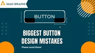
BUTTON 2X Please avoid these!
There are pretty clear rules, and we see designers break them day after day without any consequences. They are making mistakes. Button design may seem easy for you. However, it isn't. Let's clear these up →
Don't make the button too high or too low. 6px 6px Button 32px Button The perfect vertical padding value that many professionals use is 18 px. Button 65px 65px
Don't make the button too high or too low. 4px Button 4px Button 32px The perfect vertical padding value that many professionals use is 18 px. Button 32px
Don't make them too fancy. Button It is okay if you make nice buttons, but you shouldn't put so many effects on them. Just make it nice and simple.
Inconsistency through buttons. Primary Primary Avoid inconsistent button shapes because they can confuse the user. Secondary Secondary Teritary Teritary
Don't lack hierarchy. You need hierarchy. Hierarchy is one of the most important design principles, and that's why we have to apply it to buttons too.
Phone +91 7279000065 Address 3rd Floor, Sarv Elanza, Hanumangarh Road,Abohar -152116 Contact Us Website themadbrains.com E-Mail themadbrainsinfo@gmail.com
Thank You themadbrains.com