Understanding Pearson's Correlation Coefficient: Strength and Implications of Relationships
This guide explores the concept of Pearson's correlation coefficient (r), a numerical measure of the strength of the linear relationship between two quantitative variables. It explains how to interpret the correlation coefficient, with values ranging from -1 (perfect negative) to +1 (perfect positive). The importance of standardized values, the influence of outliers, and distinctions between explanatory and response variables are discussed. The guide also includes practical homework exercises using R for visualizing and analyzing data relationships through scatterplots and regression lines.

Understanding Pearson's Correlation Coefficient: Strength and Implications of Relationships
E N D
Presentation Transcript
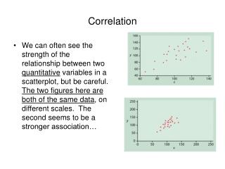
Correlation • We can often see the strength of the relationship between two quantitative variables in a scatterplot, but be careful. The two figures here are both of the same data, on different scales. The second seems to be a stronger association…
Here’s a formula for Pearson’s correlation coefficient: • This formula is not for computing r but for understanding r. Notice that the first step in this formula involves standardizing each x and y value and then multiplying the two standardized values (how many s.d.s above or below the means the x’s and y’s are...) together. • When two variables x and y are positively associated their standardized values tend to be both positive or both negative (think of height and weight) so the product is positive. • When two variables are negatively associated then if x for example is above the mean, the y tends to be below the mean (and vice versa) so the product is negative.
The correlation coefficient, r, is a numerical measure of the strength of the linear relationship between two quantitative variables. • It is always a number between -1 and +1. Positive r positive association Negative r negative association • r=+1 implies a perfect positive relationship; points falling exactly on a straight line with positive slope • r=-1 implies a perfect negative relationship; points falling exactly on a straight line with negative slope • r~0 implies a very weak linear relationship
Correlation makes no distinction between explanatory & response variables – doesn’t matter which is which… • Both variables must be quantitative • r uses standardized values of the observations, so changing scales of one or the other or both of the variables doesn’t affect the value of r. • r measures the strength of the linear relationship between the two variables. It does not measure the strength of non-linear or curvilinear relationships, no matter how strong the relationship is… • r is not resistant to outliers – be careful about using r in the presence of outliers on either variable
To explore how extreme outlying observations influence r, see the applet on Correlation and Regression at whfreeman.com/ips6e . • Homework: • Reading 2.1 • Use R to scatterplot, add different characters for a "lurking variable", compute correlation coefficient, compute slope and intercept of the regression line, plot regression line on the scatterplot (see next page for some code to do all this…) • HW: On page 16 of Reading & Problems 2.1, do problems # 4.3, 4.7, 4.9 using R. Also, look at the UN data on GDP and CO2 emissions: plot, correlate, regress… DESCRIBE/EXPLAIN WHAT YOU FIND!
plot(x,y) # gives a scatterplot of y (vertical) on #x (horizontal) To add a different plotting #character, use the pch= option as in plot(x,y,pch=15) #(or try different numbers) #or plot(x,y,pch="x") # or plot(x,y,pch=as.numeric(sex)) plot(x,y,pch=15,cex=1.5) #cex=1.5 makes the plotting #characters 1.5 times as big as default characters cor(x,y) #gives the Pearson correlation coefficient # denoted by r between x and y lm(y~x) #gives the least squares linear regression # of y on x abline(lm(y~x)) #draws the regression line on a #scatterplot (that's already drawn) summary(lm(y~x)) # shows more detail about the #slope and intercept.