Download
1 / 28
280 likes | 425 Views
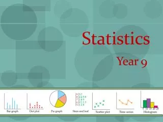
Interpreting Graphs. Statistics. Scattergraphs & Codes. Stem and Leaf Diagram. Drawing Graphs. Mean, Median, Mode and Range of a Data Set. Line of best fit. Constructing Frequency Tables (Tally Tables). Range Mode & Median from Frequency Table. Mean from a Frequency Table.

E N D
Interpreting Graphs. Statistics Scattergraphs & Codes Stem and Leaf Diagram Drawing Graphs Mean, Median, Mode and Range of a Data Set Line of best fit Constructing Frequency Tables (Tally Tables) Range Mode & Median from Frequency Table Mean from a Frequency Table
Interpreting Graphs Learning Intention Success Criteria • To explain how to interpret various graphs. • 1. Understand key information on various graphs. • 2. Solve problems involving graphs.
What does 1 computer represent You have 1 minute to come up with a question Interpreting Graphs
Interpreting Graphs General Created by Mr.Lafferty Maths Dept
Drawing Pie Charts In a survey, 300 people were asked to indicate which one of five sports they liked best. Using the graph calculate the number people who liked each sport. Football Rugby Total 300 90o 108o 36o 54o 72o Squash Cricket Ice Hockey Favourite Sport Rugby 75 Football 90 Cricket 45 Ice Hockey 60 Squash 30
Constructing Graphs Learning Intention Success Criteria • Understand how to construct various graphs from given information. • 1. To construct various graphs accurately.
Bar Graphs A survey of S1 pupils asked what their favourite pet was. The results are shown below Lets construct a Bar graph for the following table Remember graph has to be labelled and neat !
What labels should we use for the Bar Chart Title, Scale, Labels and Units where appropriate Favourite Pets 12 10 8 Number of Pupils 6 4 2 0 Cat Dog Rabbit Hamster Snake Pets
Line graphs Line graphs are most often used to show trends over time. If the temperature in Aberdeen, in ºC, over a 12-hour period is plotted, the line graph shows the temperature trend.
103 102 101 100 99 98 97 6:00 am 7:00 am 8:00 am 9:00 am 10:00 am 11:00 am 101 102 102 101 100.5 101 Temp C Constructing a Line Graph A hospital nurse recorded a patient’s temperature every hour Temperature versus Time TemperatureF Time Hours
Different Averages Learning Intention Success Criteria • To define the terms Mean Median, Mode and Range for a set of data. • 1. Know the terms Mean, Median, Mode and Range. • 2. Work out values of Mean, Median, Mode and Range.
Mean (Average) Find the mean of the set of data 1, 1, 1, 1, 2, 3, 26 Can you see that this is not the most suitable of averages since five out of the six numbers are all below the mean of 5
Different Averages An average should indicate a “measure of central tendency” but should also indicate what the distribution of data looks like. This is why we have 3 different types of averages to consider • The Mean • The Median (put the data in order then find the MIDDLE value) • 3. The Mode (the number that appears the most) For the above data the Median or Mode is a better average = 1
Different Averages Example : Find the mean, median, mode and range for the set of data. Range = Highest number – Lowest Number 10, 2, 14, 1, 14, 7
Aims of the Lesson 1. Understand the term Frequency Table. 2. Construct a Frequency Table. 3. Interpret information from Frequency Tables.
represents a tally of 5 llll Frequency tables Raw data can often appear untidy and difficult to understand. Organising such data into frequency tablescan make it much easier to make sense of (interpret) the data. Sum of Tally is the Frequency
58 56 59 57 60 56 62 62 58 56 58 59 56 59 56 59 57 58 60 62 61 58 59 62 60 58 60 59 56 59 60 61 56 60 62 59 61 58 60 61 62 58 57 62 59 61 58 60 Frequency tables Example1. A tomato grower ideally wants his tomatoes to have diameters of 60mm, but a diameter ranging from 58mm to 62mm will be acceptable. Organise the diameters given below into a frequency table. Lowest number 56 Highest number 62
58 56 59 57 60 56 62 60 58 60 58 59 57 59 56 59 57 58 60 59 61 58 59 62 60 58 60 59 59 60 59 61 59 60 62 59 61 58 60 61 59 58 57 62 59 61 58 60 Frequency tables X X X X X X l l l l l l
X X X X X X X X X X X X X X X X X X X X X X X X X X X X X X X X X X X X X X X X X X X X X X X X lll llll llll 58 56 59 57 60 56 62 60 58 60 58 59 lll 57 59 56 59 57 58 60 59 61 58 59 62 60 58 60 59 59 60 59 61 59 60 62 59 61 58 60 61 59 58 57 62 59 61 58 60 llll llll llll llll llll llll llll Frequency tables 3 4 9 13 10 5 4
Frequency Tables Range, Mode & Median Learning Intention Success Criteria • Understand how to work out the range, mode and median from a frequency table. • 1. To explain how to work out the range , mode & median from a frequency table. • 2. Solve problems using a frequency Table.
Frequency Tables Range, Mode & Median Reminder ! Range : The difference between highest and Lowest values. It is a measure of spread. Median : The middle value of a set of data. When they are two middle values the median is half way between them. Mode : The value that occurs the most in a set of data. Can be more than one value.
Different Averages Example : Find the median and mode for the set of data. 10, 2, 14, 1, 14, 7
Range Mode & Median from Frequency Table Mode value that occurs the most = 0 High – Low = 6 – 0 = 6 20 + 17 = 37 20 + 17 + 15 = 52 Here are the results of a sports survey carried out among university students. General 6 Range = 0 Mode = Median harder to calculate 20 + 17 + 15 + 10 + 9 + 3 + 2 = 76 Middle value of 76 is 38 38 lies in here Median = 2
Range Mode & Median from Frequency Table Mode value that occurs the most = 5 High – Low = 7 – 1 = 6 25 + 29 = 54 25 + 29 + 20 = 74 Here are the results of a S3 maths exam survey carried out among St. Ninian’s High School students. 6 Range = 5 Mode = Median harder to calculate 25 + 29 + 20 + 20 + 31 + 10 + 5 = 140 Middle value of 130 is 70 70 lies in here Median = 3
Frequency Tables Working Out the Mean Learning Intention Success Criteria • Add a third column to a frequency table. • 1. To explain how to work out the mean by adding in a third column to a Frequency Table. • 2. Work out the mean from a frequency Table. Created by Mr. Lafferty Maths Dept.
Frequency Tables Working Out the Mean Example : This table shows the number of coins in the pockets of some children. f x C Adding a third column to this table will help us find the total number of coins and the ‘Mean’. 1 5 5 x 1 =5 2 5 5 x 2 = 10 3 1 1 x 3 = 3 4 3 3 x 4 = 12 5 2 2 x 5 = 10 Totals 16 40
Frequency Tables Working Out the Mean Example : This table shows the number of brothers and sisters of pupils in an S2 class. S x f Adding a third column to this table will help us find the total number of siblings and the ‘Mean’. 0 9 0 x 9 =0 1 13 1 x 13 = 13 2 6 2 x 6 = 12 3 1 3 x 1 = 3 5 1 5 x 1 = 5 33 Totals 30