Download
1 / 32
320 likes | 442 Views
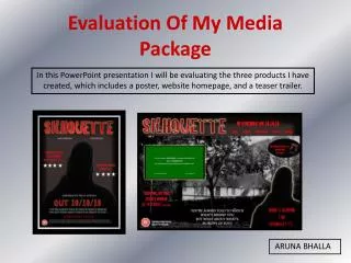
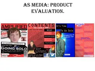
Evaluation for my media product. Question One.. . In what ways does your media product use, develop or challenge the conventions of real media products. .

E N D
Question One.. In what ways does your media product use, develop or challenge the conventions of real media products.
The Eyebrow- This is conventionally put above the masthead which Vibe follow, it is used to explain key artists or features that will appear during the magazine. The Masthead- Conventionally Vibes masthead is positioned at the top of the product and as a banner. The masthead is placed underneath the central image. Conventionally R+B and Hip Hop magazines have big bold masthead as it represents the type of music. The Typography- Conventionally they use more than one font however they do not have as much variety in their font types as a rock magazine would have. The button- These is used if the publisher would like them to draw attention to a particular feature. The Main Image- The main image conventionally looks into the eyes of the camera which draws the audience in as they are looking straight at them. The main image is layered over the masthead to add a almost 3D effect which would attract more viewers. The way in which she is posed is often conventional for this type of magazine as women are presented in a sexual way to attract a male audience. The Main Cover Line- The size of this is much bigger than the over cover lines in order to allow the audience to identify what the main feature is. The Barcode- All magazines have a barcode. For vibe they are conventionally placed in the bottom left hand corner. The Cover lines- Vibe have used 4 different cover lines, using four different colours, usually Vibe only really used 2-3 different colours however this front cover has used more than this. This highlights the conventions of most magazines front covers however the way in which they are used are different for every genre of magazine.
The eyebrow- I used an eyebrow which follows the conventions of vibe magazine, I wanted to use this as It gives the audience a idea of what else they will be seeing in the magazine The masthead- Just like Vibe magazine my mast head is bold in block colour. I wanted to make this simple because I feel that if I used a more complex masthead that it would take the attention away from the main image. The main image- My main image follows how magazines conventionally use their main images. The main image looks directly into the camera which makes it look like they are looking directly at the audience which attracts more people The cover lines- I have used 6 cover line including the main cover line which follows the conventions of Vibe magazine. Magazine colours- Vibe use a variety of different colours on their front cover I chose to use two colours as I think that this makes my cover more sophisticated which goes with my genre of music. I also wanted to use quite unisex colours as my magazine is directed at males and females. Main cover line- My main cover line is place over my main image, I think this is quite unconventional because vibe often place the cover line to the side of their main image however I have made my main cover line bigger than the rest of the cover lines which is a convention I have followed which vibe magazine also do. The barcode- I chose to place my barcode on the bottom of the right side of my magazine because I thought with my layout of cover lines and main image the barcode looked best in this place, this contrasts vibe magazine as they conventionally put the barcode on the bottom of the left hand side.
Does my Magazine Front page develop or challenge the conventions of a real Magazine Front page DEVELOP? I think that my masthead develops the convention of Vibe magazine. I wanted to create my masthead like Vibe’s as I felt that it was eye catching as it is very bold. I feel that my masthead developed this convention as I made my masthead extremely bold however still simple. I think that this best represents the type genre of magazine which my magazine is portraying. CHALLENGE? I think that the way in which I placed my cover lines challenged the conventions of vibe magazine because I used my main cover line over my main image because I wanted it to be obvious that the picture was related to the main cover line.
Header- This is used to add an identity to the page. Main Image- Vibe conventionally only use one image for their contents page compared to magazines such as NME who use at least four images on their contents page. This image is also for one of the main articles in the magazines. Page numbers- Every magazine uses pages numbers as this allows the audience to navigate their way through the magazine. Main features- Vibe conventionally show all their main articles on their contents page which contrasts other magazine such as NME who show the main article in bold surrounded by the other articles. Vital Information- This bit of information explains who the photographer or stylist is and also shows where the models clothing is from.
Header- I used a header to use as a identification to my contents page. Main image- I followed the convention of using only one image on my contents page witch vibe also use. I did this because I did not want my contents page to be too busy because it wouldn’t link in with my house style. Page number- I used page numbers as a way for my readers to navigate through my magazine Vital information- just like vibe magazine I added in some information which would allow the audience to know where the clothing is from. Main features- I put my main articles on the left hand side which is a convention which I took from vibe magazine, however I used less information under each of my features where as Vibe use quite a lot of copy under each of their features.
Does my Magazine contents page develop or challenge the conventions of a real Magazine contents page DEVELOP? I developed Vibes convention of putting the features on the left hand side. I wanted develop this as I thought it looked quite sophisticated . I developed this by making the page numbers in a bigger font than the rest of the copy and I think that this was a good feature as it allows the audience to easily navigate their way through the magazine. CHALLENGE? The use of the title of my page- ‘CONTENTS’ is challenging the conventions of Vibe magazine because they do not identify their page as the contents page . I didn’t want to directly copy Vibes codes and conventions so I wanted to add a title to my contents page.
Main image- The main image is conventionally linked to the article Headline- vibe conventionally add a title to their page in order to give the page an identity. Byline- the byline tells us who wrote the magazine. Header Gutter- this is the margins of the page, each magazine have a different size gutter to their magazine. Stand first- this gives the article a introduction. Copy- the copy is conventionally placed in three margins
Main image- I decided to use an image on the left hand side which follows the convention of Vibe magazine. My image is unconventionally looking down. This is unconventional as images conventionally look the audience directly in the eye in order to attract the audience. I chose to do this because it is quite a glamorous pose which will attract both male and females. Stand first- my stand first is writing in a similar style as vibe magazines is. I wanted my stand first to be interesting so that the audience would be interested in the article. Header- vibe also use a header. Headline- My headline is in a similar layout as vibe magazine however I made my bigger and bolder. Drop cap I used a second image on my double page spread which challenges the convention of vibe magazine as they only use one image on their double page spread. I did this because when I did my audience research I found that they liked more images on the articles. Columns- I followed the conventions of vibe magazine, and the sizing of their columns. Pull quotes- I used pull quotes in my magazine because I felt that they added character to the page and also allowed the audience to get an idea of the what the article will be like before they actually read it. Gutter-I followed the same sizing of the gutter as vibe magazine in order to follow their codes and conventions.
Does my Magazine Front page develop or challenge the conventions of a real Magazine Front page DEVELOP? I used the same type of layout as Vibe for my magazine however I did develop it slightly. I added an extra image because I wanted it to be more eye catching I also made the stand first above the first to columns of writing because I felt that for my magazine this layout look much better. CHALLENGE? Vibes double page spread did not use any pull quotes which I used. I feel that these added more interest in the article. As when readers are scanning through magazine they can easily read the pull quote which allows them to get a quick idea of what the article will consists of.
Question Two… How does your media product represent particular social groups?
Representation in the media. What does representation mean in terms of the media.. Representation is how the producer presents their media in a way that does not match reality in order to attract their target audience. Identity is an R+B/ Hip hop magazine which combines English and American artists. My target Audience would be 16-22 years old from the United Kingdom and Americans which has a focus on students. It is a unisex magazine. Reader profile: Jasmine is 19 years old and goes to University where she is studying English literature and Journalism. She is currently living in halls where she has met and made friends with a wide range of different people. She shares a common interest with her friends, and that is their interest in music. Her male and female friends love to discuss the latest songs from their favourite artists from the Hip hop and R+B industry. Jasmine is interested in all the latest technology and owns a iphone. Jasmine is highly influenced by this genre in music, and looks up to her favourite artists Beyonce and Alicia Keys.
What representations do your photographs construct Due to the fact that my model did not look exactly like Alicia Keys I needed to use Mise-en-scene in order to make my model appear similar to Alicia Keys I styled the models hair this way because it looks sleek and glamorous which most girls aspire to look like. In reality not everyone looks like this however girls mainly are attracted to this because they feel they have to look like this as well. This would also attract a male audience because they would be attracted to the model. Body Language- The model has her hand of her hip which gives off the idea that she is in charge and that no one can tell her what to do. This also implies that she has her own ‘Identity’ Clothing- This models dress is quite elegant, which would give the audience a perception of her as being quite mature. I think that girls look up to Alicia Keys and aspire to be like her.
What representations does your textual content construct My article opens with this paragraph, I used language that would entice the audience in so that they would want to continue on reading. When I conducted my audience research I found that they liked a mixture of formal and informal language. I developed this by using a tone of language which is a mixture of informal and formal language so that it can relate to my target audience. This pull quote shows that the writing isn't a biased article and that my opinion comes out into the article. My target audience can relate to this as they would not be afraid to express their opinions. This quotation express a criticism of the album which would make the audience want to read on to see what else is said.
What representations does your design construct? I chose to use the masthead ‘IDENTITY’ because I felt that it was a strong label for my magazine. I thought it would be relatable for my target audience because when your aged 16-21 you are growing up and beginning to find out your ‘identity’ hence why I chose this as my masthead. I also thought that it would be quite catchy and a name that people will remember I used the rule of thirds on my front cover design. My front cover is quite simple because I think that this represents the genre of music. My cover lines were advertising articles from both male and female artists because I did not want it to be of just one gender considering I wanted my magazine to be a unisex magazine. I used the colour scheme of red and black because I found from my audience research that they were popular colours for both boys and girls, and I felt that as my magazine is a unisex magazine I would like it to attract to both genders.
Question Three… What kind of media institution might distribute your product and why
IPC Listen to me speaking about my choice of media institution in detail Visit their website at- http://www.ipcmedia.com/ As it says on their website- ‘IPC Media is the UK's leading consumer magazine and digital publisher’. IPC are published by Time Warner which is a global company which attracts a mass audience. I think that ‘IDENTITY’ would fit in well with using IPC as their publisher because I think that there is a gap in their market as they do not have withstanding magazine like mine. IPC also publish magazines such as NME and UNCUT.
Question Four… Who would be the audience for your media product?
Meet my target audience.. My magazine is intended for males and females of the ages 16-22 in the UK and America. I do also believe that my magazine can also appeal to a older audience perhaps up to the age of 30 because I believe that my magazine is quite sophisticated which could attract a wider audience. What would they look like? My target audience are likely to shop in high street shops such as Topshop, Topman, River Island, and Zara. These popular high street shops sell fashionable clothing which appeals to my target audience as they like to stay on trend.
What are my audiences aspirations? Identity’s audience are likely to be in some kind of education whether it is high school, college, or university, Identity’s audience all have the motivation to achieve to their fullest potential. Some of Identity’s readers could potentially be interested in music and would like to follow a career within the music industry and read Identity magazine as a way to follow their favourite artists who are influencing them towards their dreams. Due to the fact that a majority of my readers will be in education this leaves a gap for advertisements which will appeal to them and benefit them such as student discount and information about UCAS.
Question Five… How did you attract/address your audience?
How did I attract and address my audience? As Identity is a unisex magazine I wanted the image to appeal to both males and females. I think the image portrays a sophisticated feel to it which would appeal to the female target audience as most women are portrayed in the media in a sexualised way. This image thus still represents this however a more sophisticated way is. Males would be attracting to her glamorous nature. Her outfit is simple however it still looks expensive and accentuates the models body. Address… Attract… I used Alicia keys throughout my magazine because I think my audience would be able to relate to her. She is seen as an inspirational artist. I used a female artist on my front cover which would attract both males and females because females see her as being a glamorous inspirational artists where as males would be physically attracted to the front cover. I used artist such as Chris Brown, Beyonce, Rhianna and Drake on my front page as cover lines because they have a wide support amongst my target audience.
Question Six… What have you learnt about technologies from the process of constructing this product?
WORDPRESS USING WORPRESS.. I used Wordpress.com to produce my blog. This is an extremely easy to use media tool which allows anybody to create their own blog. You can choose your own url for example when I created my blog, my url is rebeccaasmedia.wordpress.com this means that anybody is able to access my blog and view its contents. To allow the blog to be easily accessible I created different categories within a menu such as ‘Home’ and ‘Preliminary Product.’ Once I had practice with creating a new blog post and exploring my blog I found it extremely easy to use and didn’t come across any major issues during the process.
ADOBE PHOTOSHOP USING PHOTOSHOP… I used Photoshop to edit my images which I took in my photo shoot. I found this a quick and easy task and once I explored Photoshop and worked out which each tool did it was quite a quick simple task. This graphic editor is used by a vast amount of people including magazine editors. It is used to enhance and retouch images in a way to make them more appealing. This is a example of how I edited my photographs in Photoshop.
ADOBE INDESIGN USING INDESIGN… Indesign is a good programme for layout design, I used this to create my final magazine product. I had no experience in using Indesign so this was a challenge for me to apply myself to learn what each of the tools do and how to do different tasks. I found this quite difficult however throughout the project I began to get more and more used to the programme and now I would say that I am familiar with what each tool does. I also found it difficult to complete my product because I did not have the programme installed at home to so I had to complete all of the production on my magazine at college. On Indesign I learnt how to create a layout play, how to make different masthead designs and how to place my edited images into the layout. I think that once I got a hang of using Indesign it was a useful programme and was good for creating my final product.
EQUIPMENT FOR MY PHOTOSHOOT < For my photo shoot I used the colleges cameras.. I used a Nikon DSLR camera. I found that this camera took extremely good photographs, and due to also being a photography student I found taking the photographs quite easy as I already have skills in photography. ^ I used the studio at college to take my photographs and in there they had hot lights which were on the ceiling. Using these lights made my pictures of much higher quality as it made the picture look much brighter than without them. f < I used a tripod to balance the camera on so that there would be no shake when I was taking the pictures, this would make my pictures extremely detail and focused.
EXTRA TECHNOLOGY To create my evaluation of my media product I used Microsoft PowerPoint . This soft wear is easy to use and allows you to make a high quality slideshow. I used the social networking site- Facebook as a way of organising an appropriate time to met for my photo shoot to take my photographs with my model
Question Seven… Looking back at your preliminary task, what do you feel you have learnt in the progression from it to the full product?
What skills have I learnt/developed? I have learnt and develop skills in using different design programmes... Throughout making magazine I have learnt a lot about working on Indesign. Considering I had never used this programme at the start of the course I believe that I have picked up and learnt new skills in this programme. I have also developed my skills using Photoshop. I have learnt how to edit Photographs and make them more appealing. I have developed my skills of working within a group.. At the beginning of my coursework, we were working within a group discussing our initial ideas for our magazines. This allowed me to work with others, discussing how to overcome issues and voicing our opinions.
Manipulation in the media Whilst completing my media coursework I have found that products in the media are heavily manipulated by their producers. Pictures are heavily edited into what young people nowadays think is the way that they should look when in reality they look nothing like their edited photographs. Representation in the media creates thoughts in peoples heads of what they believe is the way to be because they are constantly bombarded with these manipulated photographs.