Download
1 / 17
170 likes | 237 Views
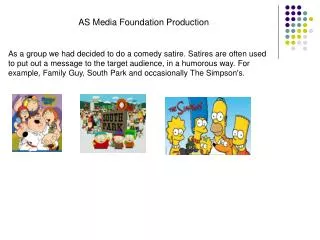
Foundation Production. Magazine Analysis. Cameras and computer programmes.

E N D
Foundation Production Magazine Analysis
Cameras and computer programmes • I took all my photos on a 8.00 megapixel Samsung camera which gave me high quality colours and zoom ability therefore I was confident in the camera to capture the exact pose and facial expression I wanted for each photo. • Paint shop pro was effective for me as I could edit both my photos and Title fonts with professional quality and experiment with its different techniques and features however the amount of programs that were available was slightly over whelming as there was ironically too much choice and this may have affected me sticking with a certain effect as I knew there was more. • I used Microsoft publisher to create and edit my magazine which I felt allowed me to move and change items such as text boxes ,photos and fonts regularly . The use of publisher gave my final magazine a professional look to it as I was able to manipulate and edit every tiny detail in order to arrive at the image I wanted to convey to my audience.
Photo pose analysis I chose the pose with the smashed up guitar to represent the cliché “ smashing into music” with the connotations of Rebel and rock star. However the actual pose contrasts this as she appears to be quite calm and mellow – showing the two sides of her and of her album e.g – slow ballads and up beat party songs
Photo editing analysis I chose to manipulate the photo and edit it to black and white/ Grayscale as I wanted to portray a more edgy and high fashion image. Having the image in colour I felt would make it look more common and I wanted it to present itself as unique and individual much like the artist.
Titles Analysis This ‘ghost graffiti’ style font was immediately effective in communicating that street urban fresh vibe I wanted to reflect however I felt with the pink back ground there would always have to be ink wasted so I swapped the colours. The white and purple was effective in the sense it was very space age and unique however I did not feel it was strong enough to represent the whole magazine. The rough looking font and the splattered paint look I found very edgy and young and I felt it represents everything the magazine stands for
Outfit Analysis The rolling stones t shirt represents a type of ‘rebel’ image that I wanted to convey about ‘ Jesse luck’ to my audience The high top ‘boyish’ trainers were chosen because it goes against the traditional female conventions of what women wear on magazine front covers and it represents her breaking the mould and barriers in the music industry.
Analysis Of different Drafts First Draft Second Draft I chose to make the exclusive a bigger font as I wanted the audience to give their main focus to the artist I want to highlight the main other features in this issue but also use the pink to reflect back to the pink title The First draft did not highlight the featured artist as much as i would have wanted therefore on the second draft I used red to highlight the artist which will be important to my pop culture obsessed audience
Front Cover Analysis The pink Graffiti style title font I think represents all that juice magazine stands for as it is bright bold and youthful. I chose to use and exclamation mark instead of ‘I’ because it brings a certain of urgency to the front cover The price of £1.50 for the magazine I arrived at after researching prices for other magazines in shops and whether they were sold weekly or monthly , the price is relatively cheap for the amount of information given per magazine therefore I felt it should be included in a large font on the front cover I chose red as it brings out the red of the rolling stones logo on her t-shirt and also it is the only red on the title page therefore really making her name stand out. If a reader is not fully engaged by the featured artist then there will be a list of all the other artist and most relevant articles inside the magazine. The magazine website will be at the bottom of every issue as my target audience will be up to date with latest technology therefore I realise that internet will soon takeover the website will feature news and articles and videos and be updated regularly
Contents Page Analysis The pink page number in the right hand corner of the main pictures highlights that these pictures are the main features of this weeks issues, it is also a quick reference for readers if they are simply flicking through the magazine on the way to school or in front of the T.V which is intentionally how my audience will experience the magazine. The Slogan your music fix makes the magazine personal to each reader as they feel it is their first source for music news and features, the word fix could refer to the how some young people have a fix with drugs or smoking but this magazine is a way for teenagers to have a positive fix with music The list of articles down the right hand sign of the page is in the font of ‘ Joker man’ which I feel is effective as it is simple much like the magazine yet a unique layout The ‘Exclusive’ box across the photo of Jesse Luck immediately shows that she is the featured artist. The colours yellow and black signify danger and danger taping and will alert the audience her music is exciting and powerful.
Semiology • Before starting my magazine I researched my target audience (14-18) and the type of artist they are listening to at the moment ( Ke$ha,Lady ,Gaga , Black Eyed Peas) I chose to include this picture because it comes across as edgy and dark, the 3 band members are facing the camera but are not smiling reflecting a type of rebel and unconventional attitude. I chose not to edit the photo to much as I felt the raw grittiness of it was what made it appeal to me and my target audience. The boy is sitting on the end and not in the middle again representing how the band is unconventional and unique. I chose this photo for the front cover because firstly the colours stand out to me and are bright reds, purples and yellows and I feel they send a positive message to the teenage audience when other media institutions perhaps portray a negative message about them ( News and Newspaper’. The pose could reflected the title ‘ looking to the future’ as she embarks on conquering the world with her music. I selected this photo because it is both conventional and unconventional. The pose which was perhaps made famous by the members of ‘Kiss’ represents a rock and roll attitude yet there is still a fun and young element to it. The black and white editing of the photo I feel gives it a ‘ Kodak moment’ feel to it and slightly more high fashion and edgy.
Artist and the Audience • The solo artist ‘ Jesse Luck’ was chosen for the front cover because she represents youth, success and fun, the band ‘ Youth Endz’ represents a different side to youth with perhaps a more gritty street image • The title Juice represents a fun fresh magazine which will hopefully entice the audience to buy into the product – The use of the colour pink is fun exciting which is contrasted the by the graffiti style font. The target audience ( 14-18) will be interested in pop culture, pop/rock music and anything that’s bursting onto the pop scene • The Title ‘Juice’ for me reflects – energy , excitement ,fun , youth and relevance all of which I want my magazine to communicate
Target Audience Demographics • Usually between ages 14 and 18 • Aimed at both male and female audience therefore the pink title is going against the typical conventions of a magazine aimed at both genders. • Watch shows such as x factor , E4 Music shows capital fm – Pop culture • Followers of fashion what's relevant and ‘in’ at the time • The Magazine was designed to appeal to all ethnicities as race will not be important factor when targeting my specific audience
Double page spread analysis • I chose to have the font for the double page spread as a ‘ransom note’ to go with rebel attitude and breaking the mould (against female conventions ) which I had already portrayed in the ‘ smashing guitar photo shoot’ I chose to include this because for me it portrayed a sort of modern feminist in the sense that she is smashing up the old Britney Spears/Christina Aguilera type pop stars and coming in as something new and fresh.
Double Page spread Analysis • The Language used in my double page spread interview was very colloquial, relaxed and informal. I made a conscience decisions to approach my interview article like this as I was aware that both the artist ‘ Jesse Luck’ and my target audience would be of an age between fourteen and nineteen were they would much rather appreciate a piece of writing in which they fully understand and relate to as oppose to a formal approach where the artist may not reveal as much about herself as they are not as relaxed. If you could collaborate with anyone past or present who would it be Ooh tricky its got to be Michael Jackson – the king of pop, no matter what genre you are he is music royalty Well can you moonwalk? I can try ha-ha I adapted a question from the interview to go with the rhythm and the direction in which it was heading, this reflects the laid back feel to the whole article and therefore puts the artist across in a light that the reader can relate to and appreciate – The celebrity ‘Jesse Luck’ then appears to come across as an everyday girl and reduces my readers obsession with the idea that celebrities are not human.
Double Page spread analysis I chose to have The four photos on each side in order For it to appear much like a movie film/reel as each photo Follows on from the next with the narrative. The whole double page spread themes is sort of black and white/ rebel therefore the photos along the side can also represent police mug shots as ‘ Jesse Luck’ is a rebel of music. The smashing of the guitar idea came from the rock star cliché about how hotel rooms are trashed and guitars are smashed . The artist Jesse Luck is new and creative and therefore the theme of smashing guitars and smashing into music was the perfect match.
On a scale of 1 – 5 please answer the following questions1 being agree strongly and 5 disagree strongly11 people surveyed
Overall • Through the planning ,production and final analysis of ‘Juice Magazine’ I have gained the knowledge that the initial message and image you want to portray must then be shown in every element of my magazine for example the way a photo is edited I:e colour enhanced or black and white can dramatically change the audiences perception of it. The chosen artist must communicate and reflect the type of image you want to portray e.g. non of my images portray smoking because my audience is between the ages of 14 and 18 and may be wrongly influenced and as a magazine it is up to us to make the choice and we have a strong influence over the youth. A magazine takes many drafts to arrive at the final product e.g. I experimented with various font titles before I arrived at my final one that I felt effectively portrayed the message I was trying to put across.