0 likes | 1 Views
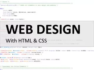
The Best CSS Tutorial is your ultimate guide to mastering Cascading Style Sheets, the backbone of modern web design. This tutorial covers everything from basic syntax and selectors to advanced concepts like Flexbox, Grid, animations, and responsive design. Whether you are a beginner learning the fundamentals or an experienced developer looking to refine your skills, this guide offers practical examples and hands-on projects. With clear explanations, tips, and real-world use cases, youu2019ll learn how to style websites efficiently and beautifully. Elevate your web development journey with CSS and
E N D
Mastering CSS: Your Path to Web Design Excellence Welcome to this comprehensive guide on mastering CSS. Whether you're just starting your web development journey or looking to refine your design skills, this presentation will provide you with the essential knowledge and practical techniques to build stunning and responsive web interfaces. Let's dive into the world of Cascading Style Sheets! https://www.tpointtech.com/css-tutorial +91-9599086977
Introduction What is CSS and Why Does It Matter? CSS, or Cascading Style Sheets, is the language used to style web pages. While HTML provides the structure of your content, CSS brings it to life with colors, fonts, layouts, and animations. Mastering CSS is crucial for any web developer because it directly impacts user experience, brand identity, and website responsiveness across various devices. Without CSS, the web would be a dull, text-only experience. Visual Appeal Responsiveness Brand Identity Transform plain HTML into visually engaging designs. Ensure your website looks great on all devices and screen sizes. Reflect your brand's unique style and personality.
Core Concepts The CSS Box Model: Understanding Layout The CSS Box Model is fundamental to understanding how elements are rendered on a web page. Every HTML element is essentially a box, composed of content, padding, border, and margin. Grasping these components is key to controlling spacing and alignment in your designs. Content The actual text or images inside. Padding Space between content and border. Border Edge around the padding and content. Margin Outer space around the border. Content Padding The actual text or image within the element. Space between the content and the border. Border Margin A line that goes around the padding and content. Space outside the border, separating elements from each other.
Styling Fundamentals Selectors, Properties, and Values CSS syntax is straightforward: you select an HTML element, then apply properties with specific values to style it. This card explores the different types of selectors, common properties, and how values influence your design. 1 2 3 Selectors Properties Values Target specific HTML elements. Examples: h1 (element), .my-class (class), #my-id (ID). Attributes you want to change. Examples: color, font-size, background-color. The specific setting for a property. Examples: red, 16px, #F0F0F0. Understanding how these three components work together is the foundation for writing effective CSS rules and achieving your desired visual outcome.
Advanced Layouts Flexbox and Grid: Modern Layout Techniques Gone are the days of floats and complex positioning for layout. Flexbox and CSS Grid are two powerful modules that have revolutionized how developers create complex, responsive layouts with ease and efficiency. Flexbox (Flexible Box Layout) CSS Grid Layout Ideal for one-dimensional layouts (either a row or a column). It allows elements within a container to align and distribute space automatically, making responsive design much simpler for navigation bars, forms, and content sections. Perfect for two-dimensional layouts (rows and columns simultaneously). Grid allows you to define a grid structure and place elements within it, making it excellent for full-page layouts, dashboards, and complex content areas that require precise control.
Enhancing User Experience Transitions, Transforms, and Animations Add life and interactivity to your web pages with CSS transitions, transforms, and animations. These features provide smooth visual feedback and create a more dynamic and engaging user experience, making your websites feel modern and polished. Transforms Manipulate the shape, size, and position of elements in 2D or 3D space (e.g., scale, rotate, translate). Transitions Smooth changes from one CSS state to another, often on hover or focus. Animations Create complex, multi-step visual effects controlled by keyframes for richer user interaction. Timing Functions Control the speed curve of an animation, like 'ease-in-out' or 'linear'. Keyframes Define specific points in an animation timeline for precise control.
Best Practices Writing Clean, Maintainable CSS As your projects grow, so does your CSS codebase. Adhering to best practices ensures your styles are organized, scalable, and easy for you and others to understand and maintain. • Use Semantic Class Names: Choose names that describe the purpose, not just the appearance (e.g., .main-navigation instead of .red-menu). • Modularize Your CSS: Break down your stylesheets into smaller, manageable files based on components or features. • Comment Your Code: Explain complex sections or non-obvious choices to improve readability. • Follow a Naming Convention: Adopt methodologies like BEM (Block, Element, Modifier) or OOCSS (Object-Oriented CSS) for consistency. • Optimize for Performance: Minify CSS, avoid overly complex selectors, and use shorthand properties where possible. • Prioritize Accessibility: Ensure your designs are usable by everyone, including those with disabilities, by considering color contrast, font sizes, and focus states.
Key Takeaways & Next Steps 01 02 Foundational Knowledge Modern Layouts Master the Box Model, selectors, properties, and values to build a strong CSS base. Embrace Flexbox and CSS Grid for efficient and powerful responsive designs. 03 04 Dynamic Interactions Clean Code Principles Utilize transitions, transforms, and animations to create engaging user experiences. Write maintainable, scalable, and accessible CSS for long-term project health. Continue practicing, building projects, and exploring new CSS features. The world of web design is constantly evolving, and continuous learning is key to staying at the forefront. Happy coding!