Download
1 / 14
140 likes | 201 Views
Evaluation. By Sam Young 12CAA. In what ways does my media product use, develop or challenge the forms and conventions of real media products?.

E N D
Evaluation By Sam Young 12CAA
In what ways does my media product use, develop or challenge the forms and conventions of real media products? Through research I have tried to keep the layout of my magazine very simple and established. Due to this I have kept to the contemporary versions of a typical jazz magazine, this is due to my target audience. I have done his so I respect not only the music industry but also so I keep to what my target audience and genre of music expects. Because I feel that challenging this form of style would hinder not only my magazine but also not reflect the message that I'm trying to portray.
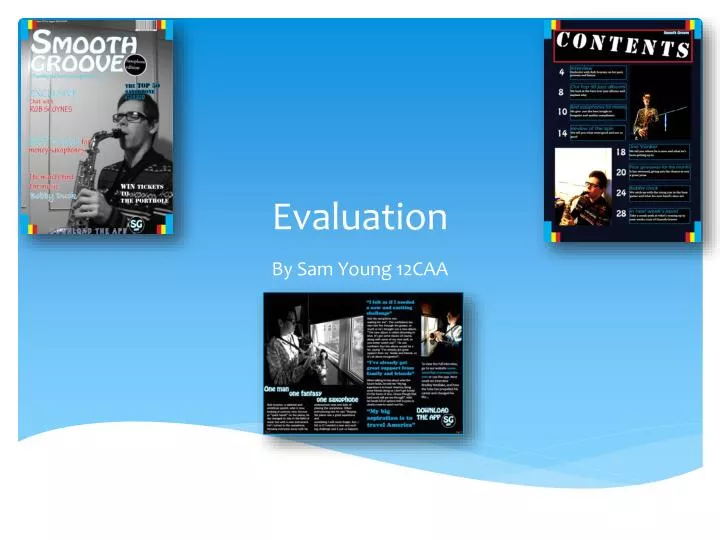
Front page- Title The title of my magazine is Smooth Groove. I have chosen this name as I feel that it reflects many of the meanings and ideas that my magazine has. The name portrays a chilled out and slightly jazzy feel as jazz is typically known to be a calm and casual form of music. The assonance of “Smooth Groove” again shows the calm attitude of my magazine as it has the feeling of a fluid magazine.
Cover- Colours The main colours I used were light blue, red, white and black. These colours I felt worked by making the target audience more varied whilst making sure the magazine look professional. The mixture of colours also makes the front cover look more appealing as it does stand-out, especially for a jazz magazine which could imply that my magazine has challenged the conventions of a jazz magazine.
Cover: Image(s) I have only used 1 image. This is because I wanted the readers attention to span past the images and look more about what the magazine actually consists of. I have used bright colours to do this. The image is in black and white as I feel that it gives a classy touch to the image whilst making it look retro. The image also contrasts to the bright colours, this is because I wanted to imply that the old fashioned ways of jazz have become intertwined through my magazine.
Fonts I used a variety of fonts on my cover to ensure that the front cover is not too boring and repetitive. So for the title I used Hobo STD because I really liked the font and I felt that it was modern and smooth due to the rounded edges of the text, henceforth that is why it works with the title! I also used Tekton Pro because it looked professional whilst not looking too boring and not interesting. Another font I used was Stencil STD because it looks very bold and dominating, it also works well with colours on the outside of letters.
Graphics I haven't used any graphics as I felt it did not suit my target audience and my genre of music, jazz
Language The language on my front cover is very standard English. I do not use any slang nor technical language as such. I did however abbreviate application to “app” but I don’t think that will completely influence my target audience nor my genre of music
Contents- Purpose To make it link with the front cover I have carried a few ideas over. One of them is that the coloured bars are the same as the ones on my front cover, along with the same colours being used. I also used most of the same fonts to again carry the theme that this magazine, although it is a jazz magazine, doesn’t want to be taken too seriously.
DPS I have made sure that the page is able to be split in the middle correctly, due to this I have sectioned the text and images in different areas in order for it to suit my DPS. I have linked the 2 pages by having one of the text boxes continuing to the top of the next page. My main text is in white on a black background, the font is Maiandra GD size 14. The text I think is professional yet interesting, which is the type of theme I have tried to carry throughout my magazine. The layout has the main text boxes, two images, and 3 separate text boxes. One image is large in the top left of the page whereas the other image is smaller in the right hand corner. The separate text boxes have key quotes from the interview, I have copied this from many other magazines as it can grab interest into the interview if people aren't interested.
How does your media product represent particular social groups? I have tried to make sure that the social groups of the magazine are varied. This is because it can help with a more wide range of buyers and a different age range of brand recognition. However I would say my magazine is aimed at males due to the style of music and the photos which are all photos of males. The magazine does not criticise or highlight any particular social group due to the style of music. Because jazz is known for not being rebellious, it could be argued that jazz made a rise for a merge of black and white singers. Because jazz was mainly introduced in the 60’s when segregation was at its peak in America.
What kind of media institution might distribute your media product and why? My media magazine is quite safe due to the genre of music. Because of this the magazine isn’t particularly expressive due to me wanting to keep the original philosophy of most jazz magazines (slide 1). However I do advertise the app on my front page so the magazine is in that aspect a digital one. The price of the magazine I believe is fair and is around about the average to most media magazines and in particular jazz magazines.
How did you attract/address your audience? I tried to use appropriate language such as standard English in order for my audience to clearly understand what they are reading. I also had appropriate side stories and correct content. The colours I have used are also not too overpowering as I didn’t want the magazine to come across looking domineering or in any way loud.
What have you learnt about technologies from the process of constructing this product? I have learnt a lot from InDesign as prefer it much more that Photoshop. I think it is much easier with text and easier to envisage what I wanted my magazine to look like. I did adapt my images on Photoshop as I learned through the process how to change the lighting and more specifically make an image go into black and white which is what my front cover image is. On InDesign I learnt how to change the font and change some small parts of it to make it look more like of what I wanted it to look like, e.g. spacing between letters.