Download
1 / 1
10 likes | 105 Views
Dive into age-specific fertility rates and the evolution of fertility curves across European cohorts. Discover how Western and Eastern countries differ in embracing new fertility patterns.

E N D
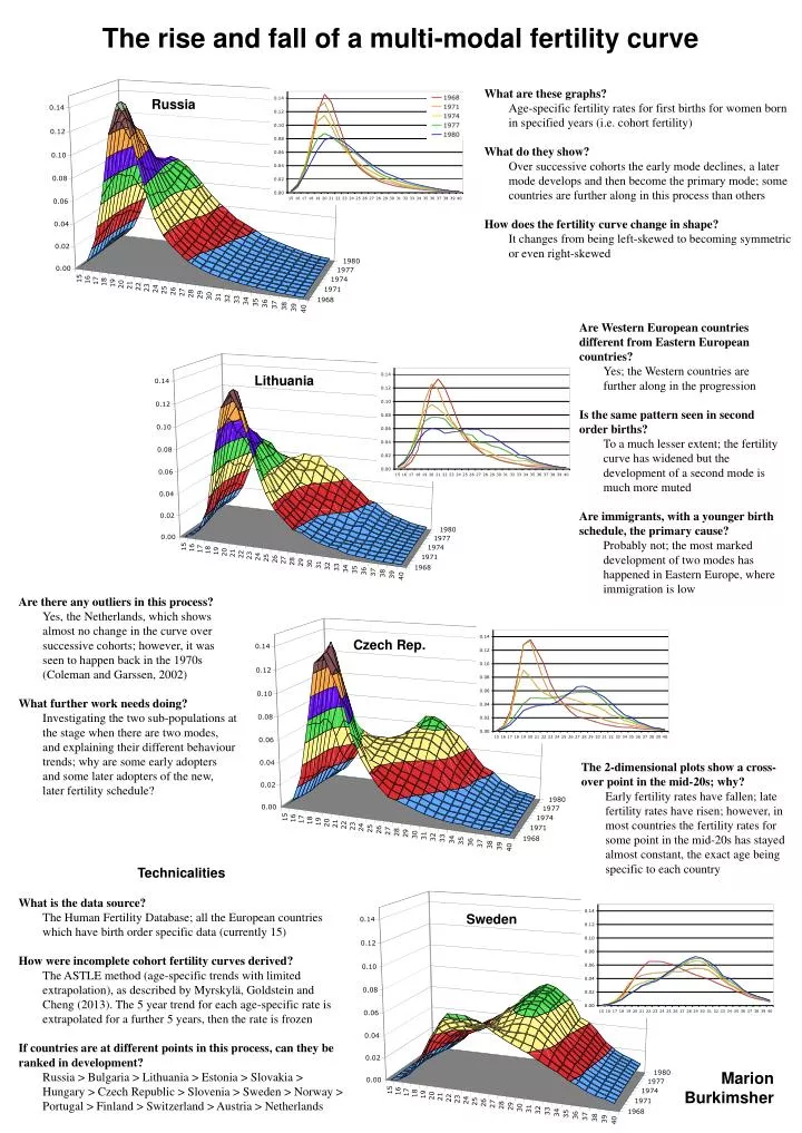
The rise and fall of a multi-modal fertility curve • What are these graphs? • Age-specific fertility rates for first births for women born in specified years (i.e. cohort fertility) • What do they show? • Over successive cohorts the early mode declines, a later mode develops and then become the primary mode; some countries are further along in this process than others • How does the fertility curve change in shape? • It changes from being left-skewed to becoming symmetric or even right-skewed Russia • Are Western European countries different from Eastern European countries? • Yes; the Western countries are further along in the progression • Is the same pattern seen in second order births? • To a much lesser extent; the fertility curve has widened but the development of a second mode is much more muted • Are immigrants, with a younger birth schedule, the primary cause? • Probably not; the most marked development of two modes has happened in Eastern Europe, where immigration is low Lithuania • Are there any outliers in this process? • Yes, the Netherlands, which shows almost no change in the curve over successive cohorts; however, it was seen to happen back in the 1970s (Coleman and Garssen, 2002) • What further work needs doing? • Investigating the two sub-populations at the stage when there are two modes, and explaining their different behaviour trends; why are some early adopters and some later adopters of the new, later fertility schedule? Czech Rep. • The 2-dimensional plots show a cross-over point in the mid-20s; why? • Early fertility rates have fallen; late fertility rates have risen; however, in most countries the fertility rates for some point in the mid-20s has stayed almost constant, the exact age being specific to each country • Technicalities • What is the data source? • The Human Fertility Database; all the European countries which have birth order specific data (currently 15) • How were incomplete cohort fertility curves derived? • The ASTLE method (age-specific trends with limited extrapolation), as described by Myrskylä, Goldstein and Cheng (2013). The 5 year trend for each age-specific rate is extrapolated for a further 5 years, then the rate is frozen • If countries are at different points in this process, can they be ranked in development? • Russia > Bulgaria > Lithuania > Estonia > Slovakia > Hungary > Czech Republic > Slovenia > Sweden > Norway > Portugal > Finland > Switzerland > Austria > Netherlands Sweden Marion Burkimsher