Download
1 / 1
10 likes | 22 Views
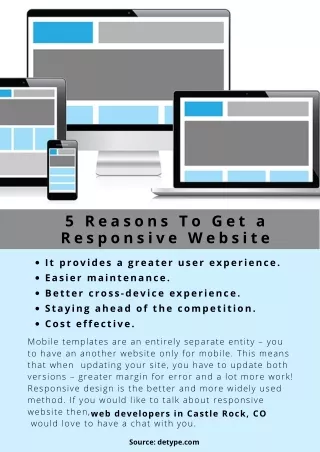
One of Googleu2019s aims is to offer an improved user experience for all users searching for information on their mobile devices. Think of the last incident when you tried accessing a site on your phone, where you tried clicking on a certain navigation button but ended up pressing the wrong one. Then you had to press the back button and again try to click on the correct link, simply because the website was not mobile or user-friendly.<br><br>Responsive website design provides an easy-to-go-through user experience across a wide range of platforms, irrespective of whether you browse from your tablet or sm

E N D
5 Steps to Create a Great Responsive Website One of Google’s aims is to offer an improved user experience for all users searching for information on their mobile devices. Think of the last incident when you tried accessing a site on your phone, where you tried clicking on a certain navigation button but ended up pressing the wrong one. Then you had to press the back button and again try to click on the correct link, simply because the website was not mobile or user-friendly. Responsive website design provides an easy-to-go-through user experience across a wide range of platforms, irrespective of whether you browse from your tablet or smartphone, laptop, or PC. It has evolved from the idea that users use varied screens to view their content, which must automatically respond to fit their screen sizes. Like the brakes or steering wheel of a car, your business website needs to be responsive. So, how do you go about it? Here is a quick look at the top 5 steps for building a responsive website successfully: Decide Elements for Small Screens Focus on Your Content Use a Fluid Grid A “Mobile-First” Approach Navigation is Prime