1 / 10
100 likes | 125 Views
Metricfox has been providing digital marketing services and Web Design solution in USA and have served a large customer base. We have catered both the large and small level organizations and have successfully enhanced their online presence. We excel at custom web applications, Salesforce Development, magento Development, Block chain Development and much more.

E N D
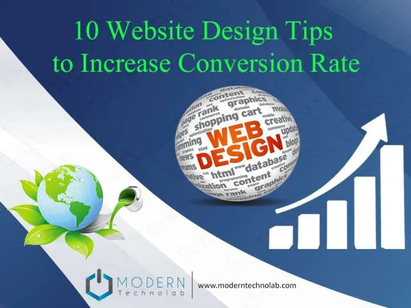
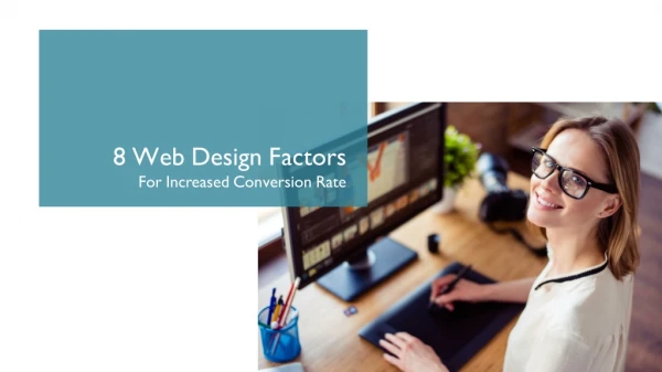
8 Web Design Factors For Increased Conversion Rate
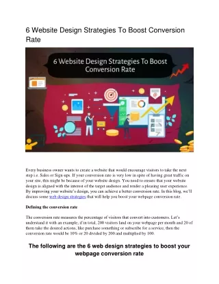
Website Design Matters • Most of the people correlate conversion with SEO and Lead generation only! • But Intelligent marketers know that Web Design can drive some real conversion • People read or interact more with something that looks attractive • According to a survey 50% people say website design makes them feel credibility of the brand • We’ll share 8 web design principles that will boost your conversion rate.
Hicks Law • CRUX • Lesser Choices cause lesser Distraction and lesser Distraction creates More Conversion • Points To remember • Limit the number of choices on your website through web Design • By limiting the number of choices users have, You can boost conversions • Cut short the choices in the Navigation Bar • Tweaks • Navigation bar or scroll down, essential choice for people • Headlines can be skimmed to see which blog post to read • Sharing your post on social media and options for commenting • Choices between purchasing, product reviews, or browsing
Rule Of Thirds • Crux • The rule of thirds can be applied to the web design as four middle intersections are strategic places of interest. • Points to remember • Call to action buttons on intersection • Navigation Bar never on Intersection • All four intersections should have the most important things • Tweaks • Call to actions button on the left bottom intersection is preferred by many websites • Try to keep your visitors focused on the intersections • Take a screenshot of the page of your website and compare it to the rule of thirds
8-Second Rule • Crux • You have just mere 8 seconds to get your visitors attention • Points to remember • Large, benefit-driven headline in brief • Eye-catching imagery that conveys the main point • Draws the attention towards your main call to action • Make signup buttons large, simple and clear • Tweaks • Power words to make your copy more engaging • Include multimedia such as video, audio, or other interactive content • Hover effects on your buttons • Use animated exit-popups to re-engage visitors who lost interest
Gestalt Similarity Principle • Crux • Keep interrelated things together • Points to remember • Human brain can process things better if they are related • Club interrelated sections and bars • When clubbed together, even the imperfection can create leads • Tweaks • Related headline, description, and opt-in button together • Testimonial boxes, conversion buttons, or images together • Using negative space effectively for correlation
Use Negative SPACE • CRUX • Use negative space effectively. Use this empty space to create a design which is more appealing. • Points to remember • Negative space between Header and sidebar can be used properly • Use space between paragraphs • Use space between line and texts • Tweaks • The smaller font needs more space between letters • Break up large texts into smaller paragraphs • Add white space between the larger elements on your site • smaller fonts need more generous line-heights
F Pattern • Crux • Visitors browse the website in a F Pattern • Points to remember • People first look from left to right • People scan the page downwards, making small forays into the content • Visibility at the bottom is minimum • Tweaks • Place those headlines down the left-hand side of the page • Less important information can go in the sidebar on the right-hand side of your page • Place the information that you want to get the lowest visibility in the lower right-hand corner of the page
Respect users’ Patience • CRUX • Page loading speed should be optimum and users should not be made to wait • Points To remember • People surfing the web are impatient • Seconds delay can result in 7% reduction in conversion • Use Page loading Tools for cross checking • Page Loading Tools
Color • CRUX • Color can play a very important role in usability as well as convey the overall meaning of a brand • Points to remember • Different color combinations can create different emotions and reactions • Color scheme for your website should be a combination that evokes the emotion that you want your brand to convey • One way to do this is by curating a Pinterest board • Tweaks • Call to action buttons should be noticeable and vibrant • Highlight should be in a color that stands out from the rest of your site • There should be Stark contrast to all the highlights from rest of the page.