Download

1 / 16
0 likes | 33 Views
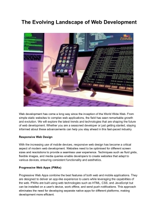
The digital landscape is continually evolving, and as more users access the web via a multitude of devices, responsive web design has become a fundamental aspect of modern web development. In this comprehensive guide, we will explore the world of responsive web designs, delving into its Responsive Web Designs origins, core principles, impact on user experience, and best practices for creating websites that adapt seamlessly to the diverse screens and devices used by today's audience.<br>

E N D
Welcome To Introduction | SEO Expate BD Ltd. The digital landscape is continually evolving, and as more users access the web via a multitude of devices, responsive web design has become a fundamental aspect of modern web development. In this comprehensive guide, we will explore the world of responsive web designs, delving into its Responsive Web Designs origins, core principles, impact on user experience, and best practices for creating websites that adapt seamlessly to the diverse screens and devices used by today's audience. Table of Contents: The Evolution of Web Design What is Responsive Web Design? The Principles of Responsive Web Design Mobile-First Design: A Shift in Perspective The Impact of Responsive Web Design on User Experience Key Components of Responsive Web Design Best Practices for Responsive Web Design The Role of Media Queries Testing and Debugging Responsive Designs Common Challenges and How to Overcome Them The Future of Responsive Web Design Conclusion The Evolution of Web Design
The journey of web design has seen several transformations over the years, shaped by advancements in technology and changing user preferences. Understanding this evolution provides a context for the emergence of responsive web design. Static Web Pages: In the early days of the internet, web pages were static and primarily designed for desktop computers. Designers had limited tools and techniques to create layouts that remained consistent across different browsers. Table-Based Layouts: In the late 1990s and early 2000s, tables were commonly used to structure web pages. While this approach improved layout control, it was still primarily desktop-focused. The Era of CSS: The introduction of Cascading Style Sheets (CSS) marked a significant step in web design. CSS allowed designers to separate content from presentation, making it easier to create consistent designs. The Advent of Mobile Devices: The proliferation of mobile devices, such as smartphones and tablets, presented new challenges for web designers. Websites built for desktops did not translate well to smaller screens, leading to a fragmented user experience. Responsive Web Design Emerges: As the use of mobile devices skyrocketed, web designers recognized the need for a solution that would make websites adapt gracefully to different screen sizes and orientations. This led to the birth of responsive web design.
What is Responsive Web Design? Responsive web design is an approach to web development that focuses on creating websites and web applications capable of adapting to various screen sizes and devices. The primary goal is to provide a consistent and user-friendly experience, regardless of whether the user is on a desktop computer, a tablet, a smartphone, or any other device with internet access. Key Principles of Responsive Web Design: Fluid Grid Systems: Instead of fixed-width layouts, responsive web designs employ fluid grid systems that allow elements to resize proportionally to the screen width. This ensures that the layout maintains its integrity and usability on different devices.
Flexible Images: Images within responsive designs are flexible, adapting in size and resolution to fit the available space without distortion. This prevents images from overflowing or being too small on various screens. Media Queries: Media queries are used to apply different styles and layouts based on the characteristics of the user's device, such as screen width, height, orientation, and resolution. Progressive Enhancement: Responsive web design follows the principle of progressive enhancement, starting with a solid foundation for basic functionality and adding more advanced features for larger screens and devices. The Principles of Responsive Web Design To create a successful responsive web design, it's essential to adhere to a set of key principles that guide the development process:Mobile-First: A mobile-first approach involves designing for the smallest screens first and then progressively enhancing the design for larger screens. This ensures that the core content and functionality are optimized for mobile users, who may have limited bandwidth and touch-based navigation. Flexible Layouts: Flexible grid systems, based on relative units such as percentages or ems, allow for the automatic adjustment of layout elements to fit different screen sizes. This flexible foundation is the backbone of responsive design.
Relative Sizing: Font sizes, margins, padding, and other design elements are specified in relative units like percentages and ems to ensure that they adapt to the user's preferred text size and screen dimensions. Media Queries: Media queries, written in CSS, are used to apply different styles based on the characteristics of the user's device. For example, specific styles can be defined for screens with a maximum width of 768 pixels to cater to tablet users. Fluid Images: Images are sized using relative units, ensuring that they adapt to the screen width. Additionally, the max-width property is often applied to prevent images from exceeding their container width. Touch-Friendly Navigation: Responsive web designs prioritize touch- friendly navigation elements, ensuring that users on mobile devices can easily interact with menus and other interface elements. Mobile-First Design: A Shift in Perspective One of the fundamental shifts brought about by responsive web design is the move toward a mobile-first design approach. Mobile-first design involves designing and building websites with mobile users as the primary focus. Here's why this perspective shift is essential: Performance Optimization: Mobile-first design encourages a focus on performance optimization, including smaller file sizes and efficient coding, which benefits users on all devices.
Content Prioritization: A mobile-first approach forces designers to prioritize content and features, resulting in a lean and user-focused design that can be progressively enhanced for larger screens. Adaptability: Starting with a mobile design allows for greater adaptability to various screen sizes and orientations, as the design must be flexible and accommodating from the beginning. Reduced Friction: Mobile-first design minimizes the need for users to zoom, scroll excessively, or manipulate the screen to access content or interact with the site. The Impact of Responsive Web Design on User Experience Responsive web design has had a profound impact on user experience (UX). The benefits it brings to UX include: Consistency: Users experience a consistent look and feel across all devices, which enhances brand identity and recognition. Improved Accessibility: Responsive designs often lead to improved accessibility for users with disabilities, as content adapts more effectively to assistive technologies and different user preferences. Reduced Bounce Rates: Responsive websites tend to have lower bounce rates on mobile devices because users can access the content they need without frustration.
Higher Conversions: Improved UX on smaller screens can lead to higher conversion rates on e-commerce websites, as users find it easier to complete purchases and form submissions. Enhanced SEO: Search engines reward mobile-friendly and responsive websites with higher rankings, which results in increased visibility and traffic. Optimized Performance: Responsive designs encourage performance optimization, ensuring that websites load quickly and provide a smooth user experience, even on slower mobile connections. Key Components of Responsive Web Design
A responsive web design encompasses several key components that work together to create a flexible and user-friendly experience across different devices: Fluid Grid System: The grid system is the foundation of a responsive layout. It uses relative units (such as percentages) to define column widths and element spacing, allowing the layout to adapt to different screen sizes. Media Queries: Media queries are CSS rules that apply styles based on specific conditions, like screen width or height. They enable designers to create different layouts and styling for various device characteristics. Flexible Images and Media: Images and media are scaled proportionally using CSS to ensure they fit the available space without distortion or excessive use of bandwidth. Mobile-First Approach: Beginning with a mobile-first approach ensures that the core content and functionality are optimized for smaller screens. As the screen size increases, additional features and styling are progressively applied. Touch-Friendly Navigation: Responsive designs prioritize touch-friendly navigation elements like mobile menus and swipe gestures, making navigation intuitive for touchscreen users. Content Prioritization: Content prioritization is a fundamental aspect of responsive design. Designers must identify essential content and features to ensure they are accessible and prominent, even on small screens.
Best Practices for Responsive Web Design To create effective responsive web designs, it's essential to follow best practices that have emerged over the years: Prioritize Performance: Optimize website performance by minimizing file sizes, reducing server requests, and leveraging techniques like lazy loading for images and other assets. Use Mobile-First CSS: Begin with a mobile-first stylesheet that contains essential styles for small screens. As the screen size increases, apply additional styles to enhance the design. Implement Responsive Images: Utilize responsive image techniques, such as the srcset attribute and the <picture> element, to deliver appropriately sized images based on the user's device and viewport size. Test on Real Devices: Test your responsive design on actual devices to ensure that it functions as intended and looks great on various screen sizes and orientations. Optimize Typography: Choose a legible font and use relative units for font sizes to ensure that text remains readable across different devices. Avoid Intrusive Pop-ups: Avoid using intrusive pop-ups or interstitials that negatively impact the user experience on mobile devices.
Compress and Minify Resources: Compress and minify CSS and JavaScript files to reduce page load times, benefiting both mobile and desktop users. Plan for Offline Access: Consider implementing service workers and caching strategies to allow users to access content even when they are offline or have a poor internet connection. The Role of Media Queries Media queries are a fundamental component of responsive web design, allowing designers to apply different styles based on the characteristics of the user's device. Media queries use specific conditions, such as screen width, height, orientation, and resolution, to determine which styles should be applied. Here's a brief overview of media queries:Syntax: Media queries are written in CSS using the @media rule. They typically begin with a media type (e.g., screen or print) and are followed by one or more conditions enclosed in parentheses. Conditions: Conditions are expressions that evaluate to true or false based on the user's device characteristics. For example, max-width: 768px specifies a condition that matches screens with a maximum width of 768 pixels. Multiple Conditions: Multiple conditions can be combined using logical operators (e.g., and, not, only) to create complex queries. For instance, screen and (max-width: 768px) targets screens with a maximum width of 768 pixels that are in the screen media type.
Applying Styles: Within the media query block, designers can specify styles that should be applied when the conditions are met. These styles can include changes in layout, font sizes, margins, or any other CSS property. Breakpoints: Breakpoints are specific screen widths or device characteristics at which media queries are applied. Designers typically define breakpoints to create a responsive layout at various screen sizes. Media queries provide the necessary flexibility to create designs that adapt to different devices, ensuring that the user experience remains consistent and user-friendly. Testing and Debugging Responsive Designs Effective testing and debugging are integral to the responsive web design process. Here are some best practices for testing and ensuring that your responsive design works flawlessly: Cross-Browser Testing: Test your design on various web browsers, both on desktop and mobile devices, to ensure compatibility. Real Device Testing: Use physical devices to test your design on different screen sizes and orientations. This provides a real-world perspective of the user experience. Emulators and Simulators: Utilize emulators and simulators to mimic different devices and screen sizes for testing. Tools like BrowserStack and Responsive Design Mode in web browsers can be helpful.
Browser Developer Tools: Familiarize yourself with the developer tools available in web browsers, which include features for responsive testing, inspecting element behavior, and debugging CSS. Validation Tools: Use validation tools like the W3C Markup Validation Service and the W3C CSS Validation Service to check for HTML and CSS errors that may affect responsiveness. Performance Testing: Assess the performance of your responsive design by using tools like Google PageSpeed Insights or Lighthouse to identify potential optimization opportunities. Debugging Media Queries: Debug media queries by temporarily adding background colors or borders to elements that should respond to the query conditions. This allows you to identify issues and ensure styles are applied as intended. Common Challenges and How to Overcome Them Responsive web design presents its own set of challenges that designers and developers need to address. Here are some common challenges and strategies for overcoming them: Complex Layouts: Complex layouts with multiple columns and rows can be challenging to make responsive. Use flexbox or CSS Grid Layout to create flexible and responsive grid systems.
Image Optimization: Images are one of the primary contributors to page weight. Implement responsive image techniques and compress images to improve load times. Performance on Mobile Networks: Users on mobile networks may experience slower load times. Optimize performance by reducing unnecessary JavaScript, CSS, and other assets. Table Content: Tables are difficult to make responsive. Avoid using tables for layout and instead use semantic HTML elements like <div> and CSS for formatting. Long Forms: Lengthy forms may be overwhelming on mobile screens. Consider breaking forms into smaller sections and using accordion or collapsible elements. Text Legibility: Ensure that text remains legible on smaller screens by using relative font sizes, adequate line spacing, and responsive typography techniques. Buttons and Clickable Areas: Buttons and interactive elements should be appropriately sized for touch targets. Ensure that these elements are easy to tap on small screens. Cross-Browser Compatibility: Test your responsive design across multiple web browsers to address any inconsistencies in rendering.
The Future of Responsive Web Design The future of responsive web design continues to evolve as new technologies and devices enter the digital landscape. Here are some emerging trends and considerations: Responsive Images with AVIF and WebP: New image formats, such as AVIF and WebP, provide better compression and improved image quality. These formats will become more prevalent in responsive designs. Motion Design: Integrating motion design elements, such as animations and transitions, will enhance user engagement and delight on responsive websites. Variable Fonts: Variable fonts, which offer a range of styles within a single font file, will enable more flexibility in responsive typography.
AR and VR Integration: As augmented reality (AR) and virtual reality (VR) technologies advance, responsive web designs will need to adapt to accommodate these immersive experiences. PWA (Progressive Web Apps): PWAs offer a responsive, app-like experience on the web. The adoption of PWAs will continue to grow, providing users with fast and engaging web experiences. Device Agnostic Design: Future designs will be increasingly device agnostic, ensuring that users on various devices, including wearables and smart TVs, have a seamless experience. Voice and AI Integration: Voice interfaces and AI-powered chatbots will become more prevalent in responsive designs, allowing for natural language interactions and personalized experiences. The future of responsive web design is marked by innovation and adaptability, as designers and developers continue to push the boundaries of what is possible in creating user-centric and device-agnostic experiences. Conclusion Responsive web design has transformed the way websites are built and experienced. It has become a necessity in a digital landscape where users access content through a multitude of devices, from smartphones and tablets to desktop computers and beyond. By adhering to the principles of responsive web design, implementing best practices, and addressing common challenges, designers and
developers can create user-friendly, performance-optimized websites that adapt gracefully to the ever-evolving world of digital devices.As the future of web design unfolds, responsive design will remain a cornerstone of creating accessible, user- centered, and adaptable digital experiences. The key to success in web development lies in embracing the evolution of technology and user behavior, and responsive web design is the bridge that ensures that the journey remains smooth for users across all devices. Contact US Website: https://seoexpate.com Email: info@seoexpate.com WhatsApp: +8801758300772 Address: Head Office Shajapur Kagji para, Majhira, Shajahanpur 5801, Bogura, Banlgladesh Thank You