Responsive Web Designs
Welcome To<br> <br>t<br>tAdaptive design<br>In order to ensure high usability across all screen sizes and resolutions, responsive web design (RWD) is a web design strategy. It is how a multi-device web should be designed. We'll explain various methods for mastering it in this article to assist you. HTML is inherently flexible or responsive. The browser will automatically reflow the text to fit the viewport if you construct a web page using simply HTML and no CSS and resize the window.<br>Long lines of text displayed in full screen on a wide monitor might be challenging to read,

Responsive Web Designs
E N D
Presentation Transcript
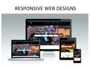
Welcome To Adaptive design In order to ensure high usability across all screen sizes and resolutions, responsive web design (RWD) is a web design strategy. It is how a multi-device web should be designed. We'll explain various methods for mastering it in this article to assist you.HTML is inherently flexible or responsive. The browser will automatically reflow the text to fit the viewport if you construct a web page using simply HTML and no CSS and resize the window. Long lines of text displayed in full screen on a wide monitor might be challenging to read, despite the fact that the default responsive behavior may make it seem like there is no need for a fix. When a user narrows their browser window or visits the site on a mobile device, the site may appear squashed if wide screen line length is lowered with CSS, for as by adding columns or a lot of padding. It also doesn't work to design a non-resizable web page by specifying a fixed width; this results in scroll bars on devices with narrow displays and too much empty space on screens with broad displays. Whether content is seen on a tablet, phone, television, or watch, responsive web design, or RWD, is a design technique that handles the variety of devices and device sizes and enables automated adaptation to the screen. Responsive web design is an approach rather than a distinct technology. The phrase "responsive layout" refers to a group of best practices used to design a layout that can adapt to any device being used to view the information. Ethan Marotta first used the phrase "responsive design" in 2010 to describe the use of fluid grids, fluid graphics, and media queries toAt the time, it was advised to create layouts for
several breakpoints using CSS float and media queries to determine the browser width. Fluid pictures have their max-width property set to 100%, which prevents them from growing wider than their container. While fluid pictures do not exceed their intrinsic size when the column that Responsive Web Designs contains them expands, they do scale down when the column becomes narrower. This allows a picture to scale down to suit its content instead of overflowing it, but it also prevents an image from becoming larger and becoming pixelated if the container becomes broader than the image.Since the publishing of Gillenwater's book and Marcotte's essay, modern CSS layout techniques are inherently responsive, and we have a plethora of capabilities integrated into the web platform. Media requests With the use of media queries, we can perform a number of tests (such as determining whether the user's screen is wider than a specific width or has a specific resolution) and apply CSS selectively to the page in order to design it for the user's needs. For instance, the following media query verifies that the viewport is and that the current web page is being presented as screen media (and not as a printed document). Only if these two conditions are true will the CSS for the. Container selector be applied.Multiple media queries can be added to a stylesheet to modify the entire layout or certain elements of it to best fit different screen sizes. Breakpoints are the points at which a media query is inserted and the layout is modified. When utilizing Media Queries, a common strategy is to make a straightforward single-column style for devices with narrow displays (like mobile phones), check for broader screens, and then implement a multiple- column layout when you're confident you have the screen width to support it. Mobile first design is the practice of creating for mobile devices first. Best practices recommend creating media query breakpoints using relative units rather than absolute sizes of a single device if breakpoints are used. Different methods can be used to define a media's styles.
Responsive design techniques Because responsive webpages are constructed using flexible grids, you don't need to create pixel-perfect layouts to accommodate every device size. Using a flexible grid allows you to modify the design at the point where the content begins to appear unappealing or add a breakpoint. For instance, you may use columns to guarantee that line lengths don't grow unreasonably lengthy as the screen size increases; you can create a breakpoint if a box becomes squeezed with two words on each line as it gets smaller. Multiple-column layout, Flexbox, and Grid are a few layout techniques that are responsive by default. All of them provide you simpler ways to build flexible grids based on the presumption that you're aiming to do so. Multicol With multicol, you can specify a column-count to designate how many columns at most your material should be divided into. The size of these is subsequently determined by the browser; this size will vary depending on the screen size. Adaptive pictures
This scales the media so that their containers are never overfilled. By downloading photos that are larger than necessary, a single huge image can be used and scaled down to fit small devices, wasting bandwidth. Serving pictures that are aimed at the user's viewport and the device's resolution is possible with responsive images by using the element, screw, and sizes attributes. For instance, you may display the same scenario as a square image on mobile but a landscape image on a desktop. The element allows for different sizes to be provided together with "hints" (information describing the screen size and resolution the picture is best suited for), and the browser will select the best image for each device, ensuring that a user will download an image size appropriate for the device. When creating responsive typography, use viewport units Without using media queries to define breakpoints, vw can also be used to provide responsive typography. If you specify your font size with vw, it will always correspond to the width of the viewport because 1vw is equivalent to one percent of the viewport width.The issue with implementing the above is that since the text is constantly correlated to the size of the viewport, the user loses the ability to zoom any text specified using the vow unit. Consequently, you should never set text solely using viewport units. There is a remedy, and it entails the use of calk(). The text will still be zoom able if the vw unit is added to a value specified using a fixed size, such ems or rems. In essence, the vw unit increases that zoomed value by adding:Therefore, rather than setting it up for mobile and then redefining it in the media queries, we only need to specify the font size for the header once. The typeface then gradually gets bigger as the viewport gets bigger.
The Meta tag for viewport This viewport meta element instructs mobile browsers to scale the content to 100% of its intended size and set the viewport width to the device width, displaying it at the mobile-optimized size that you intended. Why is it necessary? Since mobile browsers frequently exaggerate their viewport width. Because most websites weren't mobile-optimized when smartphones first became popular, this meta tag was created. Therefore, the mobile browser would render the page at a width of 980 pixels, set the viewport width to that value, and display the outcome as a zoomed-out version of the desktop layout. Users could pan around the page and zoom in to view the sections they were interested in, but it didn't look well.
You can override a mobile device's default width, such as Apple's width=980px, with the actual width of the device by setting width=device-width. Your responsive design with breakpoints and media queries might not function properly on mobile browsers without it. The user won't see your narrow screen layout if it starts working at 480px viewport width or below but the device is reporting that it is 980px wide. The viewport Meta tag should therefore always be present in the document's header. Summary A website or application that responds to the environment in which it is viewed is said to have a responsive design. It includes many CSS and HTML capabilities and approaches and is now practically the only way we create websites. Take a look at the websites you frequently access on your phone. It is probably rare to discover one that is the desktop version scaled down or where you have to scroll sideways to find stuff. This is as a result of the web moving toward this responsive design methodology.With the aid of the layout techniques you have learned in these
lessons, it has also become much simpler to create responsive designs. Today, web developers have access to a much wider range of tools than they did in the early days of responsive design. Therefore, it is important to verify the age of any items you use. Even while the older tutorials are still helpful, it is far simpler to develop beautiful and practical designs using modern CSS and HTML, regardless of the device a visitor is using to access the website. Contact US Website: https://seoexpate.com/ Email: info@seoexpate.com WhatsApp: +8801758300772 Address: Head Office Shajapur Kagji para, Majhira, Shajahanpur 5801, Bogura, Banlgladesh Thank You