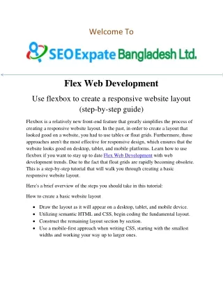
Flex Web Development
Flexbox is a relatively new front-end feature that greatly simplifies the process of creating a responsive website layout. In the past, in order to create a layout that looked good on a website, you had to use tables or float grids. Furthermore, those approaches aren't the most effective for responsive design, which ensures that the website looks good on desktop, tablet, and mobile platforms. Learn how to use flexbox if you want to stay up to date Flex Web Development with web development trends.

Flex Web Development
E N D
Presentation Transcript
Welcome To Flex Web Development Use flexbox to create a responsive website layout (step-by-step guide) Flexbox is a relatively new front-end feature that greatly simplifies the process of creating a responsive website layout. In the past, in order to create a layout that looked good on a website, you had to use tables or float grids. Furthermore, those approaches aren't the most effective for responsive design, which ensures that the website looks good on desktop, tablet, and mobile platforms. Learn how to use flexbox if you want to stay up to date Flex Web Development with web development trends. Due to the fact that float grids are rapidly becoming obsolete. This is a step-by-step tutorial that will walk you through creating a basic responsive website layout. Here's a brief overview of the steps you should take in this tutorial: How to create a basic website layout Draw the layout as it will appear on a desktop, tablet, and mobile device. Utilizing semantic HTML and CSS, begin coding the fundamental layout. Construct the remaining layout section by section. Use a mobile-first approach when writing CSS, starting with the smallest widths and working your way up to larger ones.
As I go, I'll share my thought processes and best practices that I've discovered. Feel good? Now let's get going! Wire framing the design of the webpage Diagrams of every component of your website's organization are called wireframes. They can be very basic and only cover the essentials, or they can be extremely detailed and resemble designs. We’re going to use a very basic wireframe for our purposes here. The website will be divided into its main sections, and we will determine how each will appear on desktop, tablet, and mobile devices. The Header, Hero, Content section, Sidebar, and Footer are the sections that we will be creating.As you can see, every section—including the sidebar—basically stacks atop one another in a single, long column. The simplest method for effectively fitting content onto a small device, such as a mobile phone, is stacking. Attempting to place the sidebar next to the main content would be pointless because phones aren't wide enough to accommodate both. Now, expanding in width, this is how the tablet is laid out:The primary distinction is that the sidebar can now fit next to the main content section because tablets are wider than phones. Additionally, every section fills the tablet's entire width.And this is the desktop arrangement for the largest device: You need to start thinking about
how your desktop website will appear on extremely wide monitors. would be more difficult to read and scan the website content if it were displayed full-width on a large monitor. Imagine if you had to force your eyes to move from the left to the right. It would turn away users and is far too much work.Now that we have a clear idea of how we want the website to look, it's time to get fun and start creating everything in HTML and CSS! Constructing the fundamental forms and structures We will create an HTML element for every wireframe section by working from our created wireframes. As you can see, every wireframe element now has an equivalent element in the HTML. Additionally, I added only basic placeholder text—no actual content. Add the first few CSS properties Now that we have some very basic CSS added, we can start to make this layout look nice! Certain very general styles, such as font styles and border-box settings for box-sizing, are not displayed. But these are the only styles you should be concerned about for the purposes of this article.To make it simpler to locate each element and troubleshoot any odd problems, I like to add borders to my elements. In addition, I added background colors to correspond with our previous wireframe
mockups.Perhaps you've already noticed, but the website resembles the mobile wireframe in almost every way. By default, everything is piled on top of one another. Include a few placeholder sentences It's a good idea to add some placeholder content after creating your HTML elements. By doing this, the website will resemble its final version more closer’s just going to copy and paste some lorem ipsum filler text into each element, so don't get too fancy. Here is an example of what the Hero element contains: You’ll see that I included placeholder text in varying lengths for each element to simulate the appearance of the finished product. Making the CSS mobile-friendly Okay, so we've essentially finished creating the mobile layout! Adding consistent padding to the sides (and top and bottom, if desired) is another way to improve the way a website appears on a mobile device. This merely provides the user with a small amount of breathing room. The content would feel confined if there was no padding and no margin and it would be right up against the screen edge. To maintain readability, you don't want to add too much space. I've added a global padding of 20px in this instance, but you can change it to 10px, 15px, or any other size you think looks best. Now let's add some styles for the tablet view.
Laying out a tablet in two columns The Content and Sidebar elements are arranged side by side in the tablet wireframe, as can be observed. Similar to a mobile device, everything else is stacked vertically. To format the Content and Sidebar into two columns, we must add a few styles. Instead of using CSS grid for this, we'll be using flexbox. The Content and Sidebar elements will first be wrapped in a parent that we will classify as "flex-container by altering our HTML. (Using ellipses to indicate extra markup that isn't very important at this time)We must choose how we want the Sidebar and Content to function in a two-column layout before we can begin writing our CSS. There are several distinct.We will activate flexbox when the device width is 640 pixels or more by using a media query. This means that it will stay stacked on phones with narrower widths. It will change to a flexbox layout when it reaches the 640-pixel threshold. This will guarantee that the Sidebar will always occupy 300 pixels, with the remaining area going to the Content section. On desktop devices, cap the content width The wireframes for the tablet and desktop computers bear a striking resemblance. The content of both is located next to the sidebar. As previously mentioned, the
primary distinction for desktop is to set a max-width for the main content. By doing this, the website will remain readable even on extremely wide monitors.CSS helper classes since we'll probably need these styles for a number of different elements; let's make an easily reusable helper class. We’ll update our CSS with the following new class and related styles:This will center the element on widths greater than 1200px and set its max-width to 1200px (converted into rem units).Since we wish to restrict the width of the Content and Sidebar containers, we will add the wrapper class to the flex-container wrapper in the HTML. To sum up That's it—we created a straightforward responsive layout that works well on desktop, tablet, and mobile devices! You can view a demo of the website here if you'd like to see it in use. Additionally, all of the project's code is available for download on my GitHub page. Note: Gulp and Sass are used in this project. See my Easy Gulp Tutorial here if you need assistance installing Gulp. I’m grateful you read! Please share your thoughts about this tutorial in the comments section below. Contact US Website: https://seoexpate.com Email: info@seoexpate.com WhatsApp: +8801758300772 Address: Head Office Shajapur Kagji para, Majhira, Shajahanpur 5801, Bogura, Banlgladesh