Download
1 / 49
550 likes | 837 Views
Process Control Charts. An Overview. What is Statistical Process Control?. Statistical Process Control (SPC) uses statistical tools to observe the performance of a process in order to predict significant deviations that may result in defectives. SPC Terminology. Common Cause Variation

E N D
Process Control Charts An Overview
What is Statistical Process Control? • Statistical Process Control (SPC) uses statistical tools to observe the performance of a process in order to predict significant deviations that may result in defectives.
SPC Terminology • Common Cause Variation • A natural part of any process, the normal ‘ups and downs’ • Special Cause Variation • Unnatural variation, something out of the ordinary that causes a process to ‘spike’ • Defectives/Exceptions • Failures to meet the upper or lower limits of a process (not always bad)
SPC Terminology • Mean • The average value of the data (x) • Data set = 1,2,3,3,4,4,5,5,5,6,6,8,8,9,9,9,9 • X = 5.65 • Median • The middle of the data (x) • X = 5 • Mode • The most frequent data point • Mode = 9 ~ ~
σ = n - 1 Σ(xn-x)2 SPC Terminology • Standard Deviation: • Key basis for control charts • Simple definition: the mean of the mean (e.g. the average of the averages) • If you’re a math geek, the formula is: where Σ = Sum of X = Individual score M = Mean of all scores N = Sample size (Number of scores
5 4 9 1 3 6 5 8 2 6 9 4 3 8 9 5 9 Mean (x) = 5.65 (M) (1 – 5.65)2+(2 – 5.65)2+(3 – 5.65)2+(3 – 5.65)2… σ = 111.88 n - 1 = = 6.99 = 2.64 Σ(xn-x)2 17 - 1 16 Standard Deviation Data Set Sample Size = 17 (n) σ = 2.64 OK, It’s a lot of boring numbers.What does it mean to me?
Standard Deviation First, we identify the center (mean) of the data: In a normal distribution, most of the data points will cluster around the center.
Standard Deviation Next, let’s look at one standard deviation from the mean: One σ either side of the center accounts for ~65% of the entire dataset.
Standard Deviation Now, let’s look at two standard deviations from the mean: Two σ either side of the center accounts for ~95% of the entire dataset.
Standard Deviation Finally, let’s look at three standard deviations from the mean: Statistically, in a normal distribution 99% of the data will be within three standard deviations from the mean. Data points outside of three standard deviations would be considered ‘outliers’ or ‘exceptions’
Standard Deviation • A normal curve is variable. How wide or narrow the curve is depends upon how loosely or tightly the data is centered around the mean.
Standard Deviation • The size of the standard deviation is based on the spread of the data.
Process Control Chart • Primary tool of SPC is the Control Chart • AKA Process Behavior Chart • Two components • X-bar • S-chart • Reference: • Understanding Variation – The Key to Managing Chaos, by Donald Wheeler • StatGuide - Minitab
Process Control Chart • X-bar vs. s-chart • Both control charts • Have similar components • Measure different aspects of the process • X-bar measures variation from the process center (mean) • S-chart measures variation within the subgroups; e.g. the range or ‘spread’ of the process • First, let’s review the components of a control chart:
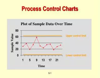
Control Charts – Components This chart demonstrates all of the components generally found in a control chart.
Control Charts – Components Control Limits –Calculated by the process, the Upper (UCL) and Lower (LCL) Control Limits define the upper and lower boundaries of the process. As long as the process remains between the UCL and LCL, it is generally considered ‘in control,’ with only normal variation. Also known as “natural process limits.”
3σ 3σ Control Charts – Components Control Limits –The UCL and LCL are each three standard deviations from the Center Line.
Control Charts – Components Center Line –Calculated by the process. On the x-bar, the Center Line defines the process mean (x). In other words, this is the process center. On the s-chart, the Center Line defines the average standard deviation of the subgroups. In other words, the process range, or spread.
Each of these points represent the mean for the specific subgroup (week). The Center Line is the mean (avg) of the subgroup. An ‘average of the averages.’ x-Bar – Calculating the Center If the process is ‘in control’ all of the subgroup averages should be within 3 σ of the center line (UCL & LCL)
Each of these points represent the standard deviation for the specific subgroup (week). The Center Line is the average standard deviation of the subgroup. S-chart – Calculating the Center If the process is ‘in control’ all of the subgroup σ should be within 3 σ of the center line (UCL & LCL)
Recall that standard deviation is based on a normal curve. On the s-chart, the Center Line is the average σ of all the subgroups. Consider it to be the ‘normal’ distribution for the process. S-chart – Calculating the Center What do we mean when we say the s-chart measures the ‘spread’ of the data?
If the spread – the σ – of an individual subgroup is broader than the average, the data point would be above the center line. If it’s too broad, it may generate an exception above the UCL. If the spread – the σ – of an individual subgroupis narrower than the average, the data point would be below the center line. If it’s too narrow, it may generate an exception below the LCL. S-chart – Calculating the Center What do we mean when we say the s-chart measures the ‘spread’ of the data?
Control Charts – Components Data Labels –Calculated by the process, the labels indicate the data used to calculate the UCL, LCL, and Center Line.
Control Charts – Components Time Axis –A control chart tracks data over time. The x axis of a control chart indicates the time period over which the data has been collected.
Control Charts – Components Data Axis –The y axis of a control chart indicates the frequency of the data being captured. This could be volumes, hours, or any quantitative measure.
Control Charts – Components Tests –There are 8 tests that can be run against a x-bar control chart. For the s-chart, only the first four tests apply.
Control Charts – Components Tests –A test 1 failure identifies a special cause, or outlier, where data exceeds more than three standard deviations from the Center Line; i.e. it falls outside of UCL or LCL. In this case the exception is outside of the upper limit. Test 1 RCA is typically very straightforward, as it can be drilled down to specific data points.
Control Charts – Components Tests –A test 2 failure identifies a special cause where there are nine data points in a row on the same side of the Center Line. Test 2 RCA is typically more complex, as it may mean nothing, or it could be identifying a trend that could be signifying an impending process shift.
Control Charts – Components Tests –Test 3: six points in a row, all increasing or decreasing.Test 4: 14 points in a row, alternating up and down.Note: Only the first 4 tests apply to s-charts. The remaining tests apply only to the x-bar chart.Test 5: two out of three points greater than two standard deviations from the Center Line (same side).Test 6: four out of five points greater than one standard deviation from the Center Line (same side).
Control Charts – Components Tests –Test 7: fifteen points in a row within one standard deviation of the Center Line (either side).Test 8: eight points in a row greater than one standard deviation from the Center Line (either side).
Control Charts – Components Process Shift –When there is a significant change to the process, which affects the UCL, LCL, and Mean (x), a process shift may be inserted and the limits released to recalculate and let the process normalize.
Control Charts – Components Process Shift –The shift will be notated at the top of the chart, with details documented within the associated report. A change to the process may also be documented within the metrics report without an associated shift, depending on the anticipated impact.
Control Charts – Components Process Shift –When a formal shift occurs, the limits are released – unfrozen – and the process runs for a period of time to let the process normalize. Once the process is deemed in control, the limits are frozen. The current status is noted on the control chart in the lower left corner.
Control Charts – Components Specification Limits –An optional component, a specification limit is an arbitrary goal set by management or customers. For example, on this chart there may be a goal set of 50 hours for a Upper Spec Limit, and 30 hours for a Lower Spec Limit.
X-bar vs. s-chart • Identifies outliers based on the variation to the process mean. • Measures the detail; is sensitive to process changes.
X-bar vs. s-chart • S-chart is a high-level view of process performance. • Uses standard deviation to identify variation in the performance of the subgroups. • Each point represents the standard deviation for that subgroup’s dataset. • The Center Line is the average standard deviation for all of the datasets. • Three σ on each side of the Center Line should account for almost the entire range of the subgroup.
X-bar vs. s-chart • S-chart • Remember, σ looks at how the dataset is clustered around the mean. • Ideally, each subgroup should have a consistent spread (range) over each measurement period. • The Center Line on the s-chart is the average σ of all the subgroups on the chart.
X-bar vs. s-chart • One way to look at it: • X-bar chart measures specifics, often allows drilldown to discrete incidents. • Measures the actions of individuals. • A single incident could cause an outlier on the x-bar. • S-chart measures the performance of the group. • Outliers are broader, because in order to generate an exception it has to impact the entire group. • It is not impossible, but it is very unlikely a single incident could generate an exception on the s-chart.
Let’s Look at Examples • Example 1 Both charts are within the normal limits. This process is consistent and can be considered ‘in control.’ Based on what you know about control charts, is there anything to be concerned with here?
Test 1 failures Let’s Look at Examples • Example 2 A test 1 failure identifies a special cause, where data exceeds more than three standard deviations from the Center Line S-chart is ‘in control.’ Based on what you know about control charts, is there anything to be concerned with here?
Investigation • Always look at the s-chart first. • It must be understood and in control before we can interpret the x-bar. • Test Failures: • Test One failure: attempt to identify the data leading to the outlier. • Determine root cause and remediation. • Other test failures often require detailed investigation. • Tests 2-8 do not generate outliers, these tests identify trends or signal a potential out-of-control process.
Investigation • Eliminating data that causes outliers. • We would eliminate any exception that we determine is unusual and out of the ordinary. • Example: • Single outlier caused by a tech ‘fat-fingering’ a time entry may be a potential candidate for elimination • If there are many examples of ‘fat-fingering’ it’s possibly inherent to the process and would not be eliminated.
Test one failure Test one failure Test two failure Let’s Look at Examples • Example 3 Potential test two failure (downward trend) A test 2 failure identifies a special cause where there are nine data points in a row on the same side of the Center Line. Based on what you know about control charts, is there anything to be concerned with here?
Test two failures We have a very low value on one end. Test eight failures Test one failure And a couple very high values on the other end. Let’s Look at Examples • Example 4 The spread (σ) of the data is larger than normal, triggering a test one failure above the UCL. A test 8 failure reflects eight points in a row greater than one standard deviation from the Center Line (either side). Based on what you know about control charts, is there anything to be concerned with here?
Test one failure, below the LCL. Test one failure, above the UCL. Let’s Look at Examples • Example 5 Based on what you know about control charts, is there anything to be concerned with here?
Let’s Look at Examples Root Cause:A single technician incorrectly using the system to enter time for administrative tasks. Demonstrates the sensitivity of using a combination of the x-bar and s-chart. Lots of VERY low numbers. Impacts the x-bar chart because the low numbers reduce the subgroup mean, causing an exception below the LCL. Impacts the s-chart because the low numbers increase the spread of the data, causing an exception above the UCL.
We can’t really investigate or understand these test one failures until we under-stand the test two failures in the s-chart. Test two failures Test three failure Let’s Look at Examples • Example 6 Test three is six points in a row, all increasing or decreasing Based on what you know about control charts, is there anything to be concerned with here?
Let’s Look at Examples • Question • What changed? • Added a newworkgroup, sowe should adda process shift. ? This is the type of test failure that can be a real challenge to investigate. A much deeper investigation will be needed to identify the potential root causes of this trend.