Download
1 / 21
210 likes | 320 Views
CIT 256 Mobile Web Development. Dr. Beryl Hoffman. Mobile User Statistics. Mobile web access predicted to overtake desktop web access! It already has in China and India in 2013 ( http://www.bbc.co.uk/news/technology-18900778 )

E N D
CIT 256Mobile Web Development Dr. Beryl Hoffman
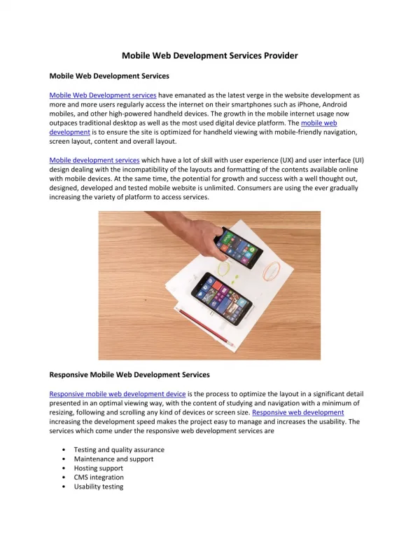
Mobile User Statistics Mobile web access predicted to overtake desktop web access! It already has in China and India in 2013 (http://www.bbc.co.uk/news/technology-18900778) See http://www.smartinsights.com/mobile-marketing/mobile-marketing-analytics/mobile-marketing-statistics/for more stats. Companies have to be ready with mobile-friendly web sites for all sizes of devices!
Multiple Web Sites • When smart phones with web access first started coming out, companies started designing a mobile version of their web sites. • But then tablets came along, and now there are so many screen sizes to consider!
Mobile Web Readiness Testing mobile readiness of web pages/code with device emulators: http://ready.mobi http://testiphone.com
Responsive Web Design • Responsive Web Design Definition: designing a web site that responds and adapts itself to the device that accesses it (especially its screen size) • Coined by Ethan Marcotte, a web designer, in an article http://www.alistapart.com/articles/responsive-web-design/ in 2010.
Responsive Examples • http://designmodo.com/responsive-design-examples/
Dreamweaver Multiscreen Preview Panel Only works for local folder or desktop.Not on hubble/network.
Default Sizes • iPhones, many Android phones: 320 x 480px (320 is portrait and 480 is landscape). • iPads, many Android tablets, and smaller laptops: 768 x 1024 • Desktops: ave. 1126 px width
Responsive Design Tools • CSS Media Queries • Adapting size of div sections • Adapting number of columns • Adapting Font size • Adapting Image sizes
CSS Media Queries • Recognize the device screen size and use different css style files for different sizes. • Desktop.css • Tablet.css • Phone.css
Dreamweaver Media Queries • Click on the Multiscreen Preview Button and choose Media Queries.
Media Queries cont. • Click on This Document (or put links in a file) • Click on Default Presets to get Phone/Tablet/Desktop • Type in file names, phone.css, tablet.css, at the bottom. • Hit – to remove a view if you already have a css file you can use.
Link/Media Syntax • Find out the width of the device: <meta name="viewport" content="width=device-width, initial-scale=1"> • Use the appropriate styles or style sheet depending on width: <link href="css/phone.css" rel="stylesheet" type="text/css" media="only screen and (min-width: 0px) and (max-width: 480px)" > <link href="css/tablet.css" rel="stylesheet" type="text/css" media="screen and (min-width: 321px) and (max-width: 768px)"> • Always link a basic/desktop style sheet first for older browsers (especially IE 8 which doesn’t do media queries).
Fluid Adaptable Layout The layout needs to change in: • the width of each page element, • the font size, • number of columns (multiple columns to just 1 column for a phone display) The standard centered fixed-width layout doesn’t work for smaller screens!
Fluid/Liquid Layout • Dreamweaver comes with some css layout files you can use (File/New/Blank Page). • Use liquid instead of fixed size layouts! Ex: 100% width instead of 960px. • In your own css code, use % instead fixed size px whenever possible.
Divs in Separate CSS Files In each .css file, change the: • the width of each page element div, • the font size, • number of columns (multiple columns to just 1 column for a phone display) A centered fixed-width of 700-1200px layout doesn’t work for smaller screens!
Changing Div Rules Three Options: • Copy rule from desktop.css into phone.css and double click on rule in css panel to edit it. • Or Create a new rule in phone.css by hitting + at the bottom of CSS panel, give it the same name as the div! • Or Create a new rule using Format/CSS Styles/New.
Div Widths • Change the width of each div to fit the appropriate screen. • If it is 100% width instead of using pixels, it will automatically adjust to the width of the device.
Number of Columns Change navigation in phone.css: • Change the number of columns to 1 in phone.css by using float: none in the nav div tag. • Might also need to change the size of the nav buttons and the font size.
Image Sizes • Add an id to each image (minimize number of images and crop them to minimize white space). • Add a CSS rule for the image’s id. • Change the image’s width and height property in this CSS rule. Use CSS to dynamically re-size or crop images. • Or change its src property to load different sized images in each device’s css file.
Responsive Design Summary • CSS Media Queries (separate css files for phone, tablet, desktop) • Fluid Adaptable Layout • Adapting number of columns • Flexible Font size • Flexible Image size