Mobile-First eCommerce Solutions_ Development and Optimization Strategies
0 likes | 5 Views
Want to boost your sales in mobile ecommerce in 2025? Learn the vital development and optimization strategies to succeed. We'll also help you find and uncover secrets in our latest mobile-first guide to success. Learn the latest strategies to optimize your user experience on mobile platforms.

Mobile-First eCommerce Solutions_ Development and Optimization Strategies
E N D
Presentation Transcript
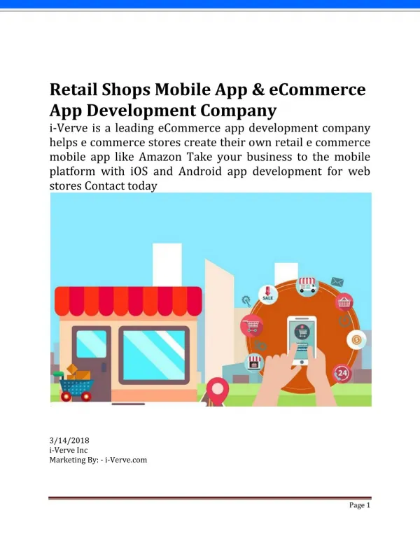
Mobile-First eCommerce Solutions: Development and Optimization Strategies In today’s digital marketplace, eCommerce solutions built for mobile users are critical for success. Over 60% of global online purchases are completed on mobile devices, and businesses that fail to prioritize mobile-first strategies risk losing customers to competitors. This guide offers a detailed roadmap for developing and refining mobile-first eCommerce solutions, covering design principles, technical frameworks, and future-ready practices. By the end, actionable steps will be provided to help businesses create mobile platforms that drive conversions and align with search engine requirements. Introduction The rise of mobile commerce has transformed how consumers interact with online stores. Smartphones and tablets are no longer secondary devices—they are the primary tools for product discovery, price comparisons, and purchases. For businesses, this shift means that eCommerce solutions must be designed with mobile users as the focal point. A mobile-first approach goes beyond responsive layouts; it involves structuring every element—from navigation menus to checkout processes—to align with the constraints and opportunities of smaller screens.
Platforms that neglect mobile-first principles often struggle with high bounce rates, slow load times, and lower search engine rankings. In contrast, businesses adopting these strategies report improved customer retention and higher average order values. This blog explains how to build and maintain mobile-first eCommerce solutions through practical development techniques, performance optimization, and forward-thinking design. Why Mobile-First eCommerce Solutions Matter Mobile commerce growth is fueled by the convenience of shopping anywhere, at any time. Statistics indicate that 73% of consumers use mobile devices to research products, and 61% are unlikely to return to a site with poor mobile experiences. Additionally, Google’s mobile-first indexing means that websites optimized for mobile are prioritized in search results, directly impacting organic traffic. User behavior further underscores the need for mobile-first eCommerce solutions. Mobile shoppers tend to make quicker decisions, especially when interfaces are intuitive. Features like one-click purchasing and saved payment details cater to impulse buying habits, which account for 40% of mobile sales. Moreover, mobile-first platforms are better equipped to handle emerging trends, such as voice search and augmented reality. Brands that invest in these solutions position themselves to adapt to technological advancements while meeting immediate customer expectations.
Mobile-First vs. Mobile-Friendly: Understanding the Difference The terms “mobile-first” and “mobile-friendly” are often conflated, but their approaches differ significantly. Mobile-friendly eCommerce solutions retroactively adjust desktop layouts to fit smaller screens, often leading to compromised user experiences. Elements like oversized images or complex menus may load slowly or appear distorted on mobile devices. In contrast, mobile-first design begins with the constraints of mobile screens. Content hierarchy, button sizes, and navigation flows are planned for thumb-friendly interactions first and then scaled up for desktop. For example, a mobile-first product page might prioritize “Add to Cart” buttons at the bottom of the screen for easy access, whereas a mobile-friendly site might bury the button beneath irrelevant content. This distinction impacts performance metrics. Mobile-first platforms typically achieve faster load times and lower bounce rates because unnecessary elements are eliminated during the design phase. Key Components of Mobile-First eCommerce Development Responsive vs. Mobile-First Design Responsive design relies on flexible grids and media queries to adapt desktop layouts to mobile screens. While functional, this approach often retains desktop-centric features that clutter mobile interfaces. Mobile-first development, however, starts with the smallest screen size, ensuring that only essential elements are included.
UI/UX Essentials - Navigation: Simplified menus, such as hamburger icons or bottom bars, reduce scrolling. - Touch Optimization: Buttons are sized to prevent accidental clicks, with spacing between interactive elements. - Mobile-Specific Features: Camera integration allows users to scan QR codes or upload photos for visual searches. Performance Requirements Page load times exceeding three seconds lead to 53% of visitors abandoning a site. Core Web Vitals, including Largest Contentful Paint (LCP) and Cumulative Layout Shift (CLS), are monitored to ensure visual stability. Techniques like browser caching and Content Delivery Networks (CDNs) distribute server loads, improving speed. Payment Integration Mobile wallets like Apple Pay and Google Pay are integrated to streamline checkout. One-click purchasing reduces cart abandonment rates, which average 85% on mobile devices. Development Strategies for Mobile-First eCommerce Solutions Platform Selection - Shopify: Pre-built mobile themes simplify launches but limit customization. - Magento: Customizable for large inventories but requires technical expertise. - WooCommerce: Flexible for WordPress users but demands plugin management. PWAs vs. Native Apps Progressive Web Apps (PWAs) mimic native app functionality without requiring downloads. They are cost-effective and easier to update but lack app-store visibility. Native apps, while offering deeper device integration, involve higher development and maintenance costs. Headless Commerce Decoupling the front end and back end enables tailored mobile experiences. APIs connect systems, ensuring consistent product data across devices. For instance, a headless setup allows a mobile app to pull real-time inventory data from the same backend as a desktop site. Security Measures SSL certificates encrypt data transfers, and biometric authentication (e.g., fingerprint scans) adds security layers. Compliance with PCI-DSS standards is mandatory for processing card payments securely.
Optimization Techniques for Mobile eCommerce Solutions Speed Improvements - Image Compression: WebP formats reduce file sizes by 30% compared to JPEG. - Lazy Loading: Images and videos load only when they enter the viewport. - Code Minification: Unnecessary characters are removed from CSS and JavaScript files. Checkout Simplification Guest checkout options eliminate account creation barriers. Auto-fill forms populate shipping details using saved data, and progress bars indicate remaining steps. Personalization Algorithms analyze browsing history to display relevant products. For example, a user searching for running shoes might see recommendations for athletic socks. Mobile SEO - Local SEO: Location-based keywords (“coffee shops near me”) attract nearby shoppers. - Schema Markup: Product snippets display prices and ratings directly in search results. - Voice Search: Queries like “best wireless headphones under $100” are targeted with conversational keywords. Tools and Technologies for Building Mobile-First Solutions Cross-platform frameworks like React Native and Flutter allow developers to create apps for iOS and Android simultaneously. Testing tools such as Google Lighthouse audit performance metrics, while BrowserStack simulates user experiences across 2,000+ devices. Analytics platforms like Hotjar generate heatmaps to identify navigation bottlenecks. For instance, a heat map might reveal that users struggle to locate the checkout button, prompting a redesign. Overcoming Mobile-First Implementation Challenges Device Fragmentation Adaptive design techniques adjust layouts for varying screen sizes. For example, a grid layout might display two columns on tablets but one column on smartphones. Network Limitations Offline modes cache critical pages (e.g., product listings) so users can browse without internet access. Data-saving features compress images when network speeds are slow. Balancing Aesthetics and Speed Heavy animations are replaced with CSS transitions, and vector graphics (SVGs) are used instead of PNGs to maintain visual quality without sacrificing speed.
Post-Purchase Experience: Retention through Mobile Strategies Post-purchase engagement is critical for customer loyalty. Order tracking pages with real-time updates reduce support inquiries, while push notifications alert users about delivery milestones. In-app feedback forms gather insights about user satisfaction, and personalized discounts for repeat purchases encourage retention. For example, a customer buying skincare products might receive a tailored offer for moisturizers after their first order. Accessibility in Mobile eCommerce Solutions Accessible design ensures inclusivity for users with disabilities. Screen readers interpret ARIA labels to describe images and buttons, while high-contrast text improves readability for visually impaired users. Keyboard navigation alternatives allow users to tab through menus without touch gestures. For instance, a drop-down menu can be expanded using arrow keys instead of swiping. Future Trends in Mobile eCommerce Solutions - Voice Commerce: Voice assistants enable hands-free shopping (e.g., “Reorder toothpaste”). - AR/VR Integration: Virtual try-ons let users visualize products like furniture in their homes. - 5G Networks: Faster speeds support live video consultations with sales representatives. These trends will redefine how mobile-first eCommerce solutions operate, emphasizing real-time interactions and immersive experiences. Conclusion The transition to mobile-first eCommerce solutions is not a trend—it’s a necessity. Businesses that prioritize mobile design, performance, and accessibility will outperform competitors in customer satisfaction and search rankings. By adopting strategies like headless commerce, PWAs, and AI-driven personalization, brands can create seamless mobile experiences. Regular audits of Core Web Vitals and checkout processes ensure continuous improvement. Emerging technologies like AR and voice search present opportunities for innovation. Start refining your mobile strategy today to meet evolving consumer demands.
Explore Expert eCommerce Solutions: For businesses looking to dive deeper into mobile-first eCommerce solutions, CartCoders offers specialized services tailored to your needs. From creating a responsive design to integrating cutting-edge features, their team ensures that your mobile eCommerce platform is not only user-friendly but also optimized for peak performance. Whether you're just starting out or looking to enhance an existing platform, explore our eCommerce solutions to give your business a competitive edge. Ready to start your project? Contact us today to discuss how they can help transform your eCommerce strategy.