Download
1 / 22
220 likes | 303 Views
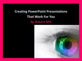
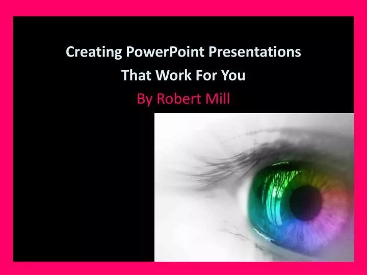
Creating PowerPoint Presentations That Work For You By Robert Mill. Summarise Your Content Your audience does not want to see slides full of words – that have been copy/pasted. Two - three – four bullet points should do on any slide . Use Easily Read Fonts

E N D
Creating PowerPoint Presentations That Work For You By Robert Mill
Summarise Your Content Your audience does not want to see slides full of words – that have been copy/pasted. Two - three – four bullet points should do on any slide.
Use Easily Read Fonts Arial, Calibri are good for content, (as used here). Berlin Sans FB Demi is a solid font for a heading, (as used here). Never use CAPS, unreadable fancy or scripted fonts or Italics. Only use two fonts in your presentation.
Images Can make a presentation really work. But make sure they are clear (non pixelated) and of high quality. Use 2 – 3 per slide to enhance your show.
Images (cont’d) Make the image/s work to your presentation. They can be subject topic or metaphorical. But you must stay within the subject. The better quality the image, the better your presentation looks & the higher marks!
Design & Colour Schemes Here you have to be really careful. Don’t use pre-set background designs and apply to all – boring as! Be innovative. Use a good colour balance.
Design & Colour Schemes (cont’d) Use light on dark. Never dark on dark or light on light. Watch colour changes on a data projector, which may ruin what you set out to do.
Design & Colour Schemes (cont’d) You can use an image as a slide background (see next slide). But care must be taken to ensure the image and text blend. The image must never overtake the content.
Data Projector Colours If you are presenting on a data projector, check your colour scheme before presenting. Otherwise you may get a shock when the colours change on you. You are assessed on what is shown on thedata projector and they are all different!
Design - Background Design – Image – Transparency (as used here will work) • The background image must have it’s transparency adjusted to make it work. • But do not insert a picture as a background as it will move around. • You may then also add a shape outline.
Have a look at the three examples used here (Thanks Shenae O’Donnell for the image). • This one as a title slide with Shape Fill. • The next as a - Title Slide • The following - as a Background. • The last as a transparency adjusted so the text is not hidden on the slide.
A Background Style with content using the transparency scale.
The Speech The speech needs to enhance upon what is visually appearing on the slides. It is not about reading off the slides. It is about adding details to what is already on the slides.
The Speech (cont’d) It needs to be either submitted as : A Word Processed document. Be in the Notes section of your slides and printed out. Be a voiceover (this is much more complex). Where required you must present your speech and presentation to your peers.
The Speech - Voiceover If selected you need to: Time your speech out to each slide. Time in Transition Timings to suit. Record your speech as one file or one file per slide. Insert your speech. Test it. Make any Transition timings accordingly.
Animations They are good only if: One animation is used on all slides, not two or three. They are set to Start After Previous The value must be set to ‘0’ and not 1 or 2. The whole slide content then will come in at once.
Animations (cont’d) The only Animations you should use are ones such as diamond, float in, split, wipe, shape. Do not attempt to use ones such as swivel, bounce, grow and turn. As these will send your audience crazy and your content will be lost on them.
No Animation Sounds Music is good as a soft background to either spoken presentations or voiceover. But never animated sounds. They are horrible and very annoying!
Before Presenting Your Work Check It! This requires you to: Check all spelling and typos. Check the colours and graphics quality. If being shown on a Data projector, ensure you have a preview before the due date and make changes where necessary. If using music, do a sound check.
Bibliography When asked for - this maybe a requirement and if needed you should cover all main resources used, for example: Rmwebed.com.au/EBook Entertainment Course. Google web search (name the end searched page/s). Google Images for (name the topics).