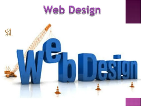
Web Design
Since the first site was established in 1991, web design has advanced significantly. It should <br>come as no surprise that this sector is here to stay given that there are already over one billion <br>active websites online. Thousands of website designers, hobbyists, and professionals call home, <br>enabling the sector to soar to new heights. You've therefore come to the perfect place if you're <br>looking to learn more about the field of web design<br>This post will focus on the role of web design as a prelude to learning how to create a website, <br>go through helpful advice, define key Web Design terms and

Web Design
E N D
Presentation Transcript
Since the first site was established in 1991, web design has advanced significantly. It should come as no surprise that this sector is here to stay given that there are already over one billion active websites online. Thousands of website designers, hobbyists, and professionals call home, enabling the sector to soar to new heights. You've therefore come to the perfect place if you're looking to learn more about the field of web design This post will focus on the role of web design as a prelude to learning how to create a website, go through helpful advice, define key Web Design terms and concepts, and look at examples that will better your understanding. We'll talk about the following. The art of structuring and organizing content on a website so that it may be shared and accessible by people all over the world is known as web design. Web design, which combines aesthetic and practical
features, influences how a website looks, including the colors, fonts, and graphics used, as well as how it is organized and how visitors interact with it. One of the foundations of having an online presence in the modern day is building a website. The world of web design is therefore as active as ever. In order to suit the expanding needs of website owners and visitors alike, it is continually improving, including mobile apps and user interface design. Web design is frequently a collaborative process that integrates expertise and resources from related fields, including UX, SEO, and web design statistics. Professionals from these fields who can optimize performance and concentrate on the bigger process and result are frequently gathered by web designers. Since web design and website development are closely related and sometimes (erroneously) used interchangeably, the first step in our web design journey is to define their respective distinctions: Web design describes the aesthetics and user interface of a specific website. The remainder of this post will go into greater depth regarding web design. Website development is the process of creating and maintaining the framework of a website. It involves complex coding systems that guarantee the website's functionality. The most popular programming languages used by web developers to create websites are as follows:
Hyper Text Markup Language, or HTML, is a coding language used to build websites' front ends. Web browsers incorporate it into the websites we visit online in order to include the structure of a web page. Cascading Style Sheets, or CSS, is a programming design language that contains all pertinent data pertaining to how a webpage will appear. The layout, typefaces, padding, and other formatting elements of a website or page are designed using CSS in conjunction with HTML. A content management system, or CMS, is a piece of computer software that controls how a website's digital material is organized. An example of a CMS that serves as an easy-to-use system for website content development is. Because of this, anyone can build a website and make changes to it without knowing how to use code. To design and create, web designers need a specific set of tools. Which types you employ and at what moment you need them will depend on a few important factors. Here are some queries to think about: What size team do you have? What sort of spending plan do you have? What sort of technological specifications would your website require? What kind of aesthetic would you like to accomplish overall? Will you produce a responsive or adaptive design? What does your website aim to achieve? Your understanding of the kind of website The creation of wireframes, unique features, and design components can be done using design software programs like, Photoshop, and Sketch. The main distinction with these tools is that every element needs to be transformed to code. Although these solutions provide collaborative
integrations like hand-off features to web developers and creative flexibility, they can also be more time-, knowledge-, and resource-intensive. Knowing what good web design is and how to achieve it is one of the first steps in comprehending what it is. The principles of design, a developed theory by artists and designers that outlines the visual attributes any composition should aim towards, can be used as a guide. Both novice and experienced web designers can create websites with a unified appearance and feel by using these concepts in web design. These are recommendations to help us learn how to use the various website design aspects, not specific laws to follow. Learn the rules like a pro so you can break them like an artist, to quote Pablo Picasso. You can adjust the strategy with a more creative touch once you are familiar with each website piece and the objectives of web design. Making sure none of the components in a single composition are overly dominant is the definition of visual balance. Drawing a hypothetical line through the middle of a webpage and placing things so that the visual weight is equal on both sides can be used to apply this to web design. On a website, there are primarily two methods for achieving balance:
When the visual weight is balanced and placed in a mirror image on both sides of the line, this is known as symmetrical balance. When used in web design, this can elicit emotions of harmony, grace, and coherence. Asymmetrical balance is when there is equal visual weight on both sides but different compositions and arrangements of the elements (i.e., not a mirror image). A balanced asymmetrical design is regarded as a contemporary strategy that will give the spectator a more dynamic experience while retaining a pleasing composition. Contrast is the arrangement of opposing components, such as dark and bright, smooth and rough, huge and small, in a way that emphasizes their differences. The dramatic and captivating properties of contrast can hold visitors' attention as they navigate through your website. The focus principle serves as a reminder that not all website components are created equal. Applying the idea of emphasis by using a bold color, motion, or size will ensure that whatever is on your website that you want people to notice first is the dominating element of your composition, whether it your logo, a CTA, or an image. Movement is what leads users from one thing to the next when it comes to web design. You can direct the travel of the viewer's eye throughout your website by managing the size, direction, and order of components on each individual web page.
The repetition of parts to achieve coherence, consistency, or to emphasize a particular message is referred to as rhythm. Your brand identification and online presence will be strengthened by repeating elements like your logo, brand colors, incorporating complementary hues, and using the same typography. It's bad web design practice to place your company name at the bottom of your homepage. Do you know the cause? To find out who you are, new visitors would have to go all the way down your website. We know this because of the hierarchy principle, which tells us that the most crucial material should be shown prominently so that users can notice it right away and engage with it. White space is a term used in art and design to describe any section of a composition that is devoid of visual components, even if it isn't truly white. The intentional placement of white space in web design will provide the visual elements of a webpage room to breathe. This might not seem like a crucial issue. All of the separate components you've put to your website should work together harmoniously to create unity as their overall result. The aim of web design unity is to prevent users from becoming overwhelmed, perplexed, or leaving your site. It could take a few tries to get it perfect, but once you do, you can ensure that every element of your site contributes to its performance and functionality. This entails being mindful of the elements you use, where and how you place them, and whether or not they actually serve a function.
The order and timing of the visual elements on each page of your website will be determined by the website layout, which is like laying the foundation for the building. This crucial phase in web design affects a site's visual appeal, degree of use, and message amplification. The objectives of your website: The message you want to send to visitor and the type of content you'll use can all influence the optimal layout for your website. There is no "one size fits all" approach, although there are two main paths you can go in: Layouts for your content: The design you select should be appropriate for the material. For instance, you might choose a layout that gives plenty of room for emphasizing photographs if you want to exhibit products. On the other hand, a blog layout will need to present new content in a structured manner. Common designs: There are a lot of tried-and-true website designs available. Because they are based on users' prior assumptions or experiences with other websites, these have a tendency to feel familiar to users. They may produce a more user-friendly, intuitive interface, making them excellent for beginners. When creating your own website, you can select website templates from a variety of categories to give your site's style a strong foundation. Wireframes are the best place to start when creating a layout from scratch. You can use this approach to plan out your website's layout before it is put into action. Website functionality, in essence, refers to how your website functions, including its speed and usability as well as the precise tasks that may be carried out on it. At the risk of sounding dated,
I'm reminded of how far we've gone when I consider how quickly and effectively websites operate today compared to the 1990s (I can still hear AOL's dial-up signal in the background). Given the developments in the web design field, it is in our best interests to make use of the cutting-edge tools at our disposal to ensure that our websites function properly and are simple to use. Multiple pages and other elements that the visitor can view or utilize can be included in a single web design. After arriving at your website, users may find the pages they require using the website navigation. The best approach to ensure easy navigation for visitors is to incorporate a navigation menu into your design. A website's menu provides links to various items on your site and aids users in navigating between various pages and sections. You could select from one of the following menu types depending on the layout of your website: A visitor walks in. A slow website is disliked by everyone, especially in our fast-paced generation. It must be operating at a rapid pace. In fact, research reveal that bounce rates increase by 38% when a homepage loads more slowly than three seconds. No matter how attractive your website is designed, you can't compete until you give users the best surfing experience. There are several variables that might influence how quickly a page loads; some have to do with a visitor's own computer or internet connection, while others might be unique to the website they're trying to access. There are tested methods and tools available today for auditing the functionality of your website and enhancing page load times. Also available here is further information on Performance.
The process of optimizing a website for search engines is known as SEO, or search engine optimization. We believe it belongs here with the functional parts because it is crucial to the success of your website. The more individuals who can find you on Google, the more users your website will receive. Even though SEO is a continuous process, there are things you can do to improve the performance of your site right now. For instance, your site's infrastructure will already enable effective performance if you use SEO tools. Before hitting publish, you can also follow a few typical SEO best practices: utilize headings in your content, add alt text to photos, use met descriptions on pertinent pages, and select a domain name that accurately describes your brand or company. Our websites must be optimized for mobile devices because more than half of all online traffic now comes from mobile devices. Adaptive design and responsive design are the two styles that allow a web design to be changed from its desktop form to its mobile counterpart. As most platforms will only support one of the two, understanding the differences between the two can be useful, especially when selecting the website builder that is ideal for you. With adaptive design, numerous iterations of the same website are made, each of which can adjust to a particular screen size or browser width. For instance, users get a mobile website adaptation in addition to the ability to design the layout of their site's desktop version. A flexible grid is used for building websites with responsive design. Depending on the size and direction of the screen being used to see it, this produces a dynamic image. The aesthetic components of a website contribute to its overall appearance and feel just as much as its functional components do. These particulars, such as color schemes, fonts, and video, affect user experience and help to define your brand. We'll discuss the visual components of web design in this area, along with some advice on how to choose aesthetics on your own:
Every page of your website has a footer, which is fixed at the bottom of the page. Since it's the last thing visitors will view, you can add and reiterate crucial information there without consuming too much visual space. Another typical location for contact information, a map, an email signup form, and social media icons is the footer. Your website's color scheme will determine the mood of the site when it comes to web design. Additionally, properly using a branded color scheme can be quite effective in boosting your online branding. Choose the colors that will serve as your major color (the one that dominates your site), secondary color used consistently but less frequently than your primary color), and accent colors when choosing a color scheme for your website used in clever ways to highlight certain details of your site. http://www.seoexpartebd.com/ info@seoexpartebd.com +8801758300772 +8801758300772 Majhira Bazar, Sajahanpur, Bogura, Puran Bogra, Bangladesh