Download
1 / 29

E N D
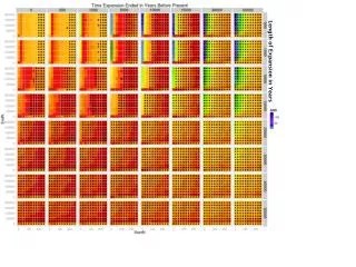
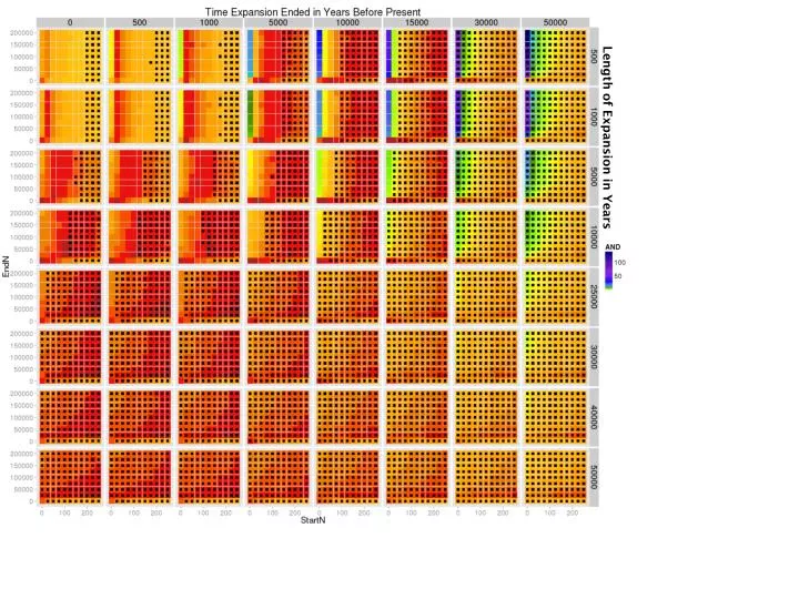
Supplementary Figure 1. Fit between model and observed data – E1b1a. The color of each of the smallest rectangular units indicates the value of AND measuring the fit between the model and the observed tree: red = good fit, yellow and green = intermediate fit, blue = poor fit. Each is based on 1,000 simulations. These small units are assembled into sets with differing values of StartN and EndN to form the grid of intermediate-sized rectangles separated by grey/white borders. This grid shows differing Times when expansion ended and Length of expansion. The units with a TMRCA > 20,000 years ago are marked with black squares.
Supplementary Figure 2. Fit between model and observed data – E1b1a. The color of each of the smallest rectangular units indicates the value of AND measuring the fit between the model and the observed tree: red = good fit, yellow and green = intermediate fit, blue = poor fit. Each is based on 1,000 simulations. These small units are assembled into sets with differing values of StartN and EndN to form the grid of intermediate-sized rectangles separated by grey/white borders. This grid shows differing Times when expansion ended and Length of expansion. The units with a TMRCA > 20,000 years ago are marked with black squares.
Supplementary Figure 3. Fit between model and observed data – E1b1a. The color of each of the smallest rectangular units indicates the value of AND measuring the fit between the model and the observed tree: red = good fit, yellow and green = intermediate fit, blue = poor fit. Each is based on 1,000 simulations. These small units are assembled into sets with differing values of StartN and EndN to form the grid of intermediate-sized rectangles separated by grey/white borders. This grid shows differing Times when expansion ended and Length of expansion. The units with a TMRCA > 20,000 years ago are marked with black squares.
Supplementary Figure 4. Fit between model and observed data – E1b1a. The color of each of the smallest rectangular units indicates the value of AND measuring the fit between the model and the observed tree: red = good fit, yellow and green = intermediate fit, blue = poor fit. Each is based on 1,000 simulations. These small units are assembled into sets with differing values of StartN and EndN to form the grid of intermediate-sized rectangles separated by grey/white borders. This grid shows differing Times when expansion ended and Length of expansion. The units with a TMRCA > 20,000 years ago are marked with black squares.
Supplementary Figure 5. Fit between model and observed data – E1b1a. The color of each of the smallest rectangular units indicates the value of AND measuring the fit between the model and the observed tree: red = good fit, yellow and green = intermediate fit, blue = poor fit. Each is based on 1,000 simulations. These small units are assembled into sets with differing values of StartN and EndN to form the grid of intermediate-sized rectangles separated by grey/white borders. This grid shows differing Times when expansion ended and Length of expansion. The units with a TMRCA > 20,000 years ago are marked with black squares.
Supplementary Figure 6. Fit between model and observed data – E1b1a. The color of each of the smallest rectangular units indicates the value of AND measuring the fit between the model and the observed tree: red = good fit, yellow and green = intermediate fit, blue = poor fit. Each is based on 1,000 simulations. These small units are assembled into sets with differing values of StartN and EndN to form the grid of intermediate-sized rectangles separated by grey/white borders. This grid shows differing Times when expansion ended and Length of expansion. The units with a TMRCA > 20,000 years ago are marked with black squares.
Supplementary Figure 1. Fit between model and observed data – R1b. The color of each of the smallest rectangular units indicates the value of AND measuring the fit between the model and the observed tree: red = good fit, yellow and green = intermediate fit, blue = poor fit. Each is based on 1,000 simulations. These small units are assembled into sets with differing values of StartN and EndN to form the grid of intermediate-sized rectangles separated by grey/white borders. This grid shows differing Times when expansion ended and Length of expansion. The units with a TMRCA > 15,000 years ago are marked with black squares.
Supplementary Figure 2. Fit between model and observed data – R1b. The color of each of the smallest rectangular units indicates the value of AND measuring the fit between the model and the observed tree: red = good fit, yellow and green = intermediate fit, blue = poor fit. Each is based on 1,000 simulations. These small units are assembled into sets with differing values of StartN and EndN to form the grid of intermediate-sized rectangles separated by grey/white borders. This grid shows differing Times when expansion ended and Length of expansion. The units with a TMRCA > 15,000 years ago are marked with black squares.
Supplementary Figure 3. Fit between model and observed data – R1b. The color of each of the smallest rectangular units indicates the value of AND measuring the fit between the model and the observed tree: red = good fit, yellow and green = intermediate fit, blue = poor fit. Each is based on 1,000 simulations. These small units are assembled into sets with differing values of StartN and EndN to form the grid of intermediate-sized rectangles separated by grey/white borders. This grid shows differing Times when expansion ended and Length of expansion. The units with a TMRCA > 15,000 years ago are marked with black squares.
Supplementary Figure 4. Fit between model and observed data – R1b. The color of each of the smallest rectangular units indicates the value of AND measuring the fit between the model and the observed tree: red = good fit, yellow and green = intermediate fit, blue = poor fit. Each is based on 1,000 simulations. These small units are assembled into sets with differing values of StartN and EndN to form the grid of intermediate-sized rectangles separated by grey/white borders. This grid shows differing Times when expansion ended and Length of expansion. The units with a TMRCA > 15,000 years ago are marked with black squares.
Supplementary Figure 5. Fit between model and observed data – R1b. The color of each of the smallest rectangular units indicates the value of AND measuring the fit between the model and the observed tree: red = good fit, yellow and green = intermediate fit, blue = poor fit. Each is based on 1,000 simulations. These small units are assembled into sets with differing values of StartN and EndN to form the grid of intermediate-sized rectangles separated by grey/white borders. This grid shows differing Times when expansion ended and Length of expansion. The units with a TMRCA > 15,000 years ago are marked with black squares.
Supplementary Figure 6. Fit between model and observed data – R1b. The color of each of the smallest rectangular units indicates the value of AND measuring the fit between the model and the observed tree: red = good fit, yellow and green = intermediate fit, blue = poor fit. Each is based on 1,000 simulations. These small units are assembled into sets with differing values of StartN and EndN to form the grid of intermediate-sized rectangles separated by grey/white borders. This grid shows differing Times when expansion ended and Length of expansion. The units with a TMRCA > 15,000 years ago are marked with black squares.
Supplementary Figure 7. Fit between model and observed data – R1b. The color of each of the smallest rectangular units indicates the value of AND measuring the fit between the model and the observed tree: red = good fit, yellow and green = intermediate fit, blue = poor fit. Each is based on 1,000 simulations. These small units are assembled into sets with differing values of StartN and EndN to form the grid of intermediate-sized rectangles separated by grey/white borders. This grid shows differing Times when expansion ended and Length of expansion. The units with a TMRCA > 15,000 years ago are marked with black squares.
Supplementary Figure 8. Fit between model and observed data – R1b. The color of each of the smallest rectangular units indicates the value of AND measuring the fit between the model and the observed tree: red = good fit, yellow and green = intermediate fit, blue = poor fit. Each is based on 1,000 simulations. These small units are assembled into sets with differing values of StartN and EndN to form the grid of intermediate-sized rectangles separated by grey/white borders. This grid shows differing Times when expansion ended and Length of expansion. The units with a TMRCA > 15,000 years ago are marked with black squares.