Download
1 / 11
110 likes | 134 Views
Your website is the first impression to your customers, so create a mobile-optimized website. The good thing about creating a mobile-optimized website is simple, easy, and convenient for your clients. The responsive web design gives you options to customize it for mobile devices.<br>The changes in Google's mobile-first indexing are beneficial to a mobile-friendly website as well as for the users who will now be able to access a highly optimized and mobile-responsive website that can be easily viewed.

E N D
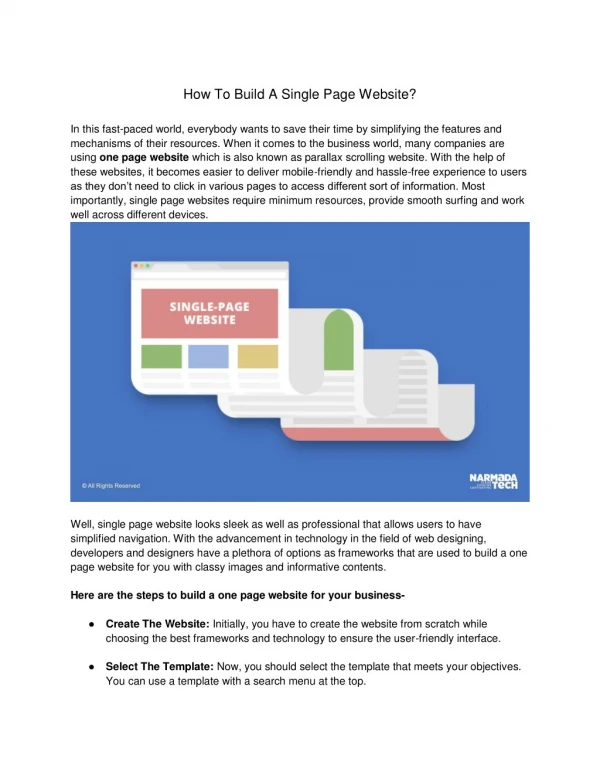
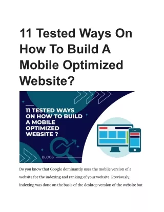
11 Tested Ways On How To Build A Mobile Optimized Website? Do you know that Google dominantly uses the mobile version of a website for the indexing and ranking of your website. Previously, indexing was done on the basis of the desktop version of the website but
with the advent of technology Google made an update in algorithm and gave dominance to mobile first indexing. Today, in this article we are going to share 11 ways on how to build a mobile optimized website. 11 Strategies: How To Make Websites Mobile Friendly? In today’s world, more and more people are using their mobile devices to access the internet. Mobile users are often impatient and if your website takes too long to load, they will likely move on to another site which means you are missing out on a lot of potential tra?c and customers. Check out the given ways to make a website mobile friendly one. 1. Select A Mobile-Responsive Theme Or Template For Your Website Choosing a mobile-friendly theme or template is the first step to a mobile friendly website. If your website isn’t mobile responsive, it won’t adjust to fit the smaller screens of mobile devices, which will result in a poor user experience. There are mobile responsive themes and templates available for just about every content management system (CMS) and website platform, so you should have no trouble finding one that suits your needs. Once
you have a mobile responsive theme or template, your website will be well on its way to being a mobile optimized website. What if I have selected a non-responsive theme? Well, if you have website which is having a non responsive theme the you can try using this code into head tag of each webpage of your website: <meta name="viewport" content="width=device-width, initial-scale=1.0"> It will automatically reformat the size as per the width of the device on which it is being displayed. 2. Focus On Website Speed Optimization The second step is to focus on website speed optimization. Mobile users are often impatient and if your website takes too long to load, they will likely move on to another site. Approximately 50% of visitors leave the website if it takes more than 3 seconds to load. To make sure your website loads quickly, you need to focus on two things: reducing the size of your files and using a content delivery network (CDN).
Reducing the size of your files is important because large files take longer to load. You can reduce the size of your files by compressing them using a tool like Gzip. A CDN is a network of servers that delivers your content to users based on their location. Using a CDN can help improve your website’s speed because the content is delivered from a server that is closer to the user’s location. 3. Use Compressed Images And CSS Use compressed images and CSS for making mobile optimized website. Like we mentioned before, large files take longer to load. By compressing your images and CSS, you can help improve your website’s speed. There are a few di?erent ways to compress your images. One way is to use a tool like Photoshop to save your images for the web. Another way is the use of tools like TinyPNG, kraken.io which are free online image compressors. You can also use a tool like Gzip to compress your CSS files. Gzip is a free and open-source file compression program that can be used to compress CSS files.
12 Image Optimization Tips for Improved SEO & Website Speed 4. Change Button Size And Placement Mobile users are often using their thumbs to navigate, so you need to make sure your buttons are large enough and in a convenient location for them to press. If your buttons are too small or in an inconvenient location, mobile users will likely become frustrated and give up on your website. 5. Use Mobile-Friendly Fonts Use mobile-friendly fonts for building a mobile optimized website. Mobile users should be able to read your content easily. This means you need to use a font that is large enough and easy to read.
Some mobile-friendly fonts include Arial, Verdana, and Georgia. You can also use a font size of 14px or 16px. 6. Avoid Using Flash Disable Flash player in chrome. Flash is not supported on most mobile devices, so you should avoid using it on your website. If you must use Flash, make sure you also provide an HTML5 version of your website. 7. Eliminate Pop-Ups Mobile users often find pop-ups to be annoying and intrusive. If you must use pop-ups, make sure they are small and easy to close.
When it comes to mobile, pop-ups should be avoided. You can’t adjust the pop-up to activate at specific moments, such as when a user leaves your screen. 8. Test Regularly That Whether Your Site Is Mobile Friendly Or Not After following all the steps, it is important to test your website on a regular basis to ensure that it is still mobile friendly. Google provides a mobile-friendly test that you can use to test your website. Simply enter your website’s URL and Google will tell you if your website is mobile friendly or not. Users can evaluate their website speed with Google Mobile friendly test or Pingdom speed test tools.
9. Avoid Large Chunks Of Text Mobile users often have shorter attention spans than desktop users. This means for making a mobile optimized website, you should avoid large
chunks of text and instead break up your content into smaller paragraphs. You can also use headings and subheadings to break up your content and make it easier to read. 10. Minimize The Use Of Plugins And Scripts Another way to ensure a mobile optimized website is to minimize the use of plugins and scripts. Plugins and scripts can often slow down your website, so you should only use them when absolutely necessary. However there are countless best WordPress plugins to make your website mobile friendly. These plugins boost the performance of your website without harming the mobile friendliness feature.
If you must use a plugin or script, make sure it is well-coded and up-to-date. Outdated plugins and scripts can often cause security vulnerabilities. 11. Use Mobile-Specific CTAs Make sure you use mobile-specific CTAs. Mobile users often have di?erent needs than desktop users, so your CTAs should reflect that. For example, if you have a website that sells products, your mobile CTA might be “Buy Now” or “Add to Cart”. Conclusion By following these strategies, you can create a mobile-friendly website that will provide a better experience for mobile users. Creating a mobile-friendly website is essential if you want to stay ahead of the competition. Source link - https://seoboard.com/mobile-optimized-website/ WEBSITE