Effective Communication Strategies for Responsive Design Across Mobile and Desktop Platforms
This guide explores the essential strategies for creating responsive web designs tailored for both mobile and desktop users. It covers key practices, including storytelling, the effective use of images and infographics, and the significance of engaging content through videos. Additionally, it emphasizes the importance of seamless navigation, task-related pathing, and the use of a single content management system (CMS) to distribute consistent content across devices. Empower your audience with the right tools and design principles to enhance usability and engagement at the Los Alamos National Laboratory.

Effective Communication Strategies for Responsive Design Across Mobile and Desktop Platforms
E N D
Presentation Transcript
Responsive Design Communication Strategy for Mobile, Desktop Ask a question at #interlab Los Alamos National Laboratory
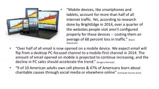
Interactive/usefulness • Story-telling • Images, images, images • Infographics • Video • Front-loaded headlines/links • Related content • Search • Completing processes Desktop: Engagement Ask a question at #interlab Los Alamos National Laboratory Los Alamos National Laboratory
Top Ten Five Tasks • Task-related pathing • Links, links, links • Searching Mobile: Tasking Ask a question at #interlab Los Alamos National Laboratory Los Alamos National Laboratory
Enter content once • Distribute to tablet, desktop through media queries, liquid page layouts, flexible images, proportional CSS • Distribute to mobile device through “templates” using discreet content blocks Content Management System Enter once, distribute thrice web CMS mobile tablet Ask a question at #interlab Los Alamos National Laboratory Los Alamos National Laboratory
same content • sameCMS template, based upon fluid layout/grid • media queries and CSS defined separately for each venue Desktop and tablet display /* iPads (landscape) ----*/ @media only screen and (max-width : 1024px) { body { background:url('/_assets/images/header-bg.jpg') repeat-x 0 -15px; } #pagecontent { width:96%; max-width: 100%/*800px*/; min-width: 780px/*750px*/; margin:0 auto 0 auto; padding: 0 0 0 0; height: auto; text-align:left; background:transparent; } Ask a question at #interlab Los Alamos National Laboratory Los Alamos National Laboratory
Desktop and tablet display • same content • same CMS template, based upon fluid layout/grid • media queries and CSS defined separately for each venue /* WIDE DESKTOP LAYOUT -----*/ @media only screen and (min-width: 1024px) { body { background:url('/_assets/images/header-bg.jpg') repeat-x 0 0; } #pagecontent { width:96%; max-width: 970px; margin:0 auto 0 auto; padding: 0 0 0 0; height: auto; text-align:left; background:transparent; } Ask a question at #interlab Los Alamos National Laboratory Los Alamos National Laboratory
same content but subset of all content for desktop/tablet • differentCMS template based upon fluid layout/grid • CSS defined specifically for phones • unique layout/grid for mobile content (task-based) Mobile device display Ask a question at #interlab Los Alamos National Laboratory Los Alamos National Laboratory
http://www.abookapart.com/products/responsive-web-design by Ethan Marcotte Resource Ask a question at #interlab Los Alamos National Laboratory Los Alamos National Laboratory
Coming Summer 2012! Ask a question at #interlab Los Alamos National Laboratory Los Alamos National Laboratory