Download
1 / 24
240 likes | 311 Views
Mary Jane Kwan's portfolio showcases her passion for architecture through drawings, sketches, and compositions capturing iconic structures and design elements such as the Golden Gate Bridge, art deco details, and modern interpretations. She delves into 2-D and 3-D compositions, exploring spatial concepts and experiential qualities in architecture. From vibrant color pencils to intricate charcoal sketches, Mary Jane's work exemplifies her deep appreciation for architectural beauty and craftsmanship. Follow her journey as she navigates through urban landscapes, cathedrals, and concert halls, translating her love for architecture into mesmerizing art pieces.

E N D
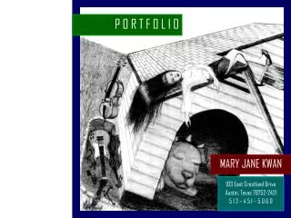
P O R T F O L I O MARY JANE KWAN 103 East Crestland Drive Austin, Texas 78752-2421 5 1 2 – 4 5 1 – 5 0 6 0
Mary Jane’s Emporium 3 Sail On By 4 GOLDEN GATE BRIDGE Love Letter 5 Anniversary 6 Art Deco 7 Looking Up 8 EXPLORATION OF ARCHITECTURE Downtown Tour Cathedral 9 Disney Concert Hall 10 Definition of Two Squares 2-D Composition 11 3-D Artifact 12 Modern Aphrodite 13 Path, Place, Pavilion Planning 14 Model 15 Web Page 16 The Recipe 17 Slanted Nap 18 “WHERE?” 19 LBJ High School 20 The Liberator : Editorial Cartoon 21 The Letter 22 Bird of Paradise 23 P O R T F O L I O : T A B L E O F C O N T E N T S
Time: August 2003 Medium: Pen Notes: I came by a store with my name while touring New Orleans (unfortunately the store was a tobacco emporium). I based this drawing, my first contour drawings, off of a photograph taken of me in front of the store’s sign. Mary Jane’s Emporium, New Orleans 3
Time: 2002 Medium: Pencil Notes: This drawing was inspired by Simon and Garfunkel’s “Bridge Over Troubled Water”. When I first heard the “Sail on silver girl, sail on by” verse, I imagined a woman on a raft in a formal gown (though this image is completely unrelated to my real interpretation of the lyrics). “Sail On By…” 4
Time: March 2003 Notes: I fell in love with the Golden Gate Bridge at the age of ten. Having not been able to visit lately, I wrote a love letter to the bridge for one of my San Francisco-bound friends to deliver: The Chinese translates to “Mary Jane Kwan loves Golden Gate Bridge.” GOLDEN GATE BRIDGE: Love Letter 5
GOLDEN GATE BRIDGE: Anniversary Artwork Time: May 27, 2000 May 27, 2001 January 2002 (63rd Anniversary) (64th Anniversary) Medium: Color Pencils Pencil Pencil Notes: The Golden Gate Bridge, in my eyes, is the most graceful and majestic structure in the world. I believe it is an impossible task to capture the bridge in all its grandeur – no photograph, drawing, video, IMAX theatre, etc. can match the sensation of the experience – the excitement of being there. I also find that it is also an irresistible task and I take a lot of pleasure in the attempt. 6
Time: May 27, 2003 (66th Anniversary) Medium: Charcoal Notes: A fantastic element of the bridge is the art deco detailing of the towers. Recently, I moved away from focusing on the bridge as a whole to concentrating on the art deco marks on the Golden Gate Bridge towers. This specific detail is from the fourth and bottommost “portal” of the tower. GOLDEN GATE BRIDGE: Art Deco Detail 7
GOLDEN GATE BRIDGE: Looking Up Time: December 2002Medium: PencilNotes: The bridge is magnificent from every angle. 8
Downtown Tour: Our Lady of the Angels Time: July 2003 Notes: The grand façade of the Cathedral of Our Lady of the Angels loomed over uncomfortably, casting a humbling effect on me. Yet at the same time, it appeared to be looking up toward the sky, as if humbled by the heavens. 9
Downtown Tour: Disney Concert Hall Time: July 2003 Notes: I was very interested in the way that this Frank Gehry building, under construction at the time of this sketch, looks somehow organic and machine-like at the same time. 10
Time: July 2003 Project Guidelines:Explore ordering principles used in design through the defini-tion of two squares in a 18” by 24” field of black and white. The two 12” by 12” squares must overlap. All intersections must be orthogonal. Notes: I sketched all possi-bilities for the placement of the two main squares. I arranged a series of over-lapping squares and cropped the pattern so that only two squares were completely defined. The next issues were how much to overlap and whether to reverse the black and white. Definition of Two Squares: 2-D Composition 11
Project Guidelines: Extrude two-dimensional composi-tion into a three-dimensional artifact, enhancing the original 2-d concepts through solid and void. Notes: In the context of my drafting table and wooden walls, I decided to reverse the black and white for the final 2-d composition. But upon a white background, the composition looked awkwardly blank. In extruding to a 3-d artifact, I overlapped and terraced the implied and fully defined squares to emphasize the pattern of the overlapping squares. Definition of Two Squares: 3-D Artifact 12
Time: July 2003 Medium: Pencil Notes: There were numerous paintings and sculptures depicting Aphrodite or Venus at the Getty Museum. The goal of this portrait was to create a “modern Aphrodite” who maintained the soft, delicate beauty and the tender expression found on Renaissance and ancient Aphrodite. Getty Museum: Modern Aphrodite 13
Project Guidelines: To explore ways in which spaces can be defined to express ideas through its experiential qualities. The site is a 50’ by 50’ clearing in a forest: Design a 4’ wide path, 20’ by 20’ place, and 8’ by 8’ by 8’ pavilion by subtracting as little land as possible and adding a set amount of walls. Path, Place, Pavilion: Planning Stage 14
Notes: I wanted to avoid having land jut out in acute angles. To do this, I made any subtraction of land perpendicular to the 5’ drop-off. I centralized the place of gathering for symmetry. I positioned the pavilion so that it would help define a corner of the place, but not obstruct the path’s view of the clearing. Path, Place, Pavilion: Model 15
Photo Gallery Web Page Notes: I designed the title graphic with the “Definition of Two Squares” project in mind. There is a T-square implied in the graphic, and the T-square’s straight-edge acts as a menu bar. The series of pages is a compilation of 400-500 of photos I took over my two weeks spent in Los Angeles. URL: http://www.angelfire.com/un/uscarchi/index.html 16
The Recipe Time: 2002 Medium: Jasc Paint Shop Pro 7 Notes: This picture began as one of my first experiments with layering. I created the line art of this Anne of Green Gables -inspired character, added color in a layer beneath it, and then removed the line art layer. I favor the foggy, impressionistic result over the other two forms of the picture. 17
Slanted Nap Time: March 2003 Medium: Pencil Notes: This piece is supposed to be disorienting. I was trying to capture that feeling of just waking up after an absurd dream. 18
Time: August 2003 Medium: Watercolors Notes: This painting was intended to conjure up a feeling of abandonment, mystery and incomplete-ness. If I was placed in this setting, I would have many “Where” questions: Where am I… where do the stairs go to… where did these shoes come from…” Each item in the painting – the yellow patches of grass, the staircase, the mailbox, and especially the shoes – contributes to the air of confused loneliness. “WHERE?” 19
Time: August 2003 Medium: Pencil, pen Notes: An image froze in my head of people passing by me on both sides and groups of people stalling in the middle of the hallway. I was forced to think very geometrically to overcome the challenge of packing many people together and posing each of them with anatomical accuracy. Lyndon Baines Johnson High School 20
Editorial cartoon for The Liberator : ID Badges Time: September 2003 Medium: Pen Notes: My school enlarged student identification cards to a size too large for wallets, thinking this would force students to wear them. This comic, published in the September issue of The Liberator, ridicules their logic. 21
Time: October 2003 Medium: Charcoal Notes: In this piece, I was experimenting with lighting and how it can affect the mood of a picture. I was also experimenting with texture, especially the textures of the grass and of the wood in the porch. The Letter 22
Door Project: Bird of Paradise Time: September 2003 Current (incomplete) Medium: Color pencils Acrylic paints Notes: On the left is the design for a mural I am painting in a cube of an office. To alleviate some “elevator claustrophobia” from the room, the idea was to create a window-like border around the door in order to help the office inhabitants inside feel connected to the faux-outdoors. The main themes of the mural is circulation and flow – everything is related to the Phoenix. 23