Download

1 / 21
210 likes | 298 Views
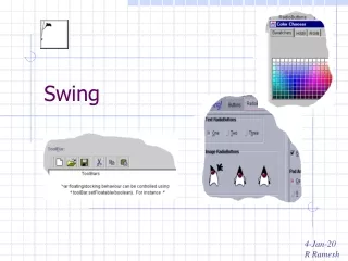
Advanced Swing. Advanced Layout Managers. GridBagLayout Example: Web Browser (Grid Bag Layout) BoxLayout Example: Web Browser (Box Layout) Several other layout managers (less commonly used) CardLayout SpringLayout GroupLayout. Grid Bag Layout. Rows and columns can have variable sizes

E N D
Advanced Layout Managers • GridBagLayout • Example: Web Browser (Grid Bag Layout) • BoxLayout • Example: Web Browser (Box Layout) • Several other layout managers (less commonly used) • CardLayout • SpringLayout • GroupLayout
Grid Bag Layout • Rows and columns can have variable sizes • Components can span multiple cells (both horizontally and vertically) • Fine-grained control of how space is allocated to each component on the grid
Grid Bag Layout • 1. Create an object of type GridBagLayout. You don’t need to tell it how many rows and columns the grid has (the layout manager will figure that out) • 2. Set this GridBagLayoutobject to be the layout manager for the component • 3. For each component, create an object of type GridBagConstraints. Set field values of the GridBagConstraintsobject to specify how the components are laid out within the grid bag • 4. Finally, add each component with its constraints by using the call add(component, constraints);
Grid Bag Constraints • gridx, gridy • Position of component on the grid (top-left corner) • gridwidth, gridheight • Size of component (in grid cells) • weightx, weighty • Controls what portion of available space the component should receive • Space is allocated to components according to their weights • A weight of zero means the component never grows or shrinks
Grid Bag Constraints • fill • How should the component fill up its cell? • None, Vertical, Horizontal, Both • anchor • If the component does not fill up its entire cell, where should it be placed in its cell? • Center, North, North East, West, South West, etc.
Grid Bag Constraints • insets (external padding) • Surrounds the component by blank space (left, top, right, bottom) • ipadx, ipady (internal padding) • Extra space added to the minimum width and height of the component • Prevents the component from ever reaching its minimum size
Grid Bag Recipe • 1. Sketch out the component layout on a piece of paper. • 2. Find a grid such that the small components are each contained in a single cell and the larger components span multiple cells. • 3. Label the rows and columns of your grid with 0, 1, 2, 3, . . .. You can now read off the gridx, gridy, gridwidth, and gridheight values. • 4. For each component, ask yourself whether it needs to fill its cell horizontally or vertically. If not, how do you want it aligned? This tells you the fill and anchor parameters. • 5. Set all weights to 100. However, if you want a particular row or column to always stay at its default size, set the weightx or weighty to 0 in all components that belong to that row or column. • 6. Write the code. Carefully double-check your settings for the GridBagConstraints. One wrong constraint can ruin your whole layout. • 7. Compile and run.
Grid Bag Example • Example: Web Browser (Grid Bag Layout)
Box Layout • Similar to Flow Layout, but more powerful • Lay out components horizontally (in a row) or vertically (in a column) • Component alignment • Column: Left, Right, Center • Row: Top, Bottom, Center • Invisible components to control spacing • Border (put empty space around the entire box) • Rigid Area (fixed space between components) • Glue (“stretchy” empty space between components) • Customer Filler (empty space with min, preferred, and max sizes)
Box Layout • Example: Web Browser (Box Layout) • Box Layout Tutorial
Dialog Boxes • JOptionPane • Built-in support for simple dialog boxes • JDialog • Base class for custom dialog box windows (use instead of JFrame) • Example: Web Browser (Dialog Boxes) • Dialog Box Tutorial
Container Components • Components that contain children • JPanel • JSplitPane • JTabbedPane • Example: WebBrowser (Panels, Splitters, & Tabs)
Complex Components • Some components display/edit simple data values such as a string, number, or boolean • JTextField, JSlider, JCheckBox, etc. • Other components display/edit entire data structures • JList, JTable, Jtree • Where does such a component get the data it should display on the screen? • How does such a component modify the data when it is edited by a user? • Customization of how the control displays the data (customer renderers) • Customization of how the control lets users edit the data (custom editing)
View Models • Complex components get their data from a “view model” object • The component queries the view model for the data it should display • The component applies data changes to the view model • The component “listens” to the view model to find out when the data has changed, and thus should be re-queried and re-displayed • The “view model” gets the data from the “application model”. These two models are different, but related.
View Model Example - JTable • Example: JTable • Initialize a JTable with the “table model” it should use • The TableModel interface • The AbstractTableModel class • Example: Color Table (Basic)
Custom Rendering Example - JTable • You can tell each column in the table what “table cell renderer” to use • The renderer controls how values in the column are drawn (or “rendered”) • The TableCellRendererinterface • The default table cell rendering is implemented by the DefaultTableCellRendererclass • To create your own customer rendering, you can subclass DefaultTableCellRenderer and tweak its behavior • Or, you can create your own class that implements the TableCellRenderer interface, and circumvent the default rendering entirely • Example: Color Table (Renderer)
Custom Editing Example - JTable • You can tell each column in the table what “table cell editor” to use • The editor controls how values in the column are modified (or “edited”) • The TableCellEditor interface • The default table cell editing is implemented by the DefaultCellEditorclass • To create your own customer editor, you can subclass DefaultCellEditor and tweak its behavior • Or, you can create your own class that implements the TableCellEditor interface, and circumvent the default editing entirely • The AbstractCellEditor base class is useful for doing this • Example: Color Table (Editor)
Notification of changes to the “view model” • In the Color Table (Color Chooser) example, if the user right-clicks on a table cell, a color chooser is displayed, which allows the user to select a new color • This circumvents the normal table editing process • When the user selects a new color with the color chooser, the underlying data in the view model has changed, but the JTable doesn’t know that because the change didn’t happen through the table • Therefore, whenever the data in the view model changes, you must call one of the “fire” methods on the view model so it will notify its listeners (i.e., the JTable) that the data has changed and needs to be re-drawn
Other complex components: JList • JList displays a list of items • Like JTable, • You feed data to a JList by implementing a “view model” class (ListModel, AbstractListModel) • You can make a JList look the way you want by creating custom cell renderers (ListCellRenderer, DefaultListCellRenderer) • Example: Web Browser (List Favs)
Other complex components: JTree • JTree displays a hierarchy of folders and items • Like JTable, • You feed data to a JTree by implementing a “view model” class (TreeModel, DefaultTreeModel) • You can make a JTree look the way you want by creating custom cell (i.e., node) renderers (TreeCellRenderer, DefaultTreeCellRenderer) • You can customize tree node editing by creating custom cell (i.e., node) editors (TreeCellEditor, DefaultTreeCellEditor) • Example: Web Browser (Tree Favs)