Download
1 / 28
310 likes | 821 Views
PowerPoint is used by more than 500 million people worldwide, but most presentations created are terrible! To make sure you don't follow suit, check out our top tips on how to create a killer presentation - http://www.sales-i.com/whitepaper/build-killer-presentation-even-using-powerpoint.

E N D
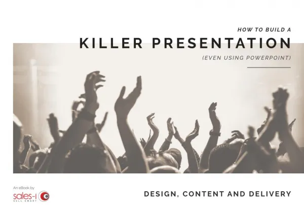
HOW TO BUILD A K I L L E R P R ES E N TAT I O N (EVEN USING POWERPOINT) An eBook by DESIGN, CONTENT AND DELIVERY
CONTENTS There are more than 500 million PowerPoint users worldwide1 creating over 30 million presentations every day2. However, 99.9% of them suck! DESIGN CONTENT Color 4 Sell the benefits 17 It’s not PowerPoint, Prezi, Keynote or any other software that is at fault, though - it’s you. The fact that you downloaded this eBook suggests that you want to build a killer presentation. Fonts 5 Storytelling 18 Logos 7 Credibility 20 PowerPoint is actually a powerful bit of kit, if used properly. Implement the tips from this guide and your presentation will stand out from the crowd for the right reasons. White space 8 The rule of three 21 Bullet points 10 DELIVERY Images 11 Humor 23 Layout 13 Tone of voice 24 Transitions 15 Body language 25 Involve your audience 26
Simple can be harder than complex: You have to work hard to get your thinking clean to make it simple. STEVE JOBS D ES I G N Steve Jobs once said “Simple can be harder than complex: You have to work hard to get your thinking clean to make it simple”. This statement is true of your presentation too. It’s easier to pick a random color, Google image or default font and then mash them together onto a slide that looks like it has just been massacred by Freddie Krueger. The difficult part is understanding which elements complement each other and which don’t need to be there at all.
COLOR Our eyes are attracted to color, so use ones that are visually pleasing. If you’re going to base your presentation on a theme, then you should use appropriate colors. For example, if it’s vintage, use pastel colors like duck egg blue or salmon pink (yes, I learned those colors from my wife). The difference that color alone makes to your slide is huge, so if you’re unsure which colors work well together, try an online color tool such as paletton.com or coolors.co to build a palette. A PRESENTATION THAT REFLECTS YOUR COMPANY’S BRAND IDENTITY LOOKS MORE PROFESSIONAL AND IS EASILY IDENTIFIABLE. This slide is easy to read and fits with the ‘vintage’ theme. Colors can be a great way to emphasize a key point such as a statistic or a certain keyword. Below I’ve used green to draw the audience to the stand out figure. Although the same design, this one looks like it could give you an epileptic fit. When creating a presentation for your company you will need to ensure that your color scheme is on brand. If you are unsure about the correct colors, contact your marketing department who I’m sure will be happy to help.
Fonts. A LIST OF FONTS TO AVOID: Tahoma Calibri Arial Verdana Courier New Times New Roman Trebuchet MS Lucida Console Comic Sans MS Like colors you need to choose a font that is relevant to your theme. Serif fonts (decorative flick on characters) are generally considered traditional, whereas Sans Serif (no decorative flicks) are more modern. But - and it’s a big but - never use the standard fonts like Comic Sans or Times New Roman. The moment you do, you render your presentation useless (in my opinion). It suggests a lack of effort and competency and makes the information much harder to take in.
There are thousands of free fonts available to download so there is no excuse for you to use any of the above. Simply Google ‘free fonts’ and you will be presented with a vast array of websites. AVOID BOLDING OR CAPITALIZING BODY TEXT AS IT MAKES IT DIFFICULT TO READ. Used correctly, fonts can become part of the design meaning you don’t need to go and find an image or can be used to complement your image. Usually it’s best practice to use one font for a heading and another for body text. By using a strong title font and a much lighter body text it differentiates between the two. WARNING COMPELLING TITLE Lorem ipsum dolor sit amet, consectetuer adipiscing elit. Aenean commodo ligula eget dolor. Aenean massa. Cum sociis natoque penatibus et magnis dis parturient montes, nascetur ridiculus mus. Donec quam felis, ultricies nec, pellentesque eu, pretium quis, sem. If you send someone a PowerPoint presentation and they don’t have your font installed then it may substitute it for a standard font such as Arial. If you’re using a PC then you can embed your fonts by following this article. If you’re a Mac user (like me) then unfortunately this is not possible and you’ll have to either save your file as a PDF or ensure the recipient has the correct fonts installed on their computer.
LOGOS A long time ago, in a galaxy far, far away I stumbled across a presentation that a colleague had created that had five logos on the same slide. In my opinion, one is too many. Your audience knows what company you work for so you don’t need to remind them on every slide. All you‘re doing is taking up valuable presentation space, giving your slide a ‘cluttered’ appearance. But the worst crime you can make with your logo is using a low resolution image that has lost its aspect ratio. How the logo should look. A logo massacre!
WHITE SPACE WHITE SPACE... ...IS GOOD! THE CLEANER THE BETTER. IT’S EASIER TO READ AND NICER TO SEE.
The design of your presentation contributes as much as the content itself. To create a beautiful presentation, you have to keep simplicity at the forefront of your mind. The easiest way to make any presentation look awesome is to make sure you have lots of space between content and you align everything to keep it nice and tidy – this is known as ‘white space’. Top tips to reduce text on a page: “Less information means more time for interaction.” One point per slide Shorten sentences to a single word Use a picture instead of words Be merciless and cut out everything that’s not needed Just remember that you’re giving a presentation, not a document. You want your audience to listen to what you have to say, not read what you’re saying from a slide. If they’re reading then they’re not paying attention to you so it begs the question, what’s the point of you being there? You don’t need to vomit every piece of information onto a single slide. A good trick is to add one main point per slide. This helps you with timing and prevents your audience from skipping ahead. Your audience will thank you for it too as it’s easier to digest one point at a time. “The average PowerPoint presentation has 40 words on each slide3.” If they’re reading everything you’re saying then what’s the point of you being there?
BULLETS Bullet points are sooo 1990. Today’s design barely uses them at all. Bullets are great at organizing content but in their basic form they’re a bit boring. Better approaches: Use an icon Highlight a certain word in a paragraph Split each point into an individual slide Overemphasize with lines, shapes and spacing I am fully aware that I’ve used bullet points to list ‘better approaches’, which was no accident. To the right are examples of how you can portray the same information in different ways. Top tip: You can download icons from Font Awesome or the Noun Project, just make sure that you only use icons of the same style. Keep them the same size for balance, too.
As the old saying goes, ‘a picture is worth a thousand words’. You need to use this to your advantage when building your presentation. Your audience will be far more receptive to an image that just text. Google Images is not the only place that you can find your pictures. There are multiple sites online that offer free vectors and photographs that you can download and use. A couple of good examples are Freepik and All Free Download. Using cheesy stock photos just makes it feel like you and your business has no personality and is faceless. Seriously, is a call center really full of super happy models? I’m pretty sure that they’re not, so avoid at all costs! THE DO’S Do enlarge images from the corner Do use high resolution images Do use relevant images THE DON’TS Don’t use stock images Don’t use clip art Don’t use images that aren’t in keeping with your theme
LAYOUT The layout is key to a good presentation. Each slide needs to look balanced with the right amount of information for what you’re saying. It’s good practice to build a series of templates and then reuse them for every presentation that you create. For instance, you can have a statistics slide, text and image, benefits, section divider, graphs timeline and so on. It’s far easier to reuse a template than building a new one every time. TITLE SLIDE Top tip: If you see a presentation that you like then try and reverse engineer the layout. Where is the image and its size? What font does it use? What color scheme is used? You can find nicely designed presentations on SlideShare. As you can see from the following examples, once a slide is broken down into a simple wireframe it’s easy to see how its constructed. TEXT LEFT
BENEFITS THREE IMAGES TWO IMAGES AND TEXT BIG IMAGE AND TEXT
TRANSITIONS Using transitions within your presentation can make it feel slick and professional! However, if you’re not a seasoned pro you should avoid using them. Used incorrectly, transitions will make your presentation look like it was developed for an 80s children’s TV show. Your transitions have to work together and complement each slide and you should never over-use them.
The buyer journey is nothing more than a series of questions that must be answered. IDC CO N T E N T Remember that you’re presenting to a captive audience, so you need to relate to them on their level. Whether that’s through understanding their challenges or a common interest. By focusing on your audience, you will pique their interest and gain a more engaged audience – which is the reason why you are presenting to them in the first place.
SELL THE BENEFITS Examples of features, advantages and benefits ADVANTAGE FEATURE BENEFIT People don’t want to buy a drill; they want to buy a hole. There is an art to selling benefits and to present like a superstar you’ll need to know how. Just like a product, everything your audience listens to should have a benefit attached to it. Xenon headlights for your car You can see 30% further at night You and your passengers are safer Sleeping bag with 1 inch layer of insulation Retain body heat on cold nights You’ll have a great sleep and be well rested for tomorrow For example, if you’re talking about CO2 emissions you’ll also want to discuss the impact it has on our environment such as global warming. You can also go one step further and discuss the effect rising temperatures will have on their families, such as how rising sea levels could put children just like theirs at risk because of flooding. Smartphone with 64GB memory You can store thousands of photos You’ll be able to capture more memories
STORYTELLING Storytelling has been around since we were Neanderthals drawing pictures of a woolly mammoth on a cave wall, and there’s a reason for that. Humans (your audience!) are hardwired for stories. They love the rollercoaster of emotions that a hero, journey, surprise and plot can provide. Your presentation is a modern method for storytelling so should follow the beginning, middle and end format. It doesn’t matter if you’re trying to sell a product or pitch an idea, there’s a story behind it. How did the product come about? What was its reason for success? Why will it help your audience now? It’s your job to create your product’s story. There are a few story structures to capture the hearts of your audience, Monomyth, The Mountain and Sparkliness.
There are loads of other storytelling methods but using any of these three will brighten up your talk and really engage with your audience – no matter how dry your subject may be. MONOMYTH THE MOUNTAIN SPARKLINESS Or the hero’s journey, is a story structure that centers around a single character who sets out on a difficult journey into the unknown – only to seek success. Place yourself as the hero of your presentation and you can share the wisdom that you have learned and how you overcame challenges with your audience.. This story structure is all about mapping the tension and drama in a story. You, the presenter will dictate when certain events occur, building a series of small challenges and rising action before a climactic conclusion. Presenting this way captivates your audience and is a great way to show how you can overcome a series of challenges. The very best speeches succeed because they contrast our current reality with an ideal, improved world (basically selling the benefits of your product). It compares the ‘what is’ with ‘what could be’. This method is excellent for creating hope and excitement with you being the provider of this dream world.
CREDIBILITY If you are going to use any statistics or quotes in your presentation you should reference them. Referencing adds credibility to what you’re saying, whether it’s primary or secondary research. A hard hitting stat can change the emotions of your audience or can back up your claim. For example, if you’re trying to sell a customer retention tool it may be worth stating early on in your presentation that ‘an average company loses between 10% and 30% of its customers each year4.’ If your audience works within a customer support role, a statistic like this will pique their interest and you’ll get more engagement from them. “I don’t care about motivation, I care about credibility.” ELIOT SPITZER Another way to ensure that you’re seen as a credible source of information is to not be too ‘salesy’ when presenting. Nobody likes to be sold to and in today’s environment 94% of B2B buyers do research first before committing to a purchase decision5. Therefore, you can be that source of information to enable them to make their decision easier – they’ll probably pick your product too, as long as you don’t try and force it on them. Just talk about their problem in detail so they know you understand them and then say how your product solves the issue.
It’s no surprise that the rule of three is used in a multitude of well-known stories such as the three little pigs, the three musketeers or the three wise men. THE RULE OF THREE SAY IT, SAY IT AGAIN AND THEN ONCE MORE. It’s no surprise that many quotes that you’re familiar with have three parts such as ‘we came, we saw, we conquered’ or ‘sex, drugs and rock n’ roll’. A tried and tested method for getting your point across in a presentation is to say something three times. You should introduce your point, talk about it in the main body and then summarize at the end. It’s no surprise that many company tag lines are three words such as ‘I’m loving it’, ‘Just Do It’ and ‘Vorsprung durch Technik.’ Marketers have been hot on the case for years and generally promote benefits in threes because the first time you say something it’s an incident, the second time, it’s co- incidence, but the third time, it becomes a pattern. This rule of three is a tried and tested method that delivers results. It makes concepts or ideas inherently more interesting, more enjoyable and more importantly, more memorable. Purposefully repeating words three times makes them more memorable. You may have noticed that the phrase ‘it’s no surprise’ was repeated three times earlier on in this section, this probably came as no surprise to you. This repetition helped to emphasize the point and break up a larger list of examples.
There are always three speeches, for every one you actually gave. The one you practiced, the one you gave, and the one you wish you gave. DALE CARNEGIE D E L I V E RY Awesome looking slide deck: check. Great content to present: check. Now you just need to deliver it in a passionate and knowledgeable way. Your delivery is just as important as all that prep work that you’ve already done. All the top presenters have improved various aspects of their voice and body language to positively talk to their audience.
HUMOR Just because you’re doing a corporate presentation doesn’t mean you can’t crack the odd joke. There’s a thin line between ‘work’ and ‘personal’ life, and when you’re trying to create relationships, a little personality is necessary to get through to your audience, so your presentation doesn’t have to be rigid. A joke or simply something said in jest about the weather, room you’re in or tie you’re wearing to ‘break the ice’ at the beginning of your presentation will gain your audience’s trust and relax them. It shows that you’re willing to entertain them rather than send them into a boredom induced coma. Top tip: Don’t become a full-time comedian, use your jokes wisely at times when it’s suitable.
What to practice: Fluctuate your voice rather than speaking in monotone Use an emotional tone to signify meaning Control the pace - don’t talk too fast Speak clearly and loudly so that everyone can hear you Pause often when talking around a key point Be passionate about your subject - it’s infectious TONE OF VOICE! Your voice is part of your personal signature and speaks volumes about your confidence, conviction and ability to persuade. It’s a bigger and more important part of your presentation than you may think. YOUR AUDIENCE WILL JUDGE YOUR SINCERITY AND CREDIBILITY IN PART BY YOUR VOICE. With your voice, you can mutter, whisper, or shout. You can roar, suggest, demand. You can state, announce, assert, declare, affirm. Varying the elements of sound in your presentation will emphasize and strengthen every message that you deliver. Lower your volume and raise gradually to build towards a point or slow your pace to let your audience absorb a certain phrase for a few seconds. You can also raise your tone to incite excitement or humor and even use the emotional quality of your voice to signify meaning. Most importantly though is your control, remember that you dictate the pace, tone and rhythm – there’s no need to rush your presentation.
BODY LANGUAGE 01 BOOST CONFIDENCE Open your chest and arms and keep your back straight. 02 SMILE It will make you more likable and make your audience comfortable. 03 EYE CONTACT COMMUNICATION IS ONLY 7% VERBAL6, THE REST IS YOUR BODY LANGUAGE. People naturally pay more attention if you look them in the eye. 04 GESTURES Arm and hand movements will help reinforce your voice. 05 VARY GESTURES Use open, closed, small and large gestures to keep your audience’s attention. 06 WALK AROUND Bring movement to your presentation by walking around. 07 POINT Draw attention to an element of your presentation by pointing at it. 08 GET CLOSER Moving closer to the audience will increase your audience’s participation. 09 PAUSE AND BREATHE SLOWLY It will give you time to think (and answer any hard questions). 10 BE POSITIVE Use positive gestures like nodding, mirroring and thumbs up!
INVOLVE YOUR AUDIENCE Another method could be to use examples of work from the audience. For instance, if you’re presenting about how to convert more visitors to sales on your website, why not show some good and bad website examples from customers in the audience. GOOD BAD Being able to involve your audience in your presentation can generate a number of benefits such as them being more engaged, contributing to your content and actually listening to what you have to say. However, creativity is the main driver, so to involve the audience you have to think outside the box and be confident in your approach. If your presentation involves a live demonstration of your product, a great way to engage your audience is to let them participate with it. A hands on approach will give them the opportunity to test out your product for themselves rather than just take your word for it. You could give your audience a card that’s either ‘yes’ or ‘no’ to show whether or not they agree with your statement. This way you can gauge the general consensus or lure them towards your main point. There are plenty more options that you could try such as quizzes, FAQ sections or even breakout sessions. Ultimately the decision on which tactic to use comes down to your confidence and the topic of your presentation.
SUMMING IT UP This eBook has covered a lot: how to design a presentation, add valuable content and deliver an engaging pitch. Creating a killer presentation is not easy and it should take the same amount of time to build as it does to write. Remember that you’re giving a presentation and NOT handing over a document. Think about good presentations you’ve seen and reverse engineer their design. Think about what makes a presentation boring for you – and do the opposite. Even if you’re not the most confident speaker your visuals will be your sidekick and can still give you that cutting edge that you need. Finally, if in doubt, use your marketing department (if you have one) to help you build your presentation or to give you pointers. Happy presenting!
A B O U T References THE AUTHOR 01 We are the leader in sales performance for distributors and wholesalers. Hi, I’m Chris, the Marketing Manager here at sales-i, the sales performance tool designed for manufacturers, wholesalers and distributors. 500 million PowerPoint users worldwide - Source 02 30m presentations are created every day - Source sales-i is sales performance software designed to make every sales call more personal and profitable. Working in Marketing, I’ve been working closely with sales teams for years to create sales presentations, so know a thing or two about what makes a good one. 03 Average PowerPoint slide has 40 words - Source sales-i enables sales professionals to clearly identify and target high quality sales opportunities within their current customer base. Equipped with customer buying behavior alerts, salespeople can make insightful, personalized, quick business decisions, realizing repeat sales, reduced customer attrition and maximized profit margins as a result. I hope you enjoyed reading and found some ideas you can use to make your presentations more engaging for both you and your audience. 04 Companies lose between 10-30% of their customer base each year - Source If you did, why not share this eBook? It only takes a moment but helps us to get this advice to your friends and colleagues, too. 05 94% research before buying - Source sales-i will change the way you sell. Get in touch for a free, online demonstration and judge our software for yourself. 06 Communication is only 7% verbal - Source Connect on LinkedIn tellmemore@sales-i.com www.sales-i.com