Download

1 / 1
0 likes | 6 Views
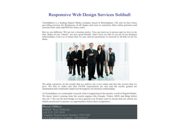
Brilliants Web offers top-notch responsive web design services that ensure your website looks great and functions flawlessly on all devices. Their experienced team creates visually appealing and user-friendly designs to help businesses establish a strong online presence.<br><br>

E N D
RESPONSIVE WEB DESIGN Flexible Layouts Designing layouts that use relative units like percentages or ems rathar than fixed units like pixels. Testing Across Devices Regularly testing the website on various devices and browsers to identify and fix any responsiveness issues. Mobile-first Approach Starting the design process with the smallest screen size in mind and progressively enhancing the layout and features for larger screens. Media Queries Using CSS media queries to apply different styles based on the device characteristics such as screen width, and resolution. Flexible Images & Media Ensuring that images and media elements scale properly within their containers to prevent them from overflowing. Viewport Meta Tag Using the viewport meta tag in the HTML head to control the layout on mobile browsers, ensures that the page is initially scaled correctly. www.brilliantsweb.in