Download

1 / 13
270 likes | 580 Views
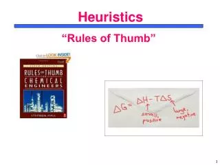
Nielsen’s Ten Usability Heuristics. Website Design http://www.useit.com/papers/heuristic/heuristic_list.html. Ten Principles for User Interface Design. Developed by Jakob Nielsen Called "heuristics" because they are more in the nature of rules of thumb than specific usability guidelines.

E N D
Nielsen’sTen Usability Heuristics Website Design http://www.useit.com/papers/heuristic/heuristic_list.html
Ten Principlesfor User Interface Design • Developed by Jakob Nielsen • Called "heuristics" because they are more in the nature of rules of thumb than specific usability guidelines.
Ten Principlesfor user Interface Design • Visibility of system status • Match between system and real world • User control and freedom • Consistency and standards • Error prevention • Recognition rather than recall • Flexibility and efficiency of use • Aesthetic and minimalist design • Help users recognise, diagnose and recover from errors • Help and documentation
Visibility of System Status • The system should always keep users informed about what is going on • through appropriate feedback within reasonable time.
Match Between System and Real World • The system should speak the users' language, with words, phrases and concepts familiar to the user • not system-oriented terms. • Follow real-world conventions, making information appear in a natural and logical order.
User Control and Freedom • Users often choose system functions by mistake • They will need a clearly marked "emergency exit" to leave the unwanted state without having to go through an extended dialogue • Support undo and redo.
Consistency and Standards • Users should not have to wonder whether different words, situations, or actions mean the same thing • Follow platform conventions
Error Prevention • Even better than good error messages is a careful design which prevents a problem from occurring in the first place
Recognition Rather Than Recall • Make objects, actions, and options visible • The user should not have to remember information from one part of the dialogue to another • Instructions for use of the system should be visible or easily retrievable whenever appropriate
Flexibility and Efficiency of Use • Accelerators -- unseen by the novice user -- may often speed up the interaction for the expert user such that the system can cater to both inexperienced and experienced users • Allow users to tailor frequent actions
Aesthetic and Minimalist Design • Dialogues should not contain information which is irrelevant or rarely needed • Every extra unit of information in a dialogue competes with the relevant units of information and diminishes their relative visibility.
Help Users Recognise, Diagnose and Recover from Errors • Error messages should: • be expressed in plain language (no codes) • precisely indicate the problem • constructively suggest a solution
Help and Documentation • It is better if the system can be used without documentation • But it may be necessary to provide help and documentation • Any such information should: • be easy to search • be focused on the user's task • list concrete steps to be carried out • not be too large