Download

1 / 45
490 likes | 767 Views
Typography and Color Theory. Mrs. Lolkema Miss Wadycki Mrs. Verpooten . What is typography?. The art and technique of selecting and arranging type styles, point sizes, line lengths, line leading, character spacing, and word spacing for typeset applications. . Typography Definition.

E N D
Typography and Color Theory Mrs. Lolkema Miss Wadycki Mrs. Verpooten
What is typography? The art and technique of selecting and arranging type styles, point sizes, line lengths, line leading, character spacing, and word spacing for typeset applications.
Typography Definition • Typography is the study of type and font. • It started as far back as the Gutenberg press.
2 Functions The two primary functions of typography are the presentation of text in a manner that is not only easy to read but also visually engaging.
The 6 races of typography Sans serif Novelty Serif Blackletter Script/ cursive Square Serif
r r serif No serif Typography Classifications • 1. Serif fonts • Serif means “foot” in Latin. • These fonts have “feet” on each of their strokes.
Serif Fonts • Are easy to read because the little feet carry your eye from letter to letter. • Are usually used for large bodies of text, like stories.
Common Serif Fonts Times New Roman Garamond Georgia Palatino Linotype
r r serif No serif Typography Classifications Sans Serif fonts • Sans means “without” in Latin • These have no marks on the strokes of the letters.
Sans Serif Fonts Are easy to read if they are large because they are very simple. Are usually used for small portions of text, like headlines & captions.
Common Sans Serif Fonts Arial Helvetica Chantilly Tahoma Comic Sans
Typography Classifications Text Black Fonts • Very old, block looking fonts Text Black
Text Black Fonts Are very difficult to read because they are so ornate. Are usually used for nameplates and anything that needs to look stately or old.
Common Text Black Fonts Engraver’s Old English
Typography Classifications Script/Cursive fonts • Are made to look like handwriting. Commercial Script
Cursive/Script Fonts • Are difficult to read because they tend to be thin and small. • Should only be used for large headlines.
Common Cursive/Script Fonts • Commercial Script • French Script • Monotype Corsiva
Typography Classifications Decorative Fonts • Most recent type of font • “Fun” fonts Platinum Blonde
Decorative Fonts Are easy usually difficult to read. Should only be used in small quantities. Should never be used in multiple places on one page.
Common Decorative Fonts Wolfpack Fatback Edith Delaney
Font Families These are fonts that have the same name and look almost the same. Like you and your family!
Font Families Are used to give unity to a publication while still giving designers a few options to work with.
A Font Family Antique Olive Antique Olive Compact Antique Olive Light
Another Font Family Eras Bold Eras Demi Eras Medium Eras Light
Mixing Fonts When using two fonts on the same page, the main goal is contrast.
Mixing Fonts Mix a sans serif with a serif. gettin’ schooled
Mixing Fonts Mix a thin with a thick. Makin’ it My way
Fonts Convey Mood Remember that fonts are a tool in telling a story. The fonts you pick should match your story
Fonts and Mood Bullies Stand up to
Typesetting • Point- size of your font • 12point, • 20point, • 30point, • 40point • Bold- makes stroke thicker • Italics
Typesetting Alignment- right, left, center, justified Leading- space in between the lines of text. Kerning- spacing between two single letters Tracking- changing the spacing between all letters equally
Legibility Legibility is the readers ability to read and understand the text based on the the texts shape and design.
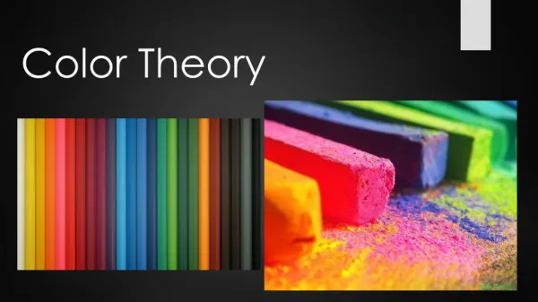
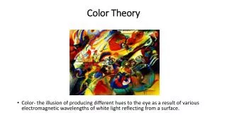
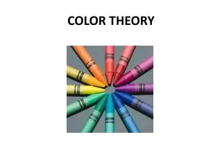
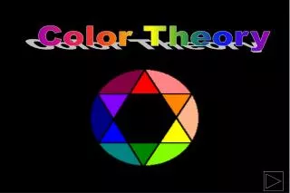
What is Color Theory? • Balance of color • How colors work together in a design • Color wheel • Color pallet
Different aspects of color • The color scheme • Color interaction • Three dimensions of color • Tints and shades • contrast
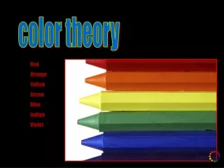
The psychology of color • What is psychology • How does color affect someone’s feelings • Red • Yellow • Orange • Blue