PowerPoint Etiquette
470 likes | 589 Views
This guide, curated by Kathy Schrock, focuses on essential etiquette for creating impactful PowerPoint presentations. It explores how to effectively use colors, fonts, transitions, and animations based on visual design research. Key recommendations include limiting the color palette to four per slide, choosing appropriate contrasts for text and background, and using no more than three fonts in four sizes. Discover tailored tips on color effects on audience perception and the emotional cues embedded in typography. Elevate your presentation skills for maximum engagement!

PowerPoint Etiquette
E N D
Presentation Transcript
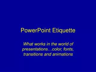
PowerPoint Etiquette What works in the world of presentations…color, fonts, transitions and animations
Created by Kathy SchrockAdministrator for TechnologyNauset Public SchoolsOrleans, MA Based on research in the area of visual design
Colors per slide • No more than four colors per slide • Too busy if use more • Viewers don’t know why you are using color • The viewers don’t know what is important and highlighted if you use lots of colors c2003. Kathy Schrock. kathy@kathyschrock.net
Colors per slide • No more than four colors per slide • Too busy if use more • Viewers don’t know why you are using color • The viewers don’t know what is important and highlighted if you use lots of colors c2003. Kathy Schrock. kathy@kathyschrock.net
Colors for type and background… You will automatically continue to see examples of color types and background. If you wish to bypass these slides, click here.
Colors to use • Light yellow on a blue background • White on a black background • Black on a light yellow background • Black on a white background may be too bright c2003. Kathy Schrock. kathy@kathyschrock.net
Colors to use • Light yellow on a blue background • White on a black background • Black on a light yellow background • Black on a white background may be too bright c2003. Kathy Schrock. kathy@kathyschrock.net
Colors to use • Light yellow on a blue background • White on a black background • Black on a light yellow background • Black on a white background may be too bright c2003. Kathy Schrock. kathy@kathyschrock.net
Colors to use • Light yellow on a blue background • White on a black background • Black on a light yellow background • Black on a white background may be too bright c2003. Kathy Schrock. kathy@kathyschrock.net
Other color information… • Don’t use red for text • It is hard to see and read c2003. Kathy Schrock. kathy@kathyschrock.net
Other color information… • Avoid red on a green background • Colorblind viewers will have difficulty c2003. Kathy Schrock. kathy@kathyschrock.net
Other color information… • For gradients, think “earth to sky” • Darker colors on bottom and lighter on top c2003. Kathy Schrock. kathy@kathyschrock.net
Other color information… • Red backgrounds stimulate emotion • Use burgundy instead c2003. Kathy Schrock. kathy@kathyschrock.net
Other color information… • Red backgrounds stimulate emotion • Use burgundy instead c2003. Kathy Schrock. kathy@kathyschrock.net
Other color information… • Green backgrounds make the viewer feel involvement with the topic c2003. Kathy Schrock. kathy@kathyschrock.net
Other color information… • Gray backgrounds make the viewer feel that the information shows a lack of commitment or neutrality c2003. Kathy Schrock. kathy@kathyschrock.net
Other color information… • Blue backgrounds indicate a calm, conservative message c2003. Kathy Schrock. kathy@kathyschrock.net
Other color information… • Yellow backgrounds indicate hope for the future and cheerfulness c2003. Kathy Schrock. kathy@kathyschrock.net
Other color information… • Purple backgrounds give the feeling of fantasy or are perceived as child-like • Save purple for the “lighter” topics c2003. Kathy Schrock. kathy@kathyschrock.net
Other color information… • Brown backgrounds are perceived as the presentation of passive information • Viewers feel that information on brown backgrounds is less stable c2003. Kathy Schrock. kathy@kathyschrock.net
Other color information… • Black backgrounds indicate power and sophistication • Ideal for presenting information that the audience has no choice but to accept • fixed budget figures • student enrollment c2003. Kathy Schrock. kathy@kathyschrock.net
Information about fonts • Type can express moods and emotions as well as images can • Type can be serious and business-like • Type can be relaxed and open • Don’t let the typeface contradict your message • No more than 3 fonts in no more than 4 sizes during a presentation c2003. Kathy Schrock. kathy@kathyschrock.net
Font details: Serif fonts • Serif fonts • tiny horizontal or vertical lines at the ends of longer line strokes • The serifs help the eye move across the text • Good for large blocks of text • Examples of serif fonts: • Bookman • Garamond • Times New Roman c2003. Kathy Schrock. kathy@kathyschrock.net
Font details: Sans-serif fonts • Sans-serif fonts • NO tiny horizontal or vertical lines at the ends of longer line strokes • Simple strokes of equal weight and thickness • Good for headlines but not lots of text • Examples of serif fonts: • Arial • Comic Sans • Eras Medium c2003. Kathy Schrock. kathy@kathyschrock.net
Fonts can express a mood • Comic sans is a gentle font • BettysHand is very relaxed • Diner makes you think of the 1950’s • Tinkertoy is a good elementary font • Schools often use the Kids font • Century Schoolbook is a formal font • Don’t let the font become distracting! c2003. Kathy Schrock. kathy@kathyschrock.net
Fonts can be congruent with the theme • A scary font such as Creepy • Lucinda Calligraphy is pretty • Old English is good for Shakespeare • Team is good for sports notes! • Teachers will recognize this font • Wingdings: Scholbokisajkth • When would you use plump? c2003. Kathy Schrock. kathy@kathyschrock.net
How much text • Use the general 6x6 rule • No more than six words across • No more than six bullet points • Words are considered markers • Text needs to include keywords only c2003. Kathy Schrock. kathy@kathyschrock.net
HOW ABOUT CAPITAL LETTERS? • Make limited use of all capital letters • Our eyes need to capture the shapes of the letters above and below the line • Words in all capital letters have nearly the same visual shape • What does this say…. c2003. Kathy Schrock. kathy@kathyschrock.net
IUMRING TO GQNGIUSIOQNS c2003. Kathy Schrock. kathy@kathyschrock.net
IUMRING TO GQNGIUSIOQNS c2003. Kathy Schrock. kathy@kathyschrock.net
Information about transitions • Good transitions can… • Help tie your presentation together • Make it flow smoothly between ideas • Signal important ideas to get the audience’s attention c2003. Kathy Schrock. kathy@kathyschrock.net
Technical aspects of transitions • Transition effects can be used with images, tables, charts, and graphs • Can add movement to • slices of a pie chart • bars in a bar chart • rows in a table • levels in an organization chart c2003. Kathy Schrock. kathy@kathyschrock.net
TransitionsGeneral rule of thumb?Keep it consistent.Inconsistencies should only be planned to draw attention. c2003. Kathy Schrock. kathy@kathyschrock.net
Blinds • The new slide is unveiled in a series of horizontal or vertical rows, similar to the effect of opening the blinds of a window Once you’ve selected a transition, Preview it to see how it will look in your presentation. ** for more assistance with this feature, contact Sue Mulderrig – ext. 5319 c2003. Kathy Schrock. kathy@kathyschrock.net
Information about transitions • Good transitions can… • Help tie your presentation together • Make it flow smoothly between ideas • Signal important ideas to get the audience’s attention c2003. Kathy Schrock. kathy@kathyschrock.net
Choosing the right transition • Should be based on • your message • your audience • the computer hardware • the length of the presentation c2003. Kathy Schrock. kathy@kathyschrock.net
Tips for transitions • It may be annoying when the same transitions are used over and over • It may be annoying when too many different types of transitions are used • Use transitions to chunk your information c2003. Kathy Schrock. kathy@kathyschrock.net
Rules for animation • Animations should serve to emphasize a speaker’s point • Too much animation weakens the points you’re trying to make • It can also serve as a distraction • Use animations sparingly – there’s such a thing as “sensory overload” c2003. Kathy Schrock. kathy@kathyschrock.net
Technical aspects of animations • Animation effects can be used with images, tables, charts, and graphs • Can add movement to • slices of a pie chart • bars in a bar chart • rows in a table • levels in an organization chart c2003. Kathy Schrock. kathy@kathyschrock.net
Using animation in a slide c2003. Kathy Schrock. kathy@kathyschrock.net
Fade in and dim • Points in a text chart are highlighted one point at a time • This prevents your audience from reading ahead of you • Focuses their attention on the point you're discussing • Dims previously introduced points c2003. Kathy Schrock. kathy@kathyschrock.net
Tips for transitions and animations • Your transitions/animations should reflect the basic feeling of your presentation • Consider the formality of your presentation and the expectations of your audience • Remember that it takes a more powerful computer to use both animations and transitions. c2003. Kathy Schrock. kathy@kathyschrock.net