Download
1 / 54
540 likes | 559 Views
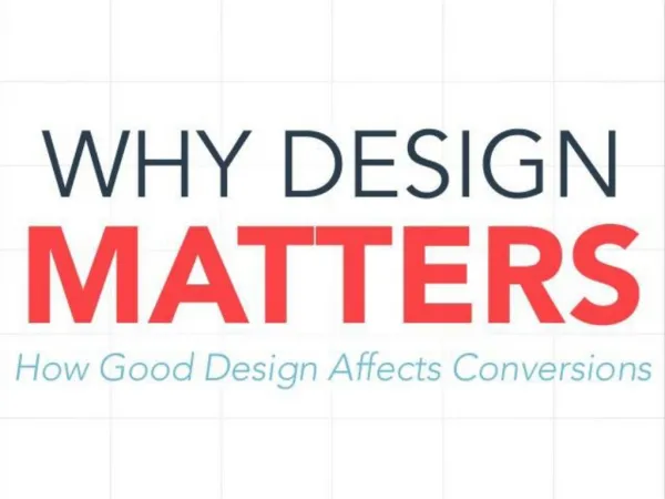
Learn the importance of good design in publication and yearbook layout. Discover key design elements and techniques to enhance your storytelling.

E N D
UNDERSTANDING WHY DESIGN MATTERS Mike Taylor, Walsworth Yearbooks
Understanding Why Design Matters You have a theme. You even have a great cover. Now it’s time to figure out what goes on each page of your yearbook. Publication design is more than placing pictures on pages. It’s more than picking pretty fonts. It’s more than using green, “because it’s my favorite color.” Good designers evolve and good design communicates. It draws the reader in, it enhances stories, it drives your well-chosen theme. Let’s get started…
Caption: The copy that explains the Who, What, When, Where, Why and How of action in a photo; plan space for every photo to have a caption Cut-out background (COB): A photo where the background is removed Dominant element: The largest eye-catching photo or collection of photos or elements on a spread Eyeline: A one-pica line that connects the left and right pages; all design elements should sit on or hang from this line External margin: A margin of white space that will frame the edges of the spread Copy: Refers to all text on a spread; copy includes captions, stories, headlines. All spreads need copy to help tell the story of the year Folio tab: Words or phrases accompanying the folio identifying the content are called folio tabs Folio: Page number on a yearbook spread Bleed: Photos, artwork or graphics that extend off of the trim area of a spread Double-page spread (DPS): Two facing pages; the left page is an even number
Internal margin/spacing: A consistent amount of white space between elements; traditionally, this has been one pica. For this design unit, it shall remain one pica. Headline: Word or words set in large type that attracts the reader to the spread; headlines traditionally are placed above copy blocks Type: Printed letters or characters White space/negative space: The absence of any element Gutter: The place where the left and right pages meet; the gutter is often one or two picas wide and is folded as the book comes together. Pica: A journalistic unit of measurement; one pica = 1/6 of an inch Logo: Artwork used to represent a company; logos can be a unifying graphic for the yearbook theme
Lesson 1: Observing the Elements of Good Editorial Design Objective — In this lesson, you will learn: To understand and recognize what makes a strong visual design
Lesson 1: Observing the Elements of Good Editorial Design • Design helps communicate the story. • The chosen photos, type and graphics are arranged on the pages to help the reader. • Design elements are not just thrown down willy-nilly, there is a plan. • Looking at great design will allow you to understand the importance of how the elements communicate. Lucy Strunk
Lesson 1 Activity: Spotting Good Design Elements • Materials needed: • Several magazines, Walsworth’s Possibilities book, Walsworth’s “Perfect Packaging” poster, Pinterest • Look at several of the yearbooks featured in the Possibilities book. • Look for examples of the following: • Dynamic photography • Captions for all pictures • Eye-catching graphics • Use of color
Lesson 2: Starting With a Blank Page • Objectives — In this lesson, you will learn: • How to recognize a well-designed yearbook spread • Basic design concepts that include column structure, external margins, internal margins, eyeline, points and picas
Lesson 2: Starting With a Blank Page • When it comes to yearbook design, where do you begin? • Pages are designed as double-page spreads (DPS). • A double-page spread means the left and right pages are seen as one layout, one unit – a horizontal rectangle instead of two vertical rectangles. • The spread has external margins. This area has two jobs: • To create a frame of white space around the page • For the printer and the binder. The printer will trim the folded pages so they are neat as they sew them into the book.
Lesson 2: Starting With a Blank Page • You will be working in a journalistic unit of measurement called a pica. • One pica equals 1/6 of an inch. Each pica is made up of 12 points.
Lesson 2: Starting With a Blank Page Let’s do a math lesson! If you have a 72-point headline, how many picas do you have? How many inches is a 72-point headline?
Three Areas Now on to the actual page design. For this, you need to think about three areas:
Lesson 2: Starting With a Blank Page Take a look at Walsworth’s “Perfect Packaging” poster. Notice that the dominant element is a large photo that is not directly in the middle, but is toward the center of the spread.
Lesson 2 Activity: Dominating Design • Often the first design element that you’ll begin with when designing a spread is a dominant photo. • This image sets the tone for the page and determines how the entire spread will be laid out. • Use the example templates and sketch how you’d design around a dominant photo. • Be sure to include areas for modular packages, copy, captions, headlines and additional photos.
Lesson 2 Activity: Manipulating Photos to Create an Eyelineand Consistent Internal Margins • Materials needed: • Various magazines, newspapers and yearbooks (preferably not your school’s book) • Walsworth layout sheets • 8 ½ x 11 white paper • Assignment: • Take the sheet of white paper and fold in in half from top to bottom, short sides together. • Tear the paper in half. • Take one-half of the paper and fold that in half and tear it as well. Now you have two 1/4 pages. • Again, take one of those pieces and fold and tear it into two 1/8 pages. • Continued on next slide
Lesson 2 Activity: Manipulating Photos to Create an Eyelineand Consistent Internal Margins Now take the largest piece of paper and lay it down in the middle of the spread. Do not place it in the direct middle. Yes, it may and should cross the gutter. Leave only one pica separation and lay down the next largest piece of paper. Once the two are down, see if you notice an eyeline. Now using the eyeline, place all pieces of paper leaving only one pica between each element. All pieces of paper should sit on or hang from the eyeline.
Lesson 3: Designing a Basic Layout Objective — In this lesson, you will learn: How to create a yearbook spread using all the basic rules of design
Lesson 3: Designing a Basic Layout Creating a design means the designer places all elements (photos, copy, graphics) on a page in a planned manner. Strong design will encourage the reader to study further and will cause them to react to the design.
Lesson 3 Activity: Time To Design Take a size 7, 8 or 9 layout sheet and examine the external margin, the pica structure and even the columns, which have been established for you. If you fold the sheet in half, you will notice the established gutter.
Lesson 3 Activity: Time To Design To keep your internal margins consistent, use grids. When you design, simply remember to start and stop on a column.
Lesson 3 Activity: Time To Design Establishing an eyeline is the first step in creating an appealing design. You should never do this directly in the center. Choose a line 1/3 of the way from either top or bottom. The eyeline is a way of visually linking the left and right pages into one spread. Draw an eyeline on your layout sheet.
Lesson 3 Activity: Time To Design Starting on a column and ending on a column, draw a large rectangular box that either sits or hangs from the eyeline.
Lesson 3 Activity: Time To Design Choosing Photos You should look at a variety of photos that have strong focal points, good composition and include a variety of people. Photos should convey the emotion you would like to express. The strongest photo should become the dominant element. The bottom of the photo will sit directly on the eyeline. Place the photo in the box you drew in step 4 on the previous slide.
Lesson 3 Activity: Time To Design Place remaining photos: Place the supporting photos in the same manner; always sit or hang from the eyeline. Place the second best photo (preferably of opposite shape). Stay one pica from the dominant. Place the third photo and always remember to start and stop on a column. Vary the shape of your photos.
Lesson 3 Activity: Time To Design Placing Captions and Copy Now draw the caption areas and copy area. Remember, photos and captions will act to tell more in-depth coverage of the story. Thus, every photo should have a caption.
Lesson 3 Activity: Time To Design Place the caption one pica away from the photo it describes. This one-pica separation will continue the use of a strong internal margin for the spread. All captions should be designed with the same width/column structure of the spread. The exception for this is group shots. Captions should also be kept to the outside, which will help maintain consistent internal margins.
Lesson 3 Activity: Time To Design When placing photos in the center of a spread, you should leave an area to place the copy and the headline to the outside of the spread.
Lesson 3 Activity: Time To Design Remember to leave room for the headline. A headline should cross over the top of the copy box and be large enough to attract the reader’s attention.
Lesson 4: Understanding Type • Objectives — In this lesson, you will learn: • How to recognize and use appropriate fonts and font families to tell a story • The differences in point size; and the difference between serif, sans serif and decorative type
Lesson 4: Understanding Type At your computer, go to the Type pull-down menu and look at all the fonts you have at your fingertips. You can easily understand why students can get confused when choosing a font. Some are easy to read, others are very decorative. Always remember, readability is the key.
Lesson 4 Vocabulary • Ascender: The part of a lower case letter that rises above the main body of the letter • Bold :Type created with a heavy stroke. Bold type adds emphasis • Centered type: Both the left and right sides of a block of type are uneven • Condensed: The font width is narrow, but the height remains the same • Descender: The part of a lower case letter that extends below the main body of the letter • Drop initial (Drop cap): A highlighted letter that is set into the text that has the remainder of the text indented to accommodate the letter • Extended: The font is made wider and the height remains the same
Lesson 4 Vocabulary Extra-bold: Type created with very heavy strokes to add emphasis (not good in large blocks of text) Flush left: Type alignment that creates a vertically even line on the left side of a text box; some call this ragged right Flush right: Type alignment that creates a vertically even line on the right side of a text box; some call this ragged left Font: A complete set of letters, numbers, punctuation marks and icons in a certain size of a printed character (also known as typeface) Font family: A style of type/font in all its widths, weights and sizes
Lesson 4 Vocabulary Italics The letters are slanted to the right: used to contrast the normal version of the font Justified type: Type alignment vertically even on both the left and right sides of a block of type Kerning :The space between characters in a font Leading: The negative space between lines of type; measured in points Light: Type made with thin lines Point: A journalistic unit of measurement; a point =1/72 of an inch; 12 points make up a pica. Type and graphic elements are measured in points and picas
Lesson 4 Vocabulary Sans serif (without feet): A font with no finishing strokes at the ends of each letter (traditionally works for headlines) Serif (feet): A font with a decorative finishing stroke at the end of the letter (traditionally works for body copy/captions) Text wrap: Columns of text will flow around a graphic, art or photo Ultra-light: Type made with very thin lines Weight: The width of the lines that create a letter Width: The horizontal measurement of a font
Lesson 4: Understanding Type Fonts You Will Need Once you have a theme and cover, choose fonts for the entire book. • Choose a decorative font to depict your theme. • a. Use this decorative font to enhance, not to tell the story • b. Use this font as a graphic treatment • Choose a contrasting font in either a serif or sans serif as your headline style font • a. All headline styles should be written in this font • b. Headlines traditionally have sans serif fonts (Myriad, Helvetica) • And finally, a body copy, caption, names font • a. Use this font throughout your book • b. Decide on a size 8-12 points • c. Pick a folio font for page number, section name, page content
Lesson 4 Activity: Font Identification Find examples of various type styles from magazines, newspapers, college brochures, posters or other printed materials. Using the list below, cut out the example and match it with its name. Ascender/Descender Justified type Bold Kerning Centered type Leading Condensed Sans Serif Drop initial Serif Extended Text wrap Italics Ultra-Light
Lesson 5: Selecting Fonts • Objectives — In this lesson, you will learn: • How to choose a font family that will help convey the appropriate message in the yearbook • How to determine the proper font size and placement for your design
Lesson 5: Selecting Fonts • When you begin to decide on fonts, you should consider the theme. • For a classic theme: Garamond, Times or Helvetica would be appropriate for the voice of the book. • For a modern theme:Check out Futura, Gotham or Proxima Nova. • No matter your choice, remember to stick with a font family. • When looking for a family, look for a font that has a thick weight, thin weight, bold, italics and even ultra-bold and ultra-thin. • Some fonts will have serifs and san serifs. This provides the • contrast needed for headlines, sub headlines and copy without • sacrificing the voice of the book.
Lesson 5: Selecting Fonts • Body Copy • When making font choices, also decide on leading choices, justification choices and indent styles. • Fonts for main stories throughout the book should be consistent. • Depending on your font choice, body copy size should be set anywhere from 8-10 point. Theme copy is often larger, but not too large for a sophisticated appearance. • Serif fonts are also called Roman fonts. These fonts have small strokes at the ends of the letters. When set in long blocks of copy, the strokes help the reader distinguish between letters, thus making the copy easy to read. Old style/ traditional Roman fonts include Palatino, Garamond and Times.
Lesson 5: Selecting Fonts • Column Width • Use a column that is one and one half the size of the point size of your chosen font. • Therefore, if you have a 10-point font, you would use a 15-pica column. • Remember, you may use multiple columns to tell your story. • Making text too wide causes the reader distress.
Lesson 5 Activity: Picking Appropriate Body Copy Fonts • Using your basic design from Lesson 3, simply highlight the text for the body copy area. Replace the text with any decorative font. • Turn that decorative font into odd colors • Turn that decorative font into bold • Use the shadow command to change the font • Use the stroke command to change the font • After each change, decide if you would actually read that block of text. • More than likely, the answers will be a definitive “no.”
Lesson 6: Headline Type • Objectives — In this lesson, you will learn: • Different styles of headlines and how to use them to create interest in a yearbook spread • What fonts work best for a headline and add visual appeal to a spread • How to determine the appropriate size for headlines
Lesson 6: Headline Type • The best yearbook staffs design their headlines. • Designers look to magazines, Pinterest or Design Shack for great examples. • Headline rules do vary more than the body copy rules. Why? Because headlines are larger and are made to attract attention. • You know that decorative font you used on your cover? It is OK to now use that font in a letter or word; never the entire headline. • Therefore, it is important that you select a headline font that will contrast nicely with your theme font. In other words, two serifs will probably not mix well.
Lesson 6: Headline Type Instead of using multiple fonts, use a texture, color or even different capitalization formats to add the desired emphasis. Remember, headlines attract. That’s their job. When someone wants to attract attention, they get dressed in their best outfits. Yearbook headlines need to think in the same manner.
Lesson 6: Headline Type Headlines should be varied in design, but consistent in font choice. This is where the imagination and creativity will really come in to play. When setting your headlines, never just type it and walk away. Your design program will use a default kerning. You should never just allow the default to do your work. Change the kerning so the letters are tighter or spaced to help you attract attention.
Lesson 6: Headline Type Pairing fonts is also essential to attract attention. Often, the theme will use a script or cursive font. The best place to carry this font through in the yearbook is the headlines. However, be careful. The best use of a script is in a large font. Scripts look best using the first letter in caps and subsequent letters in lower case, not all caps. Headlines work in all caps in some fonts. Body copy or captions will not. All caps in large blocks of text are difficult to read. Modern publications are setting the headlines in all lower case. Whatever your choice, just be consistent.
Lesson 6 Activity: As a Matter of Font Use two contrasting fonts to create different looks for these headlines: Dance Know How Dance team makes a second win as District Champs Turning Point Swimmers change their fate half way through the season Prying Eyes Photo Club works with professional to develop Once you have completed creating the headlines, add them to the basic design spread you created in Lesson 3.
Lesson 7: Creating a Secondary Coverage Package Objective — In this lesson, you will learn: How to manipulate a basic design to accommodate more coverage, photos and information
Lesson 7: Creating a Secondary Coverage Package • At this point, a book created with the design rules you have learned • so far will be visually appealing to the reader. • However, there is little difference from one spread to the next. • Most spreads have only five to seven photos. The story is there, but there is little area to explore and report more information. • So now it is time to add some variety to the spreads. • Work with one of the photo areas you have created. • Decide on a photo area and simply design a secondary coverage package in that chosen area.