Download
1 / 10
100 likes | 111 Views
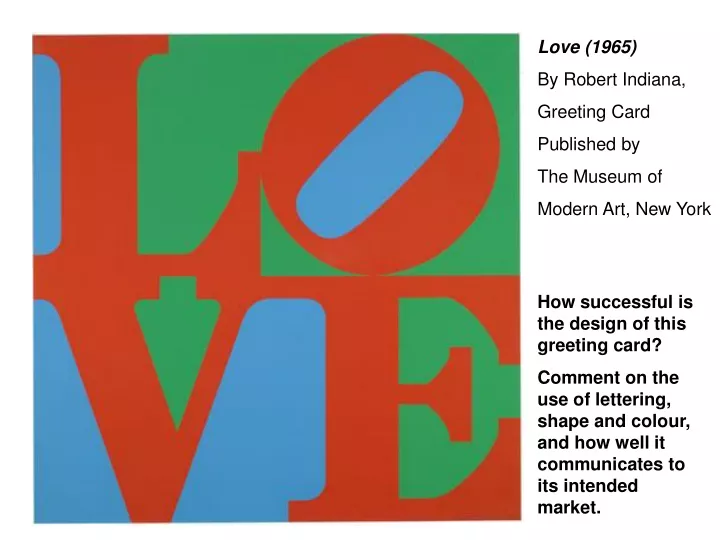
Love (1965) By Robert Indiana, Greeting Card Published by The Museum of Modern Art, New York. How successful is the design of this greeting card? Comment on the use of lettering, shape and colour, and how well it communicates to its intended market.

E N D
Love (1965) By Robert Indiana, Greeting Card Published by The Museum of Modern Art, New York How successful is the design of this greeting card? Comment on the use of lettering, shape and colour, and how well it communicates to its intended market.
You would gain marks here by making sure you ANSWER THE QUESTION which has been asked: how successful is this design? • Why do you think it is successful? • Target audience? • You MUST comment on the use of shape, lettering and colour. A good place to start is with the shapes created by the lettering (positive and negative shape); the use of only three colours and the bold impact this has on the design (don’t forget to use words such as ‘primary’ and ‘secondary’ colour; the bold lettering and the use of space within the outer shape
Assassins Creed cover design for Sony Playstation3 Comment on the use of technology in this graphic work. What does it communicate about the product and the target market? What is your personal opinion of this style of graphic design?
Comment on the use of technology (i.e Photoshop, creating a sleek, graphic finish, would could not be done by hand). The use of highlighting and colours help to communicate that it is intended for a specific market… • Which age group/ gender might this be? Reasons why you think this? • You should mention that the Playstation 3 logo is clearly shown, and incorporated into the design. • All text is designed to communicate what the game is about, and who the intended market might be – be sure to speak about this.
What target market is this packaging design aimed at? • Refer to imagery, lettering and colour. • Do you think it is successful?
You should have started your answer by stating that the images used are designed to attract younger children, and possibly teenagers. • You should have referred to the fun, child-like lettering, bubble-shaped text, and the different stylesand colours used for the lettering. • Mention the cartoon-style drawing, and refer to the techniques used to produce this image (air-brushed/ Photoshopped to make the character appear softer, and more amusing). • Cereal hoops are scattered around the packaging, clearly showing children what the contents look like. • The background is bright and colourful (only primary colours). This light background helps the dark-coloured text, and makes it more prominent/ easy to see. • Clever placement of the fiber content for adults/ parents, making the cereal look more appealing for the health-conscious.
Comment on the effectiveness of this graphic design. • What does it communicate to us? You should refer to use of imagery, colour and visual impact. • What is your opinion of this design? • Apple logo from 1990s, and below, the logo on an Apple computer.
You should have started your answer by stating that the image is highly coloured, and what these colours might be a symbol of. State that they are bright, bold, eye-catching and lively for extra marks. • It is important to state that the apple is simplified, and that there is a bite taken from the apple. • Can this bite also be referenced to a byte, or part of computer memory? • When stating your opinion of the design, you should be sure to refer to target market/ audience, simplicity of design, how eye-catching and instantly recognisable it is, and the logo image itself replacing the word ‘Apple’.
Discuss the methods used by Klimt to portray the character of the sitter. • Comment on at least two of the following: composition; colour;pattern; pose • What is your opinion of the painting? Portrait of Adele Bloch Bauer (1907) by Gustav Klimt. Oil, silver and gold on canvas (138 x 138cm)
You should have started your answer by talking about the contrasts in the surfaces of this painting (the woman’s face is pale, smooth and flawless, in contrast to the background, which is encrusted with gold swirls and pattern). • You should comment on the effect all this swirling pattern has: it helps us to focus more on the woman’s face, as it is painted so differently from the background and surrounding areas. • The woman looks quite thoughtful, and seems to be ignoring the riches (in colour and pattern) that surround her. • When speaking about your opinion of the painting, you should refer to whether you believe it to be an effective portrait, in terms of how well it represents the woman. You should also comment on Klimt’s use of media/ materials, technique and colour.