Download
1 / 73
730 likes | 857 Views
English presentation skills: seminars in chemical biology. Powerpoint use. Contents. Part I: Slide exercise discussion Some more verbal communication Part II: Powerpoint use Part III: Chemical biology questions. Exercise. Exercise. Verbal communication – speech melody.

E N D
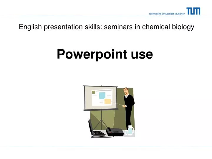
English presentation skills: seminars in chemical biology Powerpoint use
Contents • Part I: • Slide exercise discussion • Some more verbal communication • Part II: • Powerpoint use • Part III: • Chemical biology questions
Verbal communication – speech melody • Falling pitch at end of a sentence • Rising pitch when something is to follow • Pause after a ‘thought group’ • “I was about to leave my office, (pause) when I realized I left my notebook there.” • “They who sold quickly (pause) made a profit” • “They who sold (pause) quickly made a profit.”
Verbal communication – speech melody • Don’t give every word the same emphasis • Emphasis changes meaning • He went to the OFfice that morning. • HE went to the office that morning. • He went to the office THAT morning.
Verbal communication – speech melody • Exercise: Underline word with emphasis / for pause Arrow for intonation • Many Hong Kong children suffering from asthma were unable • to attend school recently on account of the unhealthy air • quality. Officials had advised those suffering from heart or • breathing problems to stay indoors until the air quality improved. Taken from: Language Center of Hong Kong University for Science & Technology
Contents • Part I: • Slide exercise discussion • Some more verbal communication • Part II: • Powerpoint use • Part III: • Chemical biology questions
Powerpoint points • Text • Colors • Pictures: graphs & tables • Templates & lay out • Animations • Presenter’s view
Text: use Sans Serif font • This is Arial • This is Helvetica • This is Comic Sans • This is Times New Roman • This is CG Times • This is Courier Sans Serif Serif takes longer to read used for long texts
Text: Avoid all capital and italics • DO NOT USE ALL CAPITAL LETTERS IT IS NOT PLEASANT TO READ • Similar is true for italics • Doesn’t this read easier?
Text: boldface looks good • Arial vs Arial Bold • Helvetica vs Helvetica Bold • Boldface: Titles and highlights
Text: keep it legible • 28 point size • 24 point size • 20 point size • 18 point size • 14 point size • 12 point size Use 20 points or larger Reference in 14 points is OK
Make titles informative • Summary/conclusion of the slide • Audience gets the main point without paying attention
Don’t use too much text • If you have a slide like this, with a lot of text, nobody in the audience is going to read all this, they just wait until you read it to them. And if they start reading it all, you have lost their attention and it will be hard for them to get back to the story that you are telling. • Of course, it is tempting to use text to remember what to say, but do not use full sentences.
Don’t use too much text • One line per bullet point • Statements, not full sentences • Do not forget visual learners
Limit lists to a few points • One • Two • Three
Don’t make too many sublists • One • Item 1a • Item 1b • Item 1c • Item 1c-1 • Item 1c-2 • Two • Item 2a • Item 2b • Three
Powerpoint points • Text • Colors • Pictures: graphs & tables • Templates & lay out • Animations • Presenter’s view
Text: use of colors • Dark against light • Or Light against dark • Works best for small rooms
Text: use of colors • Black or dark blue background best for large rooms • But: room should be dark!
Be careful with color combinations! • This is hard to read and hurts your eyes • Because the contrast is too low • Maximize contrast when using colors • For graphics: white contrasts with most colors
Be careful with color combinations! • People might not be able to read this • Avoid red-green combinations • 5-8% of males is colorblind Sometimes it’s unavoidable
Powerpoint points • Text • Colors • Pictures: graphs & tables • Templates & lay out • Animations • Presenter’s view
Graphs and charts • Birthrate EU 8.2-15.5 • Germany lowest • Ireland highest • World average 20.3
Keep graphs simple • Not too much data! • What do you want to proof/show?
Bargraphs essentials • Legible text • No gridlines • Include numerical value
Bargraphs essentials • Do not use 3D bars • Information gets distorted
Exercise • How to improve this graph?
Pie charts: Avoid if possible • Why? Areas harder to judge than length
When to use pie charts • Small number of categories • Slices should be large
Copy-pasting from Excel • Select chart and press Ctrl+C • In Powerpoint: use ‘paste special’ → Enhanced metafile
Copy-pasting from pdf’s • Use ‘snapshot tool’
Copy-pasting from pdf’s • Or: Printscreen and crop Picture toolbar magnification
Powerpoint points • Text • Colors • Pictures: graphs & tables • Templates & lay out • Animations • Presenter’s view
Lay out: slide design • Keep it simple! • I don’t like most templates
Use templates with care • Do not use colored backgrounds • Unless it’s black or dark blue Green Orange Pink Red
Don’t go crazy • Keep background free of patterns/watermarks
An old slide design of mine Lots of space for title Lots of space for figures and text
Keep structure recognisable • For long talk: use a ‘Content’ slide after Title slide • Let ‘Content’ slide come back & highlight topic
What is wrong with this slide? There is some text explaning the figure and table here
Use a lot of empty space Edges may get cut off… Empty space creates rest
What is wrong with this slide? • AOMK probes: Label purified proteases • Label proteases in whole cells • Knock-out cell line shows: Cat B/CatL • Imaging of proteases: • Specific lysosome staining
Break it down in 3 slides • AOMK probes: Label purified proteases • Label proteases in whole cells • Knock-out cell line shows: Cat B/CatL • Imaging of proteases: • Specific lysosome staining
New probes can label purified proteases • Acyloxymethyl ketones (AOMK): electrophile • Modification of active site Probe structure here
Do not present too much information at once • Make only 1 or 2 points/conclusions per slide • Don’t include figures you won’t discuss!
Powerpoint points • Text • Colors • Pictures: graphs & tables • Templates & lay out • Animations • Presenter’s view
Slide transitions: don’t use them • They don’t add anything