Download
1 / 13
130 likes | 249 Views
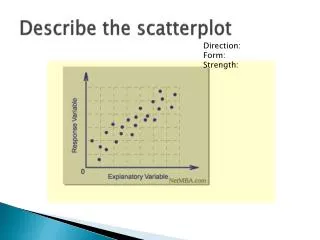
Reading a scatterplot. Examples: Mars rocks (sulfate is measured as a percentage & redness is measured as a ratio of red to blue in light spectra) American Association of University Professors (cases are different academic disciplines). SAT score versus length of essay GPA versus SAT.

E N D
Reading a scatterplot • Examples: • Mars rocks (sulfate is measured as a percentage & redness is measured as a ratio of red to blue in light spectra) • American Association of University Professors (cases are different academic disciplines)
SAT score versus length of essay • GPA versus SAT
Correlation coefficient • Point of averages: (average of variable 1, average of variable 2) • SD’s of both variables • These describe the center and spread of the data.
Figure 1. Car ownership in Anytown, by household income www.statistique-canada.com/.../scatter.htm
Correlation coefficient • r = correlation coefficient • Definition: measure of linear association • r is always between -1 and 1 • A positive value of r means there is a positive slope of the data – both variables increase together. • A negative value of r means there is a negative slope of the data – as one variable increases the other decreases or vice versa.
Figure 2. Strong linear relationship of variables www.statistique-canada.com/.../scatter.htm
Figure 3. Scattered data points www.statistique-canada.com/.../scatter.htm
Figure 4. Very low or zero correlation www.statistique-canada.com/.../scatter.htm
Figure 5. Data widely spread www.statistique-canada.com/.../scatter.htm
The relationship between 2 variables can be summarized by: • Average of the x-values • SD of the x-values • Average of the y-values • SD of the y-values • r
The SD line passes through the point of averages and through all of the points which are an equal number of SD’s away from the average for both variables. • The slope of the SD line is ± • + for a positive association • - for a negative association
Computing r • Convert each value of each variable into standard units • Take the average of the products • Example: x: 3, 4, 5, 8, 10 y: 12, 10, 7, 6, 2