Misleading Graphs and Statistics
Misleading Graphs and Statistics. Arizona State Standard:. Objective. I will recognize misleading pictographs and bar graphs. I will recognize and correct misleading line graphs. Questions to Ask When Looking at Data and/or Graphs. Is the information presented correctly?

Misleading Graphs and Statistics
E N D
Presentation Transcript
Misleading Graphs and Statistics Arizona State Standard:
Objective I will recognize misleading pictographs and bar graphs. I will recognize and correct misleading line graphs.
Questions to Ask When Looking at Data and/or Graphs • Is the information presented correctly? • Is the graph trying to influence you? • Does the scale use a regular interval? • What impression is the graph giving you?
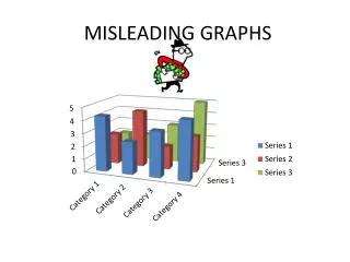
What makes a graph misleading? • Irregular Intervals • Break in the scale (horizontal/vertical) • Distorted data *Over/Under-sized bars/pictures • Biased Title • Vertical Axis starting @ something other than zero
Why is this graph misleading? This title tells the reader what to think (that there are huge increases in price). The scale moves from 0 to 80,000 in the same amount of space as 80,000 to 81,000. The actual increase in price is 2,000 pounds, which is less than a 3% increase. The graph shows the second bar as being 3 times the size of the first bar, which implies a 300% increase in price.
A more accurate graph: An unbiased title A scale with a regular interval. This shows a more accurate picture of the increase.
Why is this graph misleading? The scale does not have a regular interval.
Graphs can be misleading in the news. • The margin of error is the amount (usually in percentage points) that the results can be “off by.” • Be wary of data with large margins of error.
Problems: • The difference in percentage points between Democrats and Republicans (and between Democrats and Independents) is 8% (62 – 54). Since the margin of error is 7%, it is likely that there is even less of a difference. • The graph implies that the Democrats were 8 times more likely to agree with the decision. In truth, they were only slightly more likely to agree with the decision. • The graph does not accurately demonstrate that a majority of all groups interviewed agreed with the decision.
Let’s Practice! • Review what can cause a graph to be misleading … • Are you ready???
Let’s Practice • Page 228 • #1 - 14