1 / 1
Analyzing the Impact of Color Schemes on Text Clarity in Computer Graphics
10 likes | 150 Views
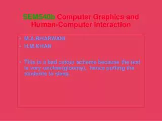
This study by M.A. Bharwani and H.M. Khan examines the effects of poor color schemes on text clarity within computer graphics and human-computer interaction. It highlights how gloomy color combinations can render text unclear, leading to decreased engagement and cognitive fatigue among students. The research sheds light on the importance of effective color usage in educational materials and digital interfaces to maintain attention and enhance readability, ultimately benefiting user experience and learning outcomes.
Download Presentation 

Analyzing the Impact of Color Schemes on Text Clarity in Computer Graphics
An Image/Link below is provided (as is) to download presentation
Download Policy: Content on the Website is provided to you AS IS for your information and personal use and may not be sold / licensed / shared on other websites without getting consent from its author.
Content is provided to you AS IS for your information and personal use only.
Download presentation by click this link.
While downloading, if for some reason you are not able to download a presentation, the publisher may have deleted the file from their server.
During download, if you can't get a presentation, the file might be deleted by the publisher.
E N D
Presentation Transcript
SEM540b Computer Graphics and Human-Computer Interaction • M.A.BHARWANI • H.M.KHAN • This is a bad colour scheme because the text is very unclear(gloomy), hence putting the students to sleep.
More Related
