Download
1 / 8
80 likes | 372 Views
Typography -- Using Text There are two basic types of fonts: Serif Sans Serif Typography -- Using Text Fonts that are cross-platform: Windows Mac Unix Arial Helvetica Helvetica Times New Times Times Roman Courier New Courier Courier

E N D
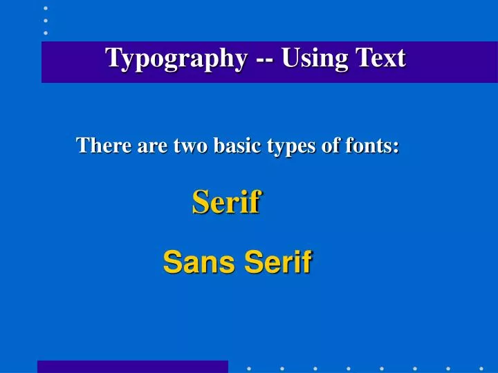
Typography-- Using Text There are two basic types of fonts: Serif Sans Serif
Typography-- Using Text Fonts that are cross-platform: Windows Mac Unix Arial Helvetica Helvetica Times New Times Times Roman Courier New Courier Courier
Typography-- Using Text Readability -- how easy it is to read a lot of text • A clean serif typeface is most readable • Not too big (not above 14 point) • Not too small (not below 10 point) • Never set large amounts of text in bold, italic, • caps, small caps, script, etc. Small amounts • are OK when necessary.
Typography-- Using Text Readability (cont.) -- • Avoid very long lines of text -- never let text • spread out across the entire browser window. • Try to keep type in block indents. • Avoid very short lines of text -- very short lines • break up the thought patterns too much. • Make sure there is enough contrast between • the type and the background.
Typography-- Using Text Legibility -- how easy it is to recognize short bursts of text such as headlines, buttons, signs, etc. • Generally, use a sans serif typeface • Avoid special type faces where ascenders • hardly taller than the body, mix capitals • and lower case together, etc. • Don’t set all type in caps
Typography-- Using Text Contrast text wisely There are six ways to contrast type: 1. Size 2. Weight (thickness) 3. Structure 4. Form (shape) 5. Direction (e.g. slant) 6. Color
Typography-- Using Text Contrast text wisely (cont.) Strive for: A contrasting relationship -- typefaces and elements are clearly distinct from each other Be careful of : A concordant relationship -- only one type family A conflicting relationship -- a combination of typefaces too similar in size, style, weight, etc.
Typography-- Using Text Variables that affect how type appears on a user’s monitor -- • Browser’s default font • Browser’s default font size • Resolution of the monitor • Windows 95 - custom font size setting in • “display” • Font specified in HTML file by designer • Font size specified in HTML file by designer