Essential Guidelines for Creating Effective Presentation Slides
This guide outlines key strategies for preparing impactful presentation slides. Emphasizing simplicity, clarity, and consistency, it advises against overcrowding slides with multiple topics, advocating for one topic per slide. Key principles include the 7x7 rule, using bullet points, maintaining readable text size and typeface, and selecting color schemes wisely. Furthermore, it highlights the importance of aligning content and using visuals to enhance understanding. Remember, slides support your message, so focus on engaging your audience effectively.

Essential Guidelines for Creating Effective Presentation Slides
E N D
Presentation Transcript
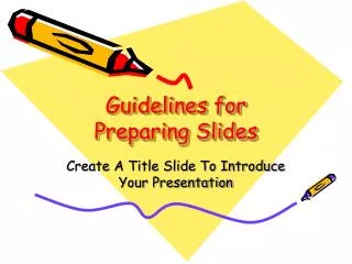
Guidelines for Preparing Slides Create A Title Slide To Introduce Your Presentation
Outline Formats Are Easier To FollowDo not try to cover too many topics—this may strain the audience’s attention or cause confusion.
Maintain A Consistent LayoutA consistent layout and color scheme will create continuity and cohesiveness.
Use Bullets, Not Numbers • Bullet points replace complete sentences. • Bullets imply no significant order. • Use numbers only to show rank of sequence.
Keep Slides Easy To Read And UnclutteredAllow plenty of room around borders and illustrations.
Select Readable Type Size • 36 point for titles—minimum. • 24 point for body text—minimum. 45 Point 40 Point 35 Point 30 Point 25 Point 20 Point 15 Point 10 Point
Use A Readable Typeface And Font • Use Sans serif (no curly feet) such as Arial or universal for body text. • Use Serif (curly feet) such as Times New Roman or Courier for body text. • No more than two fonts per slide.
Typeface Examples • Typeface Examples • Typeface Examples • Typeface Examples • Typeface Examples • Typeface Examples • Comic Sans MS • Universal • Times New Roman • Arial • Century Schoolbook
Adjust Lettering To Discriminate Or Emphasize • Make titles a larger type size than body elements. • Emphasize important statements or words with bold, italic, larger size, color, or different fonts.
Choose Color Carefully • Use the same color consistently throughout the presentation. • Use light letters on a dark background and dark letters on a light background. • Do not let color overpower the words. • Use color to communicate, not decorate.
Use Solid Colors Instead Of Fill Patterns On Charts • Patterns on bars or pie slices cause confusion. • Solid colors convey a clear bold message.
Enhancing the Presentation • Add Clipart, Pictures, Bitmaps, Animation, Video Clips, and Sound where appropriate. • If ever.
Enhancing The Presentation • Transitions • The most natural movement is from left to right. • If making a special point, text could move from the right to left. • Too many things flying around the screen detracts from the presentation. • Not every slide needs to be animated.
Enhancing the Presentation • Keep everything in alignment. • Don’t go outside the default title and text block. • Use handouts to show more detail than will project well on a slide.
Your Slides Are Not Your Presentation • Slides draw attention to presentation. • Focus interest on what is important. • Audience must finish reading before you start talking. • Do not read slides.
Always use at least one but no more than two summary/conclusion slides. Summary Slide
Finish Slide • “Thank You For Your Attention” or other appropriate finish slide. • Include 2 or 3 copies of finish slide to avoid inadvertent mouse “clicks”.

















![[GDPR Webinar Slides] Preparing for the GDPR - the Compliance Countdown Begins](https://cdn4.slideserve.com/7518879/preparing-for-the-gdpr-the-compliance-countdown-dt.jpg)
