Download
1 / 17
170 likes | 260 Views
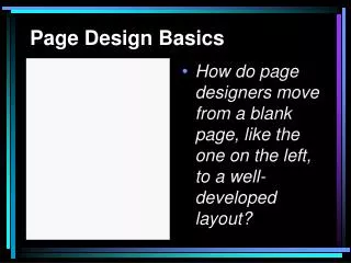
Basics of Page Design. Page designers want readers to be able to proceed in an orderly manner as they scan page and move effortlessly from story to story. The basics. One format dominates American journalism – modular format

E N D
Page designers want readers to be able to proceed in an orderly manner as they scan page and move effortlessly from story to story
The basics • One format dominates American journalism – modular format • Every story, along with pictures, graphics, etc., arranged in shape of square or rectangle. No odd (P) shapes.
Not just enough to be in a module. Need to arrange knowing will see picture, then headline. So arrange so can glide from picture to headline. (Doesn’t matter what side put picture on, readers won’t be too taxed if picture is at end of headline)
Always start with the art. Find your dominant photo. Put that in. Then add that text. Move on to next photo. How will you anchor the page, make it even?
If more than one picture or graphic, play one larger so your package will have focus
Dominant photo • Dominant photo (or graphic, etc.) placed on upper half of page, usually top right or left. Now, a lot of publications put it in the middle. Can take up a fifth of page. • Dominant image used to package story that gives page focus; smaller photos then used elsewhere to make sure readers scan whole page
Need lots of info above the fold, for sales from vending machines. Three stories (or start of) above fold is ideal.
Headlines Remember to vary. Usually 54 to 66 is biggest you will go.
Contrast • You can increase the contrast of modular designs by using • Assortment of horizontal and vertical modules • Varying column widths and thickness of rules (a lot of papers requiring horizontal and vertical line separators between stories) • Adding color (not just photos but including in service journalism boxes)
Varying modules • Without a variety of horizontal and vertical modules, pages may seem static and unexciting • Work hard at finding a dominant image • Strive for variety when cropping images • Sketch rough drawing of how page might look • Balance – avoid pages lopsided or too top heavy
Use “bastard” measures – columns that are wider than normal • Most papers are six columns of 12p3 (12 picas, 3 points) – there are six picas in an inch, 12 points in a pica (so 72 points in an inch) • so 24-point headline measures 24 points from bottom of the descenders to top of ascenders (more of this next class)
Rules are usually measured by their width and serve three functions: • Separate items on a page • Group items • Establish a page’s personality
Color can: • make papers more interesting – even with exact same content, readers prefer pages with color • Help direct the reader’s eye • Help show which stories are related • Help establish paper’s personality
What if you’re short? *Add a mugshot*Enlarge a display photo*Add a liftout quote*Add subheads (if appropriate)*Add more display type (if possible)*Lead out your story
What if you’re long? • Trim the story (if possible) • Jump if there’s at least 4 inches to jump • Reduce the size of a photo • Trim an adjacent story (if possible) • Reduce the amount of display type.
Criticism of Modular Layout • Papers look too much alike • Too boxy, limits amount of contrast • Allows design considerations to dictate content (each story must fit the rectangle)