Responsive Website Development Agency
Nova Developments specializes in Responsive Website Development, creating websites that adapt seamlessly across all devices, from desktops to smartphones. Our expert team ensures that your site delivers a consistent and user-friendly experience, regardless of screen size or orientation. By employing cutting-edge techniques like fluid grid layouts, flexible images, and mobile-first design, we build websites that are not only visually appealing but also optimized for performance and SEO. <br><br>https://nova-developments.com/web-development/


Responsive Website Development Agency
E N D
Presentation Transcript
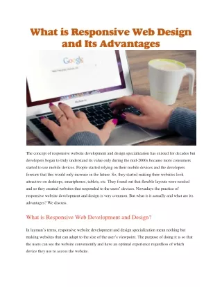
Introduction Responsive website development is crucial in today's digital landscape. With the variety of devices used to access the internet, ensuring that a website functions seamlessly across all platforms is essential for user satisfaction and engagement.
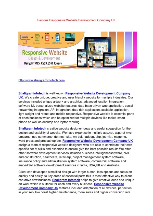
1. Definition Responsive web design allows a website to adapt its layout and content based on the screen size and device used by the visitor. This approach ensures a consistent and optimal user experience on desktops, tablets, and smartphones. 2. Importance Enhanced User Experience: Adapts to any device, providing a user-friendly interface. Improved SEO: Search engines favor mobile-friendly websites, which can improve your search rankings. Cost-Efficiency: Reduces the need for separate designs for different devices, streamlining development and maintenance. Key Concepts
Fluid Grid Layouts Utilizes percentage-based widths rather than fixed sizes to allow content to resize according to the screen width. Flexible Images Images and media elements are scaled to fit the container, ensuring they don't overflow or become distorted on different devices. Media Queries CSS media queries apply different styles based on the device's characteristics, such as screen width, height, or orientation. Mobile-First Design Designing the mobile version of a website first ensures that the most critical content and features are accessible on smaller screens before expanding to larger devices. CoreTechniques
Benefits • Broader Reach: Ensures your website is accessible on any device, reaching a wider audience. • Higher Engagement: A responsive site reduces bounce rates and encourages users to spend more time on your site. • Future-Proofing: Adapts to new devices and screen sizes, providing long-term benefits.
Conclusion Responsive website development is a vital strategy for modern web design. By ensuring that your website is flexible and adaptable, you enhance user experience, improve search rankings, and future-proof your online presence.
Contact Us Website: www.nova-developments.com Email: info@nova-developments.com Phone: (248) 675-5713
Thank you Nova Developments www.nova-developments.com