Download
1 / 14
140 likes | 240 Views
Explore the redesign process of Hotmail to improve usability. Discover issues, methods, results, and the redesigned interfaces for a seamless email experience.

E N D
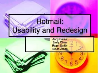
Hotmail:Usability and Redesign Andy Garza Emily Chen Ralph Smith Susan Jones
Overview • Background • Issues • Methods • Results and Analysis • Redesign
Background • Hotmail is a free web-based email system, open to everyone. • How are users using Hotmail? What difficulties do they experience when performing common tasks with it? • What improvements can Microsoft make in Hotmail’s usability?
Issues • Navigation • Speed • Accessibility
Methods: Test Format • Participants • Pre-test questionnaire • Formal testing in a usability lab • Walkthrough • Pilot test • Tests • Post-test questionnaire and summary session
Methods: Scenarios • Scenario 1: Registering for Hotmail and Logging On (time limit: 10 minutes) • Scenario 2: Reading, Composing, and Sending Messages (time limit: 15 minutes) • Task A: Check for email messages received from Hotmail. • Task B: Write an email message and send it. • Task C: Check for a new message and respond to it.
Methods: Data Collected • Quantitative • Time spent on task • Percentage of test participants succeeding/failing at tasks • Qualitative • Think-aloud protocols • Facial expressions • Interview responses
Results and Analysis • The Hotmail Search feature failed. Enable or remove the Hotmail user search feature. • It is difficult to attach files. Reduce the number of steps required to attach files and change the default file type to “all files.” • User feedback is lacking. Provide better and more visible feedback to users. • Internal and network errors are common. Research the causes for internal errors and network errors and determine ways to improve the robustness of the product. • The Enter key does not always work. Allow users to use the Enter key and Submit button interchangeably.
Results and Analysis (continued) • Users weren’t sure how to reply to mail. Make more obvious the functions of radio buttons versus links. • Icons, buttons, options are sometimes hard to find. Consistently position buttons, icons, options, etc. so that users learn where to find items. Avoid duplicating options on a single window. • The password clue was confusing. Use a more familiar password reminder, such as “mother’s name.” • Some language was confusing. Find a synonym for the word “compose.” “First name” and “last name” are terms international users might fail to recognize.
Redesign • Prototypes include • Inbox page • Compose page • Add Attachments page
Redesign: Inbox Page • Search function is enabled • Reply button is enlarged and “active” • Icons, buttons, and options are consistently placed
Redesign: Compose Page • “Compose” has been replaced by “Write email.” • An icon reinforces the meaning of this option. • Tabbed interface is more familiar to users than radio buttons. • Attach Files button is prominent.
Add Attachments Page • The two-step process is clearly documented and visually separated. • Default file type is “All Files.”