Download
1 / 32
320 likes | 440 Views
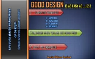
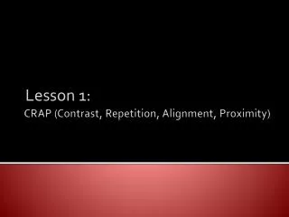
CRAP (Contrast, Repetition, Alignment, and Proximity). Graphic Design Principles. O nce upon a time in a far away place called Media world There were five royal hero’s across the land. So let us take a wonderful journey to meet these hero’s. Contrast refers to the way in which

E N D
CRAP (Contrast, Repetition, Alignment, and Proximity) Graphic Design Principles
Once upon a time in a far away place called Media world There were five royal hero’s across the land. So let us take a wonderful journey to meet these hero’s.
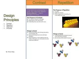
Contrast refers to the way in which • an element stands out above the • rest of the piece • Making Items distinct and • different from one another. • Avoid elements that are merely • similar – make them different, • very different King Contrast
When using contrast you will • notice that the page that one • is creating looks interesting • especially for the readers • One can use different colors, • fonts, shapes to grab the • attention of a reader. • Its function is to draw the attention • of the viewer, and create a focal • point to help the viewer determine • which part of the information is • important. King Contrast
After using Contrast Before using Contrast The Meeting of the century Who: The King When: March 17, 2007 Where: At the royal palace The Meeting of the century Who: The King When: March 17, 2007 Where: At the royal palace
After using Contrast Before using Contrast
Contrast • Difference between elements • Adds visual interest • Organizes and guides • Approaches • Typefaces • Headings and subheads • Graphic elements • Direction • Size • White space Contrastingcolors ALL CAPS vs. lowercase Contrastingfonts BOLD vs. regular Contrasting shapes Contrasting sizes
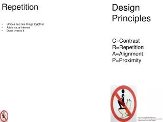
“Repeat some aspect of the design • throughout the entire piece.” • When repeating throughout your • design it may signify something • important . • A conscious effort and willingness • to unite, join, fuse, the entire page • together (print or web based) Queen Repetition
You can repeat colors, shapes, • textures, spatial relationships, line • thickness, fonts, sizes, graphic • concepts, etc. • This helps organize the information, • reduces clutter, and give the • reader a clear structure • Thought of as Consistency, • Continuity of all pages Queen Repetition
Example of Repetition I am the Queen of Repetition And here is my crown to prove it Crown
After using Repetition Before using Repetition • When you get to the end of the information, does your eye just wander off the card? • Repeated bold type encourages reader to “bounce” between the two dominant typefaces
After using Repetition Before using Repetition
After using Repetition Before using Repetition
Repetition • Repeat one or more design elements or portions of an element • Guides and organizes • Creates consistency and unity • Approaches • Headings, subheads • Page numbers • Rules, bullets • Typefaces • Margins, etc.
“Nothing should be placed on • the page arbitrarily. Every item • should have a visual • connection with something • else on the page.” • Every element on a page should • have some visual connection with • another element on the page • Alignment means to align things • along a line, or side, or some • sort of edge. • Text or images that can be • centered, justified, right and left • aligned. Sir Alignment
The basic rule of thumb is to align • everything the same way. If one • part of the page is flushed left, • make sure every other part of the • page is also flush left. • When aligning text in center • the center please don’t write • a paragraph. Just write • something short and snappy. • Also correct alignment looks • neat and easy for the audience • to read. Sir Alignment
Before using proper alignment After using proper alignment The fight of the century Sir Alignment in a jousting Match against black knight. The fight will begin in the royal court yard on march 12, 2007. The fight of the Century Sir Alignment vs. Black Knight The fight begins: March 12, 2007
Before using proper alignment After using proper alignment
Before using proper alignment After using proper alignment • No element has any connection • to the others. Elements aligned
Before using proper alignment After using proper alignment
Before using proper alignment After using proper alignment • Trapped white space pushes • elements apart • “Find a strong line and use it.” • Flush right type makes use of • image’s border.
Alignment • Organize the elements on a page • Use the same alignment throughout the entire document • (right justify, left justify, or center align) • Do not place anything on the page arbitrarily • Do not center align everything. • Visually connect each element on the page to something else on • the page (Unity)
Items that are close appear to • have a relationship, to belong • together • Be conscious of space between • items • When using proximity one will • noticed how organized it will • look. • Also, don’t group unrelated items • things will be confusing for the • reader. Duke Proximity
Keeping things at close proximity • to each other will create a link • between them, so that the reader • will know just by looking that they • are related. • When close enough -they • appear to have a belonging • to each other. • When physically far - they do • not appear to have a • relationship with each other. • Elements become visually • disconnected from each other. Duke Proximity
Before proximity After proximity A viewing party at Duke Proximity’s house it will be a party to remember. March 28, 2007 A Viewing Party Who: Duke Proximity When: March 28, 2007 Where: Duke Proximity’s house why: New family crest
Before proximity After proximity Problem: Reader’s eye must bounce all around card to obtain information Solution: Group together related elements
Before proximity After proximity Problems: • The two items in top left are in close proximity but not related • Gaps separate related items Solution: • Regroup information • Change to caps/lowercase • Use squared edges • Let image break out of box
Before proximity After proximity Problem: • Everything is close to everything else Solution: • Contents are grouped • Contrast is added with headlines/rules
Before proximity After proximity • Visual cues for organization and importance
Before proximity After proximity
I hope you enjoyed your journey. Don’t forget to apply the principles you have learned here Today. CRAP Contrast, Repetition, Alignment, and Proximity.